Stacked Area Chart Maker
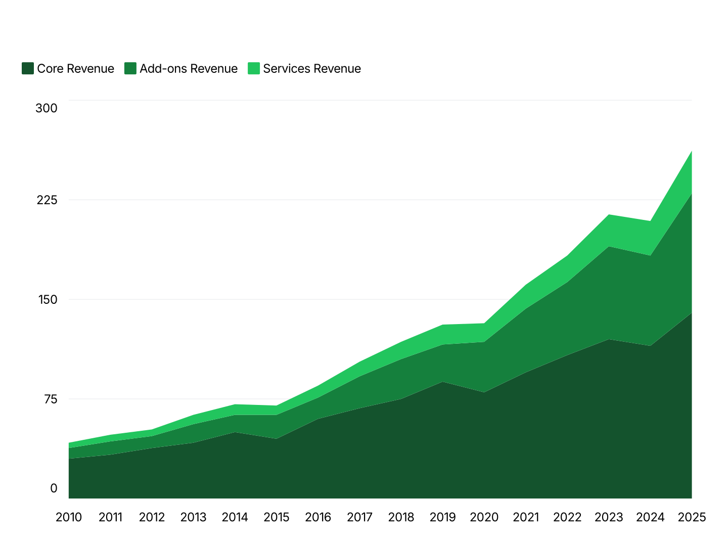
A stacked area chart layers multiple series on top of each other so their shaded regions sum to a changing total. The top edge shows the combined total over time; each layer's thickness shows its share of that total. It's the right choice when three or more time series make up a whole and both the total and the breakdown matter.
Stacked Area Chart Features
- Non-Overlapping Stacked Fills: Series stack instead of overlapping, so every layer stays readable even with three or more series.
- Total and Composition Together: The top edge of the stack shows the combined total; layer thickness shows each series' contribution, both readable in one chart.
- Easy Data Import: Import from Excel or Google Sheets. First column is your X-axis; each additional column is one stacked series.
- Smooth or Straight Curves: Toggle spline smoothing on or off. All stacked layers follow the same curve setting for a consistent look.
- Consistent Series Colors: Each series keeps its own color across the whole chart, so audiences can track a layer's contribution over time.
- Export Straight to PowerPoint: Export ready for PowerPoint or Google Slides. Every chart drops directly into PowerPoint and Google Slides.
When to Use a Stacked Area Chart
Stacked area charts are the right tool when you have a dense, continuous time axis and three or more series that together make up a meaningful total.
- Traffic by Channel: Each layer = one acquisition channel (organic, paid, referral). The stack's top edge shows total traffic; layer thickness shows each channel's contribution over time.
- Revenue by Product Line: Each layer = one product line. Shows total revenue growth alongside which lines are driving it, across a dense weekly or monthly time series.
- Device or Platform Split: Each layer = mobile, desktop, tablet. Shows total usage and how the device mix is evolving, day by day or week by week.
- Server or Resource Usage: Each layer = one service or resource pool. Shows total load and which services are consuming the most capacity over time.
- Cumulative Fundraising by Round: Each layer = one funding round or investor group. Shows cumulative capital raised and which rounds contributed most, over the raise timeline.
- Content Mix Over Time: Each layer = one content category or format. Shows total output and how the mix of formats has shifted release over release.
Stacked Area vs Area vs Stacked Column Chart
All three show composition, but each fits a different number of series and axis type.
Stacked Area Chart
- Best for: Three or more series summing to a changing total, over a continuous time axis.
- Strength: Layers stack instead of overlapping, so total and composition both stay readable.
- Use when: Traffic by channel, revenue by product line, resource usage over time.
Area Chart
- Best for: One or two series where magnitude matters alongside trend.
- Strength: Simple, no stacking complexity for a single metric.
- Use when: Traffic, MRR, cumulative growth, single-metric tracking.
Stacked Column Chart
- Best for: The same composition story, but with discrete periods rather than a continuous axis.
- Strength: Each column is a distinct, directly comparable unit.
- Use when: Revenue mix by quarter, cost structure by year.
AECharts supports all three. Switch chart types without re-entering data to find the right format for your story.
How to Create a Stacked Area Chart
Select the stacked area chart type. Open the AECharts editor and select Stacked Area Chart from the chart type picker. Browse the template explorer on the right panel to apply a visual style instantly.
Enter your data. Click "Edit Data" in the top-right corner. The first column is your X-axis, typically dates. Each additional column is one series, AECharts stacks them in column order. Import directly from Excel or Google Sheets, or upload a CSV or Excel file.
Adjust styling. Use the top menu bar to assign a color to each series. Toggle smooth curves, adjust fill opacity, and set axis and grid options. Every change previews instantly.
Export. Export ready for PowerPoint or Google Slides. Every chart drops directly into PowerPoint and Google Slides.