Population Pyramid Maker, Create Back-to-Back Bar Charts Free
Built for workforce demographics, customer segment comparisons, and any two-group breakdown across shared categories. Free to start.
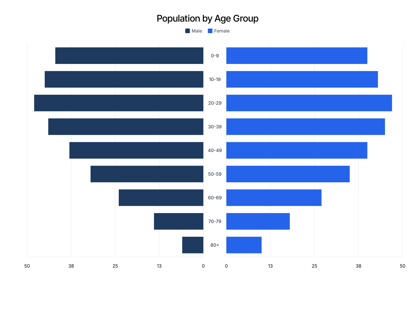
Everything You Need to Create Population Pyramids
- Easy Data Input: Paste from Excel or Google Sheets. Category plus two group values. AECharts mirrors the bars automatically.
- Shared Category Axis: Both groups compare against the same categories, making shape differences easy to spot.
- Export Straight to PowerPoint: Export and drop it directly into PowerPoint, Google Slides, or reports.
- Custom Colors: Each side gets its own color. Match your brand palette or use a built-in color scheme.
- Real-time Preview: See every change instantly. What you see in the editor is exactly what exports.
- No Design Skills Needed: Templates are professionally designed. Paste your data and export, most users are done in under a minute.
When to Use a Population Pyramid
Population pyramids work best when comparing two groups across the same set of categories, where the overall shape of each distribution matters.
- Workforce Demographics: Compare headcount by gender across seniority levels in a D&I or HR report.
- Customer Base by Region: Compare two customer segments across a shared set of categories like plan tier or usage band.
- Before/After Distribution: Compare a distribution before and after a change, mirrored for direct visual comparison.
- Market Research Demographics: Show age or income distribution for two audiences side by side.
- Survey Response Comparison: Compare response distributions between two groups across the same question categories.
- Product Usage by Segment: Compare feature usage intensity between two customer segments across the same feature categories.
Population Pyramid vs Grouped Bar Chart
Both compare two groups across categories, laid out differently.
Population Pyramid
- Best for: Comparing the overall shape of two distributions.
- Strength: Mirrored layout makes shape differences jump out immediately.
- Use when: Demographics, workforce breakdowns, before/after comparisons.
Grouped Bar Chart
- Best for: Comparing exact values side by side.
- Strength: Easier to read precise values per category.
- Use when: Precise value comparisons matter more than overall shape.
AECharts supports both. Switch between chart types to find the right format for your data.
How to Create a Population Pyramid
Choose a Template. Browse population pyramid templates and pick one that fits your data.
Paste Your Data. Copy from Excel or Google Sheets. Category plus a value for each of the two groups. AECharts mirrors the bars automatically.
Customize Colors & Style. Assign a color to each side and match your brand. Adjust fonts and background.
Export. Export and drop it directly into PowerPoint, Google Slides, or reports.