Stacked Waterfall Chart Maker — Create Stacked Bridge Charts Online for Free
A stacked waterfall chart, also called a stacked bridge chart, is a waterfall chart where each bar is broken into segments that show how multiple sub-components contributed to that step. The stacked height reveals both the direction and the composition of each change. Use AECharts to build stacked waterfall charts from your Excel or Google Sheets data for revenue bridges, cost analysis, and EBITDA walks.
How to Create a Stacked Waterfall Chart
Select the stacked waterfall chart type
Open the AECharts editor and select Stacked Waterfall Chart from the chart type picker. If you want a different visual style, browse the template explorer on the right panel and click any template to apply it instantly.
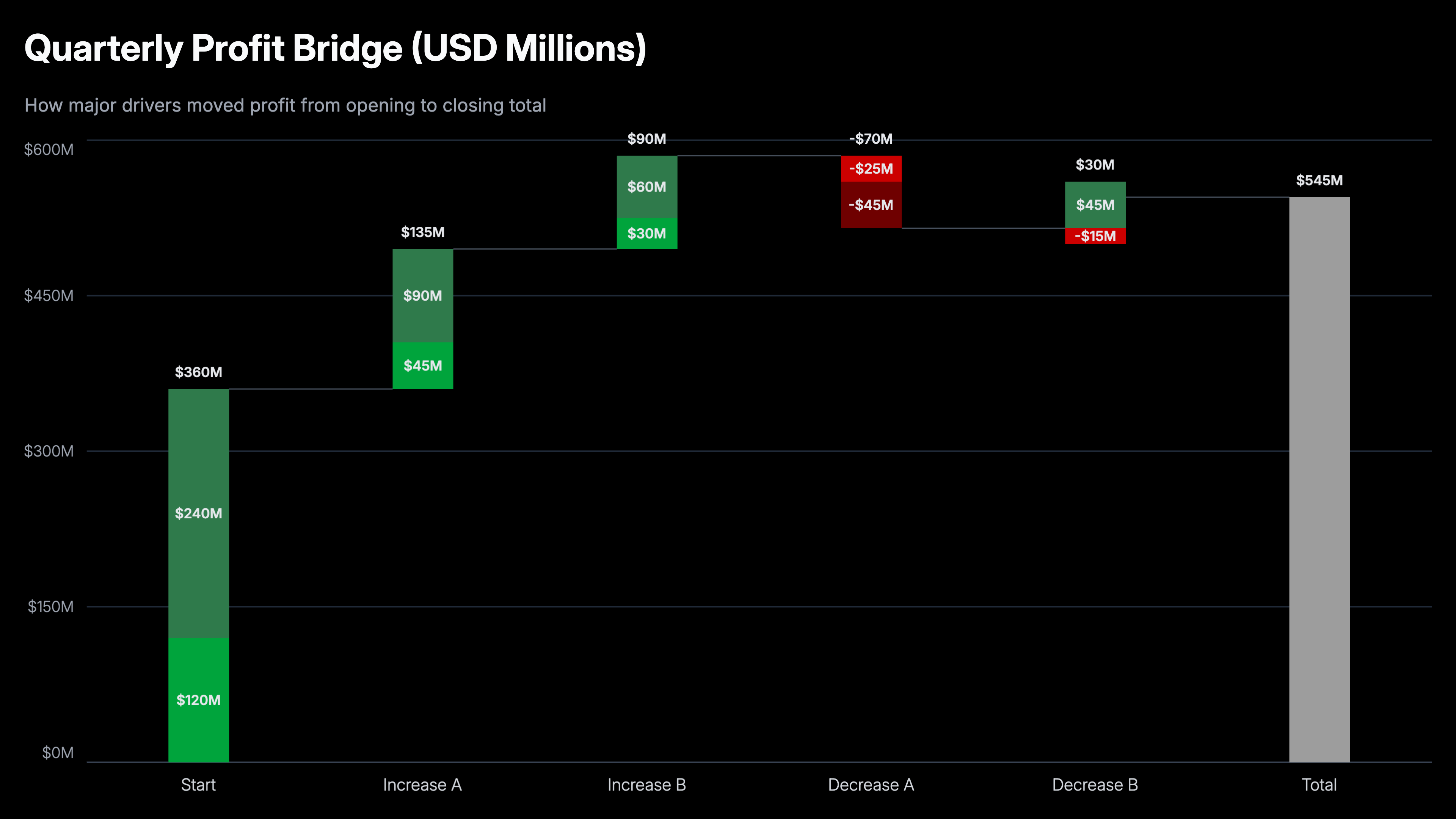
Enter your data
Click "Edit Data" in the top-right corner to open the spreadsheet. The first column holds your step names. Each row becomes one bar in the bridge. Additional columns are your data series. Positive values push the bar up; negative values push it down. Each column becomes a colored segment stacked within the bar for that step. Import directly from Excel or Google Sheets, or upload a CSV or Excel file.
Adjust styling
Use the top menu bar to customize the look. For each series you can set a positive color and a negative color independently, so gains and losses are visually distinct even within the same segment. Adjust the connector line color and width, the total bar color, and the usual label, tick, axis, and grid options including font, size, and color. Every change previews instantly.
Export
When you're ready, export as a static image (PNG), an animated video (MP4 at 1080p), or a PowerPoint file. MP4 embeds directly into slides and social posts; PNG works for reports and print; PPTX lets you keep editing in PowerPoint.
Stacked Waterfall Chart Maker Features
Stacked Segment Breakdown
Each step bar splits into color-coded segments by category. See both the total change at each step and the mix of contributors driving it.
Automatic Positioning
AECharts calculates floating bar positions, running totals, and segment stacking automatically. No manual baseline arithmetic required.
Video & Image Export
Export as MP4 at 1080p or as a static image. Works in PowerPoint, Google Slides, LinkedIn, and reports.
Consistent Category Colors
Each category keeps the same color across every step. Audiences can track a segment through the full bridge without reading labels at every bar.
Real-time Preview
See every change instantly. What you see in the editor is exactly what exports.
No Design Skills Needed
Templates are professionally designed. Import your data, adjust colors if needed, and export. Most users are done in under two minutes.
When to Use a Stacked Waterfall Chart
Use a stacked waterfall when a standard bridge chart isn't granular enough. Use it when the composition of each step is as important as the step itself.
Revenue Bridge by Product Line
Show how total revenue changed quarter-over-quarter, with each bar segmented by product. Audiences see both the direction of change and which products drove it.
Cost Variance by Department
A cost bridge where each step (headcount, materials, overhead) is broken into departments. Immediately surfaces which groups are responsible for overruns.
EBITDA Walk by Business Unit
Show the margin bridge from last year to this year with each improvement or deterioration stacked by business unit. Standard in private equity and corporate finance.
Budget vs Actual Variance
Each category of spend shows as a stacked bar over or under budget. See total variance and the mix of drivers in a single chart.
Sales Pipeline Conversion
Stage-by-stage drop-off with stacked segments by region, rep, or product. Identify where pipeline is lost and in which segments.
Headcount Bridge
Show how headcount changed from one period to the next, including hires, attrition, and transfers, segmented by department or seniority level.
Stacked Waterfall vs Standard Waterfall: Which Should You Use?
Both are bridge charts, but they answer different levels of detail.
Stacked Waterfall
Best for: Showing the composition of each change, specifically which categories or segments drove each step.
Strength: Two dimensions of information in one chart. Audiences see the 'how much' and the 'what drove it' simultaneously.
Use when: Revenue, cost, or margin bridges where sub-category breakdown is required for the analysis.
Standard Waterfall
Best for: Showing the sequence of changes from start to finish. Simple, clear, and fast to read.
Strength: Cleaner and easier to understand. Better when the audience doesn't need category-level detail.
Use when: P&L statements, cash flow analysis, budget bridges with a single value per step.
AECharts supports both. Start with a standard waterfall and add stacking if the category breakdown strengthens the story.
Frequently Asked Questions About Stacked Waterfall Charts
Create Your Stacked Waterfall Chart Today
Import your data, pick a template, and export in under two minutes. Free to start, no credit card required.