Pareto Chart Maker
A Pareto chart, also called a Pareto diagram or Pareto graph, combines bars sorted largest to smallest with a cumulative percentage line. It makes it easy to identify the small number of causes that account for the majority of an effect. Build Pareto charts online from your Excel or Google Sheets data for quality reviews, defect analysis, and prioritization. Free to start.
How to Create a Pareto Chart
Select the Pareto chart type
Open the AECharts editor and select Pareto Chart from the chart type picker. If you want a different visual style, browse the template explorer on the right panel and click any template to apply it instantly.
Enter your data
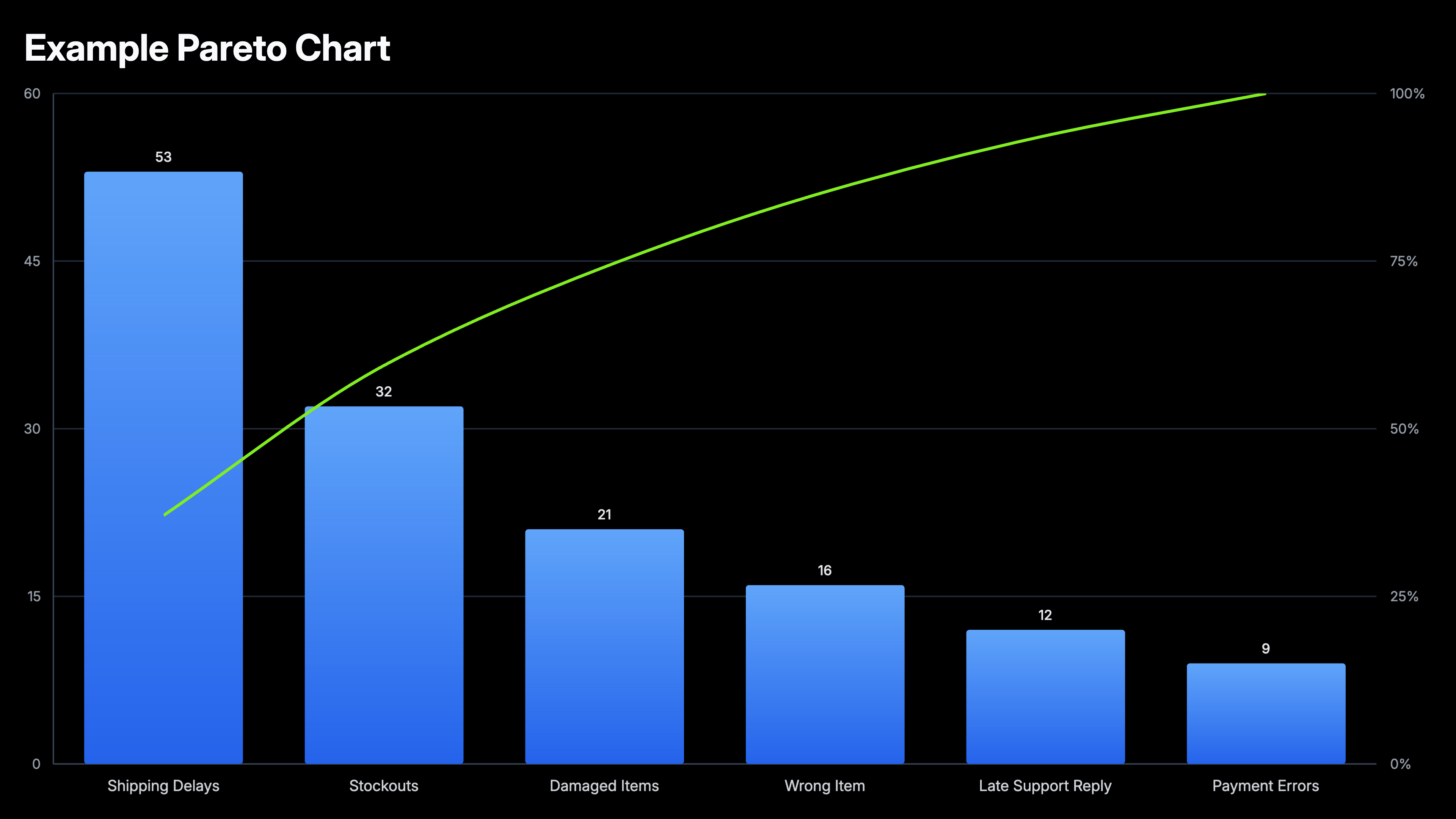
Click "Edit Data" in the top-right corner to open the spreadsheet. Add category names in the first column and values in the second. No need to sort — AECharts automatically orders bars from largest to smallest and computes the normalized cumulative percentage line. Import directly from Excel or Google Sheets, or upload a CSV or Excel file.
Adjust styling
Use the top menu bar to customize the look. Set bar color, stroke color, stroke width, and bar width. Adjust the cumulative line color and width separately. The usual label, tick, axis, and grid options — font, size, and color — are all available too. Every change previews instantly.
Export
When you're ready, export as a static image (PNG), an animated video (MP4 at 1080p), or a PowerPoint file. MP4 embeds directly into slides and social posts; PNG works for reports and print; PPTX lets you keep editing in PowerPoint.
Pareto Chart Maker Features
Auto-sorted Bars
Import your data in any order. AECharts automatically sorts bars from largest to smallest, the defining feature of a proper Pareto chart.
Cumulative Line
The overlay line updates automatically as you add or change data. See exactly where you cross 80% without any manual calculation.
Export for Any Format
Export as PNG, JPEG, PPTX, or MP4. Works in PowerPoint, Google Slides, and reports.
Easy Data Import
Import from Excel or Google Sheets. Two columns: category and value. The chart handles the rest.
Real-time Preview
See every change instantly. What you see in the editor is exactly what exports.
No Design Skills Needed
Templates are professionally designed. Import your data, adjust colors if needed, and export. Most users are done in under two minutes.
When to Use a Pareto Chart
Pareto charts work best when you need to prioritize. When you have multiple causes or categories and want to know which ones deserve attention first.
Customer Complaints
Rank complaint types by frequency. The top two or three categories almost always account for the majority. Fixing those has the highest leverage.
Defect Analysis
In manufacturing and QA, Pareto charts reveal which defect types are responsible for most failures. Standard tool in Six Sigma and lean processes.
Support Ticket Triage
Show which ticket categories consume the most engineering time. Makes the case for self-serve documentation or product fixes.
Revenue by Product
Identify which products or SKUs generate the majority of revenue. Useful for portfolio reviews and resource allocation decisions.
Bug Prioritization
Rank bug categories by frequency or user impact. Focus engineering effort where it eliminates the most pain.
Cost Reduction
Show which expense categories account for the bulk of spend. Pareto charts make it obvious where cutting has the most effect.
Pareto Chart vs Bar Chart: What is the Difference?
Both use bars, but they answer different questions.
Pareto Chart
Best for: Prioritization, identifying the few causes that account for most of an effect.
Strength: The cumulative line makes the 80/20 threshold visible at a glance. Audiences immediately see where to focus.
Use when: Quality reviews, retrospectives, defect analysis, support triage, cost reduction.
Bar Chart
Best for: Comparison, showing how categories differ in magnitude without implying a priority order.
Strength: Simpler and more familiar. Works for any categorical comparison where rank order is not the main message.
Use when: Revenue by region, performance by team, product comparison, survey results.
AECharts supports both. Use a bar chart when you are comparing. Use a Pareto chart when you are prioritizing.
Frequently Asked Questions About Pareto Charts
Create Your Pareto Chart Today
Import your data, pick a template, and export in under two minutes. Free to start, no credit card required.