Sankey Chart Maker
Paste your flow data, pick a template, and export as video or image.
Built for energy flows, budget allocation, user journeys, revenue breakdowns, and any data showing how quantities move from sources to destinations. Free to start.
Everything You Need to Create Sankey Diagrams
Source-Target-Value Format
Each row is a flow: source, target, value. Paste from Excel or Google Sheets — AECharts builds the node layout automatically.
Multi-Level Flows
Flows can pass through intermediate nodes — supply chains, conversion funnels, energy transformation. No limit on depth.
Custom Node Colors
Full control over node colors and link opacity. Match your brand palette or use a built-in theme.
Video & Image Export
Export as MP4 at 1080p or as a static image. Works in PowerPoint, Google Slides, LinkedIn, and reports.
Real-time Preview
See every change instantly. What you see in the editor is exactly what exports.
No Design Skills Needed
Templates handle node positioning and link routing automatically. Paste your data and export — most users are done in under a minute.
When to Use a Sankey Diagram
Sankey diagrams excel at showing flows, transfers, and relationships between categories — any time you need to show how quantities move from sources to destinations.
Energy Flow Analysis
Show electricity generation sources flowing to consumption sectors, or track carbon emissions through supply chains.
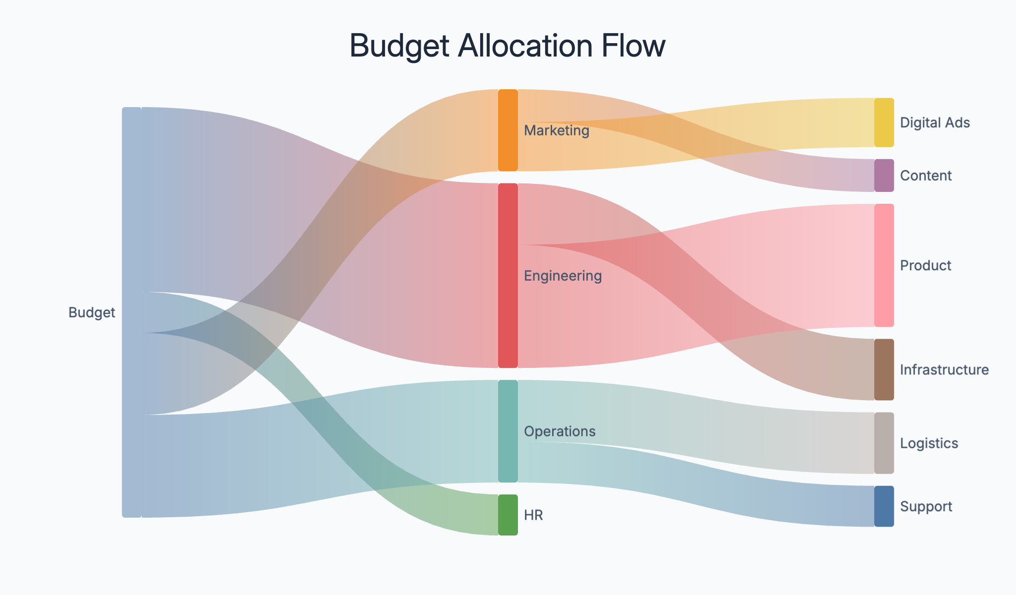
Budget Allocation
Display how funds flow from revenue sources to spending categories — government budgets, company P&L, or departmental spend.
User Journey Mapping
Track how users flow through your product or website — from landing pages through conversion funnels to purchases or sign-ups.
Supply Chain Flows
Map material and product flows through manufacturing and distribution networks from raw materials to end customers.
Revenue by Channel
Show how total revenue is generated across channels (organic, paid, direct, referral) and how each flows to product lines.
Migration Patterns
Visualize population or customer movement between segments, regions, or competitors. Show talent flows or churn between brands.
Sankey Diagram vs Bar Chart
Both visualize quantities — but Sankey diagrams are specifically for flow between categories.
Sankey Diagram
Best for: Flow data — showing how quantities move from sources to destinations through intermediate stages.
Strength: Link width encodes quantity — readers see both the direction and magnitude of each flow at once.
Use when: Energy flows, budget allocation, user journeys, supply chains.
Bar Chart
Best for: Comparing independent values across categories without implying flow.
Strength: Simple, familiar, and precise — bar height maps directly to value.
Use when: Revenue by region, product comparisons, rankings.
AECharts supports both. Switch between Sankey and bar to find the right format for your data.
How to Create a Sankey Diagram
Choose a template
Browse Sankey diagram templates and pick one that matches your use case.
Paste your data
Copy source-target-value data from Excel or Google Sheets and paste it in. AECharts builds the Sankey structure automatically.
Customize colors and style
Adjust node colors, link opacity, and labels. Match your brand or use a built-in color scheme.
Export as video or image
Export as a 1080p MP4 or static image. Drop into slides, reports, or share directly.
Frequently Asked Questions
Create Your Sankey Diagram Today
Paste your flow data, pick a template, and export in under a minute. Free to start — no credit card required.