Stacked Column Chart Maker
A stacked column chart divides each vertical column into colored segments to show both totals and composition at once. It is the standard chart for tracking how a revenue mix, cost structure, or segment breakdown shifts over time. Switch to 100% stacked mode to focus on proportion rather than absolute size.
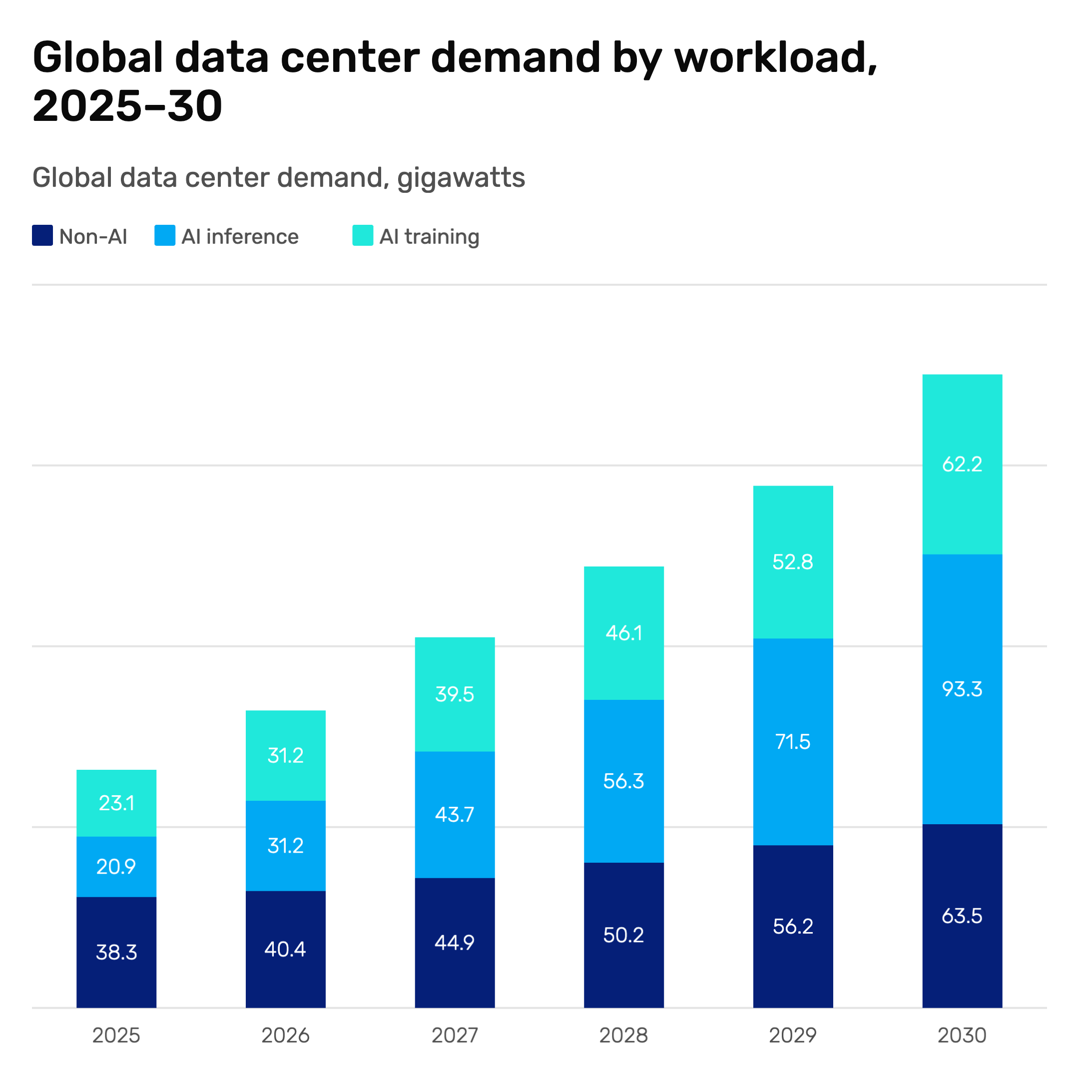
How to Create a Stacked Column Chart
Select the stacked column chart type
Open the AECharts editor and select Stacked Column Chart from the chart type picker. Browse the template explorer on the right panel to apply a visual style instantly.
Enter your data
Click "Edit Data" in the top-right corner. The first column holds your time periods or categories — each row becomes one column. Additional columns are your segments — each adds one stacked layer. Import directly from Excel or Google Sheets, or upload a CSV or Excel file.
Adjust styling
Use the top menu bar to assign a color to each segment. Switch between standard stacked and 100% stacked mode with one click. Adjust bar width, stroke, labels, axes, and grid options. Every change previews instantly.
Export
Export as PNG, JPEG, PPTX, or MP4. The animated version drops directly into PowerPoint and Google Slides slides.
Stacked Column Chart Features
Standard and 100% Stacked Modes
Switch between standard stacked (shows absolute totals and composition) and 100% stacked (shows proportion only, normalized to the same height). One click between modes.
Consistent Segment Colors
Each segment keeps the same color across all columns. Audiences track a segment through time without re-reading the legend at every column.
Easy Data Import
Import from Excel or Google Sheets. First column is the category or time period; each additional column is one segment. The chart builds automatically.
Export for Any Format
Export as PNG, JPEG, PPTX, or MP4. The animated MP4 drops directly into PowerPoint and Google Slides.
Segment Connectors
Dashed lines connect the top and bottom of each segment across adjacent columns, showing whether each layer is growing or shrinking. A standard feature in consulting decks that makes mix shift immediately readable.
Stack Totals
Display the total value above each column so the audience can read the overall figure without adding segments mentally. Toggle on or off alongside segment labels.
When to Use a Stacked Column Chart
Stacked column charts are the right tool when the horizontal axis is time and both the total trend and the mix story matter. The 100% stacked variant is particularly useful in decks where you need to show share shift clearly without total growth distorting the picture.
Revenue Mix by Quarter
Each column = one quarter. Segments = product lines or geographies. Column height shows total revenue growth; segment widths show whether the mix is shifting toward higher-margin products.
Cost Structure Over Time
Each column = one year. Segments = cost categories (COGS, R&D, SG&A). Shows whether total costs are rising and which categories are driving the increase.
P&L Composition
Each column = one reporting period. Segments = revenue streams or business units. Makes it easy to show which parts of the business are growing as a share of total.
Headcount by Function
Each column = one quarter. Segments = Engineering, Sales, Marketing, G&A. Shows total headcount growth and how the org mix is shifting as the company scales.
Portfolio Breakdown
Each column = one period. Segments = asset classes or investment categories. Used in fund reporting and portfolio reviews to show allocation drift over time.
Market Share Over Time
Each column = one year. Segments = competitors. Best shown in 100% stacked mode so the audience sees share shift clearly, independent of total market growth.
Stacked Column vs Waterfall vs Grouped Column
All three use vertical bars, but each answers a different question.
Stacked Column
Best for: Showing how a total and its composition change across periods.
Strength: Totals and mix visible in one chart. 100% mode isolates the composition story.
Use when: Revenue mix by quarter, cost structure, P&L composition, market share over time.
Waterfall Chart
Best for: Explaining what drove the change from one total to another.
Strength: Sequential build shows each contributing factor as a positive or negative step.
Use when: Revenue bridge, budget variance, P&L build-up from one period to another.
Grouped Column
Best for: Precise comparison of individual segment values across categories.
Strength: Each segment starts from zero, making exact differences easy to read.
Use when: Comparing two or three metrics side by side, before/after analysis.
AECharts supports all three. Switch chart types without re-entering data to find the right format for your story.
Frequently Asked Questions
Create Your Stacked Column Chart Today
Import your data, pick a template, and export in under two minutes. Free to start, no credit card required.