Horizontal Bar Chart Maker
Paste your data, pick a template, and export and use in PowerPoint or Google Slides. Built for rankings, comparisons, and any data with long category labels. Free to start.
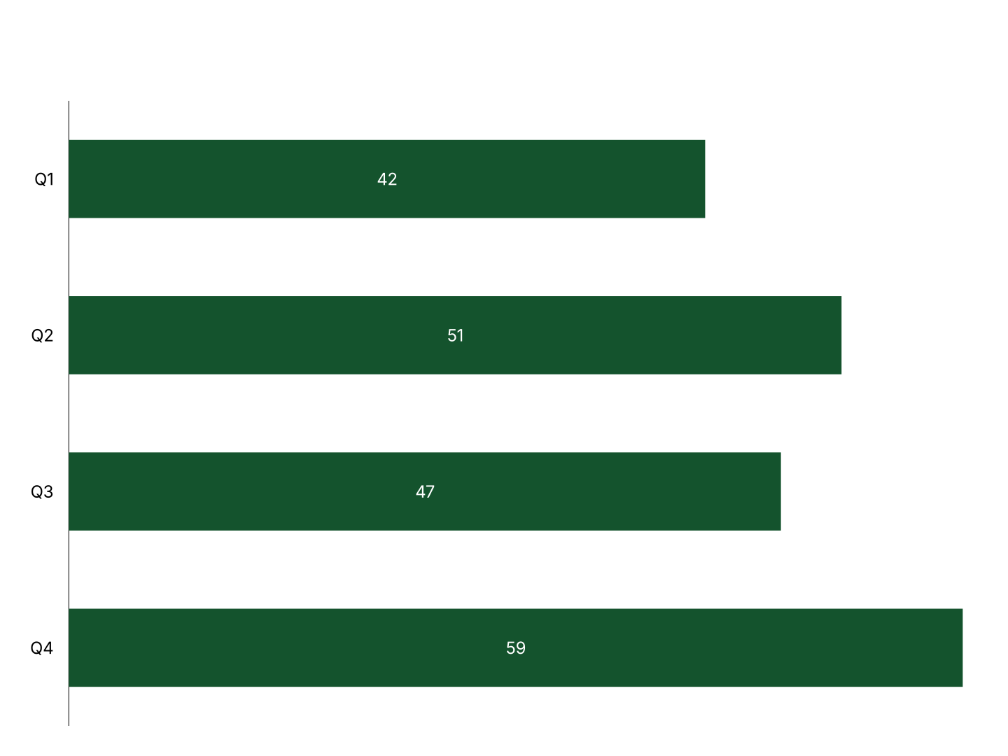
When to Use a Horizontal Bar Chart
Horizontal bar charts shine when you need to compare categories and readability of labels matters.
- Rankings & Top-N Lists: Top 10 products, countries, or teams by revenue. The top-to-bottom order mirrors reading order, immediately intuitive.
- Survey Results: Agreement levels, feature requests, or satisfaction ratings across response options. Long labels fit naturally on the left axis.
- Competitive Benchmarks: Compare your product against competitors across multiple attributes. Horizontal bars make side-by-side comparison easy to scan.
- Department Performance: Revenue, headcount, or KPI scores by team or region. Names like 'North America Enterprise' fit without rotation.
- Feature Usage: Which product features are used most. Bar length instantly communicates relative usage, no legend required.
- Budget Breakdown: Spend by category or department. Horizontal layout keeps long cost-center names legible at any chart size.
Horizontal vs Vertical Bar Chart
Both compare discrete categories, but they suit different data and contexts.
Horizontal Bar Chart
- Best for: Rankings, long category names, ordered lists.
- Strength: Labels are readable without rotation, no clutter on the x-axis.
- Use when: Comparing countries, products, departments, or survey responses.
Vertical Bar Chart
- Best for: Time-series data, short labels like months or quarters.
- Strength: Intuitive for time flowing left-to-right, familiar in financial and business reporting.
- Use when: Showing monthly revenue, quarterly growth, or year-over-year trends.
AECharts supports both. Switch between horizontal and vertical to find the right format for your data.
How to Create a Horizontal Bar Chart
Choose a template. Browse horizontal bar chart templates and pick one that matches your style.
Paste your data. Copy from Excel or Google Sheets. One row per category with a value, AECharts builds the bars automatically.
Customize colors and style. Assign a color to each bar and match your brand. Adjust fonts, labels, and background.
Export. Export and drop it directly into PowerPoint, Google Slides, or reports.