Gauge Chart Maker — Create Animated Gauge Charts Online for Free
A gauge chart uses a circular ring, or multiple concentric rings, to show progress toward a target. Each ring fills proportionally to represent current vs maximum value, and animates on playback. Use AECharts to build animated gauge charts for KPI dashboards, sales quota tracking, and goal attainment in presentations.
How to Create a Gauge Chart
Select the gauge chart type
Open the AECharts editor and select Gauge Chart from the chart type picker. If you want a different visual style, browse the template explorer on the right panel and click any template to apply it instantly.
Enter your data
Click "Edit Data" in the top-right corner to open the spreadsheet. Each row becomes one ring. The first column is the label (the metric name), the second column is the current value, and the third column is the maximum value. For example: Revenue | 820 | 1000. AECharts fills each ring proportionally and animates from 0 to the current value.
Adjust styling
Use the top menu bar to customize the look. Set a fill color and a background track color for each ring independently. Adjust ring thickness and the gap between rings. Control the label font, value font, size, and color for each ring. Every change previews instantly.
Export
When you're ready, export as a static image (PNG), an animated video (MP4 at 1080p), or a PowerPoint file. MP4 embeds directly into slides and social posts; PNG works for reports and print; PPTX lets you keep editing in PowerPoint.
Gauge Chart Maker Features
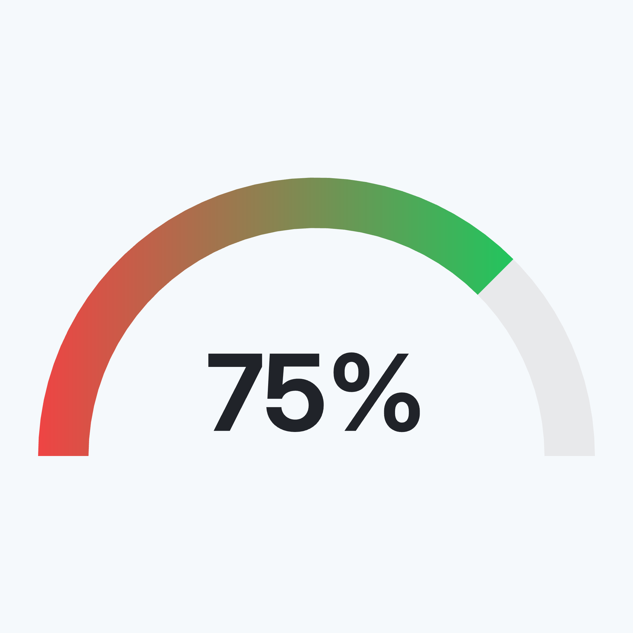
Activity Ring Format
Each metric is a circular ring that fills proportionally from 0 to the maximum. The arc length makes attainment instantly readable without gridlines or axes.
Multiple Concentric Rings
Stack 2 to 4 rings to show several KPIs at once. Each ring is independent — different label, value, max, and color.
Animated Fill
Rings animate from empty to their current value on playback. The animation draws attention to each metric in sequence.
Custom Ring Colors
Each ring gets its own fill color and background track color. Match your brand palette or use a built-in color scheme.
Video & Image Export
Export as MP4 at 1080p or as a static image. Works in PowerPoint, Google Slides, LinkedIn, and reports.
Real-time Preview
See every change instantly. What you see in the editor is exactly what exports.
When to Use a Gauge Chart
Gauge charts work best when you have a value and a target and you want the gap between them to be immediately visible.
Sales Quota Attainment
$820K of $1M target. The partially filled ring makes the remaining gap tangible, more compelling than a percentage in a table.
Activity & Fitness Tracking
Move, exercise, stand — three rings, three goals. The stacked ring format is instantly recognizable and works well in health and wellness content.
Project Completion
Show what share of a project or sprint is done. Useful in stakeholder updates and status decks where a single visual replaces a paragraph.
Fundraising Progress
Raised vs goal. The ring fills as you close in, works in pitch decks and investor updates.
KPI Dashboard
Group 3 to 4 key metrics as rings in one chart. Revenue, churn, NPS, retention — at-a-glance status for an executive audience.
Onboarding Completion
Show how far users have progressed through a setup flow. Works in product decks and customer success reviews.
Gauge Chart vs Progress Bar vs Animated Number
All three show a value against a target. The difference is how much visual weight you want on each metric.
Gauge Chart
Best for: 2 to 4 KPIs that each need strong visual presence.
Strength: Animated ring fill is eye-catching in video, great for presentations and social.
Use when: You want the metric to be the centerpiece, not a data point in a table.
Progress Bar
Best for: Lists of many metrics side by side.
Strength: Compact — fits many rows in a small space.
Use when: Comparing multiple items where relative size matters more than visual impact.
Animated Number
Best for: A single headline metric with no target.
Strength: Maximum focus on the number itself, no visual noise.
Use when: The absolute value is the story, not the gap to a goal.
Frequently Asked Questions
Create Your Gauge Chart Today
Enter your values, pick a template, and export in under a minute. Free to start, no credit card required.