Free Scatter Chart Templates
Browse scatter and bubble chart templates for correlations, distributions, and two- or three-variable comparisons. A strong fit for research decks and business analysis presentations.
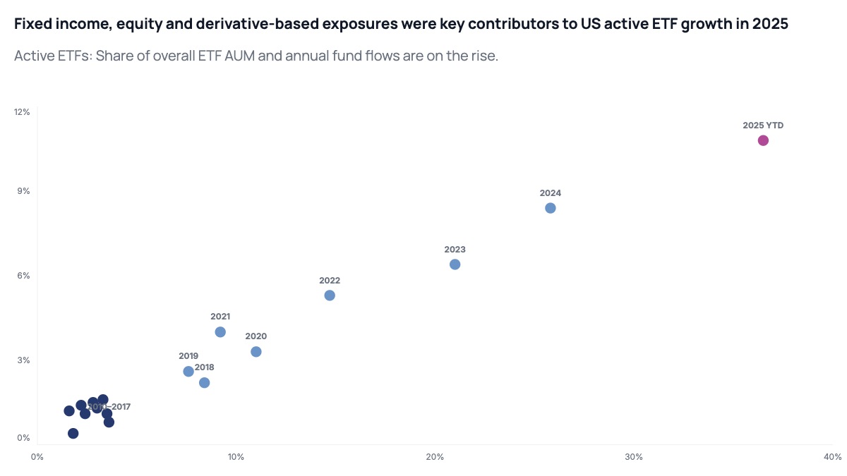
Scatter and bubble chart templates for analysis and presentations
Scatter charts reveal the relationship between two variables: price vs volume, spend vs revenue, effort vs outcome. Add a third variable as bubble size and it becomes a bubble chart, useful when market size, deal value, or headcount needs to show up alongside the two axes. They're essential for research presentations, analyst decks, and any slide where you need to show correlation. Pick a template, paste your data, and drop it straight into your deck.
What is a scatter chart used for?
Scatter charts plot individual data points against two axes to show correlation, clusters, or outliers. Common uses include comparing marketing spend vs revenue, employee performance vs tenure, or product price vs customer satisfaction.
What's the difference between a scatter chart and a bubble chart?
A scatter chart plots points against two variables (x and y). A bubble chart adds a third variable by sizing each point, so you can show, for example, revenue vs growth rate with market size as the bubble size. AECharts scatter templates support both.
Can I label individual data points?
Yes. AECharts supports per-point labels so you can identify specific companies, products, or segments on the scatter or bubble chart.
Browse individual templates