Radar Chart Maker
Radar charts, also called spider charts, radar graphs, or web charts, plot multiple variables on a single diagram, making it easy to spot strengths, gaps, and patterns at a glance. Use AECharts to build radar charts from your Excel or Google Sheets data for reports, presentations, and competitive analysis.
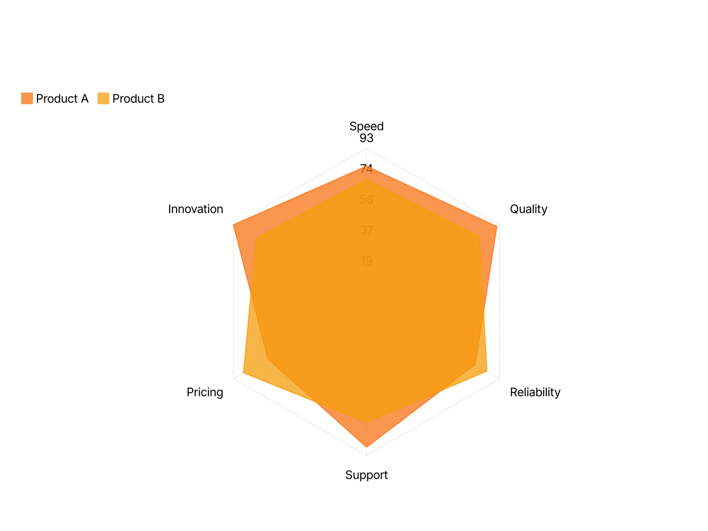
Radar Chart Maker Features
- Easy Data Input: Paste from Excel or Google Sheets. One row per attribute, AECharts maps each row to an axis and plots the shape automatically.
- Multi-Series Comparison: Overlay two or more series on the same chart. Use distinct colors and transparency so each profile is clearly readable.
- Export Straight to PowerPoint: Export and drop it directly into PowerPoint, Google Slides, or reports.
- Custom Colors: Each series gets its own fill and stroke color. Match your brand palette exactly or use a built-in color scheme.
- Real-time Preview: See every change instantly. What you see in the editor is exactly what exports.
- No Design Skills Needed: Templates are professionally designed. Paste your data, adjust colors, and export, most users are done in under a minute.
When to Use a Radar Chart
Radar charts work best when you have 4–8 dimensions and want to show a shape, where something excels and where it falls short.
- Competitive Analysis: Plot two competitors on the same axes, price, quality, speed, support, scalability. The overlapping shapes reveal where each wins and loses at a glance.
- Employee Performance Reviews: Score an employee across skills: communication, execution, collaboration, initiative, technical depth. The radar shows strengths and development areas in one view.
- Product Feature Comparison: Compare your product vs. alternatives across dimensions that matter to buyers. More persuasive than a feature matrix when your product's profile is visually stronger.
- Sports & Athlete Analytics: Visualize a player's stats, speed, passing, shooting, defense, stamina. Commonly used in scouting reports and broadcast graphics.
- UX / Research Evaluation: Score a product or prototype on usability dimensions: learnability, efficiency, memorability, errors, satisfaction. Radar charts are standard in UX audit reports.
- Brand Perception Studies: Plot how customers perceive a brand on dimensions like trustworthiness, innovation, affordability, and quality. Useful in brand strategy decks.
Radar Chart vs Bar Chart
Both can show multiple values, but they communicate very different things.
Radar Chart
- Best for: 4–8 dimensions, especially when comparing two profiles side by side.
- Strength: Shows shape and balance, readers instantly see which areas are strong or weak.
- Use when: Competitive analysis, performance reviews, skill assessments, multi-attribute comparisons.
Bar Chart
- Best for: Ranking or comparing values where precise magnitude matters.
- Strength: Familiar and easy to read, aligned baselines make differences obvious.
- Use when: Revenue comparisons, category rankings, before-and-after data with a clear winner.
AECharts supports both. Switch between radar and bar to find the right format for your data.
How to Create a Radar Chart or Spider Chart
Select the radar chart type. Open the AECharts editor and select Radar Chart from the chart type picker. If you want a different visual style, browse the template explorer on the right panel and click any template to apply it instantly.
Enter your data. Click "Edit Data" in the top-right corner to open the spreadsheet. Put your category names in the first column, each row becomes one axis (side) of the radar. Add values in the columns to the right, each additional column creates a separate radar series overlaid on the same chart. Paste directly from Excel or Google Sheets, or upload a CSV or Excel file.
Adjust styling. Use the top menu bar to customize the look. You can set the fill color and opacity for each radar series, the stroke color and thickness, dot radius at each axis point, radar ring color, and the tick label font and color. Every change previews instantly.
Export. When you're ready, export ready for PowerPoint or Google Slides. Drop into slides, reports, or share directly.