Pictograph Maker, Create Pictograms and Icon Charts Free
Turn data into pictograms, icon charts, and picture graphs. Import from Excel or Google Sheets, pick icons, and export ready for PowerPoint or Google Slides. Free to start.
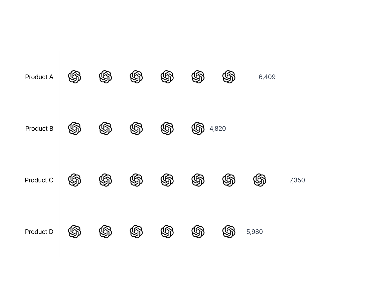
Everything You Need to Create Pictograms and Icon Charts
- Easy Data Import: Import from Excel or connect Google Sheets. One row per category. AECharts maps your values to icon counts automatically.
- Icon Library: Choose from a library of icons including people, objects, and symbols. Each category gets its own icon and color.
- Export Straight to PowerPoint: Export and drop it directly into PowerPoint, Google Slides, or reports.
- Flexible Units: Set how many units each icon represents. One icon can equal 1, 100, 1,000, or any value. Labels update automatically.
- Real-time Preview: See every change instantly. What you see in the editor is exactly what exports.
- No Design Skills Needed: Templates are professionally designed. Import your data, pick icons, and export. Most users finish in under a minute.
When to Use a Pictograph
Pictograms, picture graphs, and isotype charts work best when you want data to feel human and countable rather than abstract.
- Population Comparisons: Show how many people a stat represents. 1 in 5 icons shaded communicates 20% more viscerally than a bar or a number.
- Unit Sales: Each icon = 10,000 units sold. Product-by-product comparisons become instantly readable in investor decks and sales reviews.
- Survey Results: '3 out of 4 respondents.' A picture graph with three filled icons and one outline conveys this faster than any chart type.
- Resource Allocation: Headcount, budget slots, machine capacity. A pictogram makes abstract resource numbers feel concrete.
- Health and Demographics: Prevalence stats, patient counts, risk ratios. Icon charts are the standard for public health communication because they build intuition.
- Annual Reports: Pictograms add visual variety to data-dense reports. One well-placed icon chart breaks up tables and makes a stat stick.
Pictograph vs Bar Chart: Which Should You Use?
Both compare quantities, but they serve different audiences and contexts.
Pictograph / Pictogram
- Best for: Public-facing communication, presentations, infographics where data should feel accessible.
- Strength: Icons are intuitive and memorable. Viewers count them rather than estimate, which builds stronger recall.
- Use when: You have a small number of categories (2–6) and the message is the unit count.
Bar Chart
- Best for: Precise comparisons across many categories where exact values matter.
- Strength: Scales to 10+ categories and handles a wide range of values without becoming cluttered.
- Use when: Analysts, dashboards, or reports where accuracy takes priority over visual engagement.
AECharts supports both. Switch between pictogram and bar chart to find the right format for your audience.
How to Create a Pictograph
Choose a template. Browse pictograph and pictogram templates and pick one that matches your style.
Import your data. Import from Excel or connect a Google Sheets URL. One row per category with a value.
Choose icons and customize. Select icons for each category and assign colors. Set how many units each icon represents.
Export. Export and drop it directly into PowerPoint, Google Slides, or reports.