Create professional
charts and business graphics
Used by individuals from


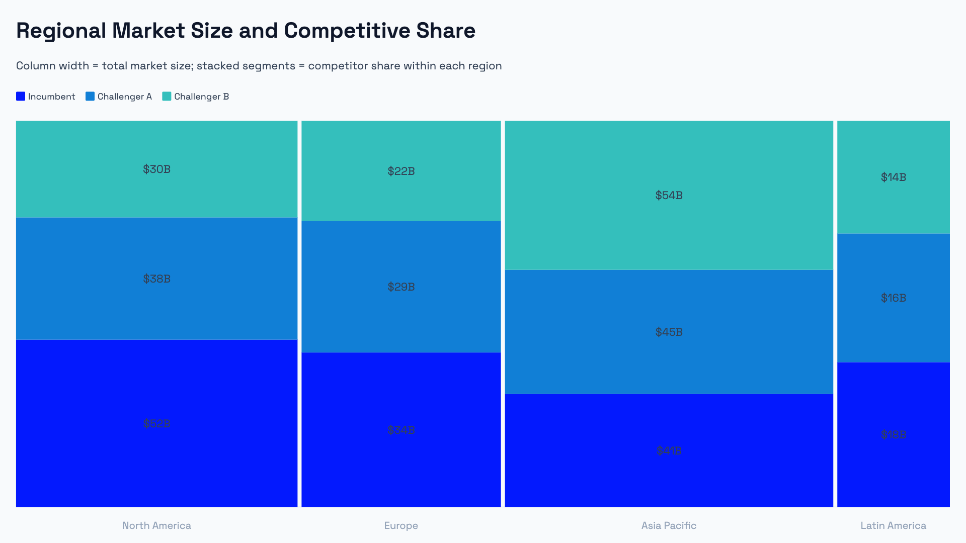
Advanced chart types built for business.
Waterfall, Marimekko, Pareto, dumbbell, radar, and funnel charts — the chart types analysts and consultants use in client decks, but that PowerPoint and Google Slides don't support natively.
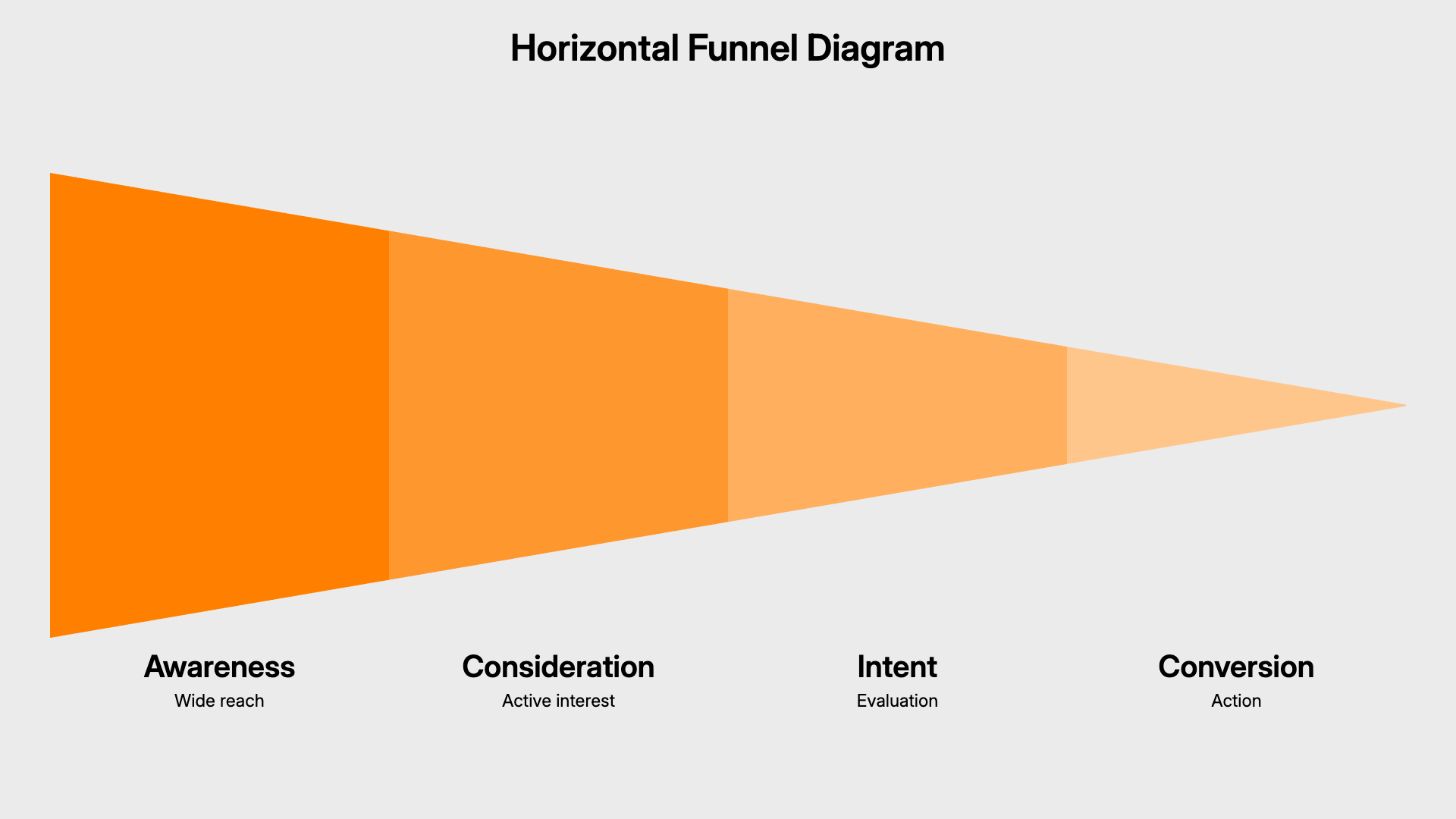
Presentation diagrams that reflow.
Timeline, cycle, hub-and-spoke, and process flow diagrams that recalculate their layout as you add or remove items — no manual repositioning.
Import data from Excel, Google Sheets, or CSV.
Paste directly from a spreadsheet or import a CSV file. AECharts maps your columns to the chart automatically.
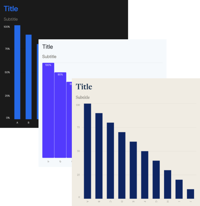
Full control over styling and brand.
Fonts, colors, label formats, axis ranges — every visual property is editable. Team plans include a Brand Kit that applies your settings across all charts.
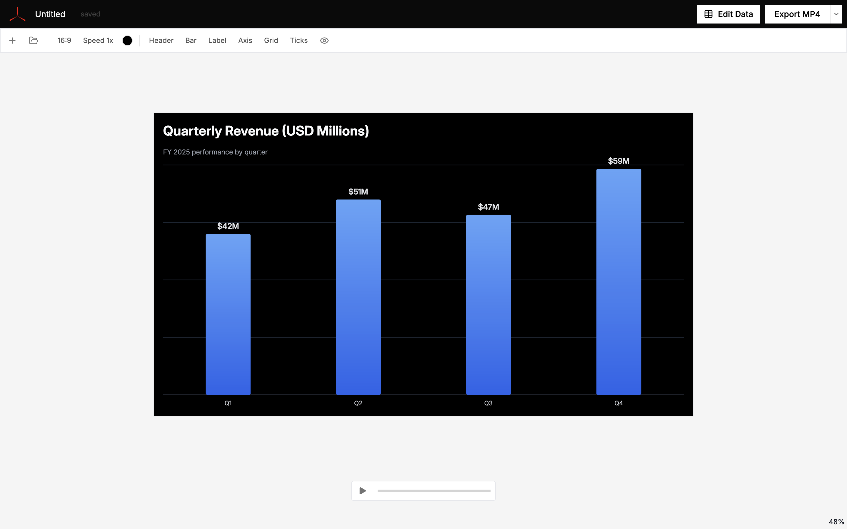
Charts animate by default.
Every chart plays a smooth reveal animation out of the box — bar charts grow from zero, line charts draw from left to right, pie charts sweep a clean 360. Export as video to drop directly into a YouTube video, reel, or presentation recording.
Export to PowerPoint, Google Slides, PNG, or MP4.
All formats render from the same source chart — drop into a client deck as PPTX, share as Google Slides, embed in a report as PNG, or publish as MP4 video.
20+ chart types and presentation diagrams
How to create charts and diagrams with AECharts
Pick one of the chart types — bar, line, pie, donut, scatter, gauge, and more. Each comes with pre-built templates.
Paste data from Excel, Sheets, or CSV![]()
![]() — then edit colors, fonts, labels, and animation speed in the sidebar. Changes preview instantly.
— then edit colors, fonts, labels, and animation speed in the sidebar. Changes preview instantly.
Export as PowerPoint, Google Slides, PNG, or MP4![]()
![]()
![]()