Types of Line Charts
Line Chart Comparison Table: Which Type Should You Use?
Use this comparison to choose the right line chart type for your data and presentation needs.
| Chart Type | Data Size | Best Use Case | Video Fit |
|---|---|---|---|
| Basic Line | 5-50+ data points | Time series, trends | Excellent - smooth drawing animation |
| Area Chart | 5-50+ data points | Volume emphasis, cumulative data | Excellent - fill animation adds impact |
| Multi-Line | 2-5 series, 5-30 points each | Comparison across series | Good - sequential line reveals |
| Step Line | 5-20 data points | Discrete changes, pricing | Good - clear step transitions |
| Sparkline | 10-30 data points | Inline trends, dashboards | Limited - best as static element |
All Types of Line Charts at a Glance
- Basic Line Chart - perfect for time series data (daily, monthly, yearly)
- Area Chart - emphasizes volume and magnitude of data
- Multi-Line Chart - compares multiple data series directly
- Step Line Chart - shows discrete changes, not gradual transitions
- Sparkline - compact visualization for space-constrained layouts
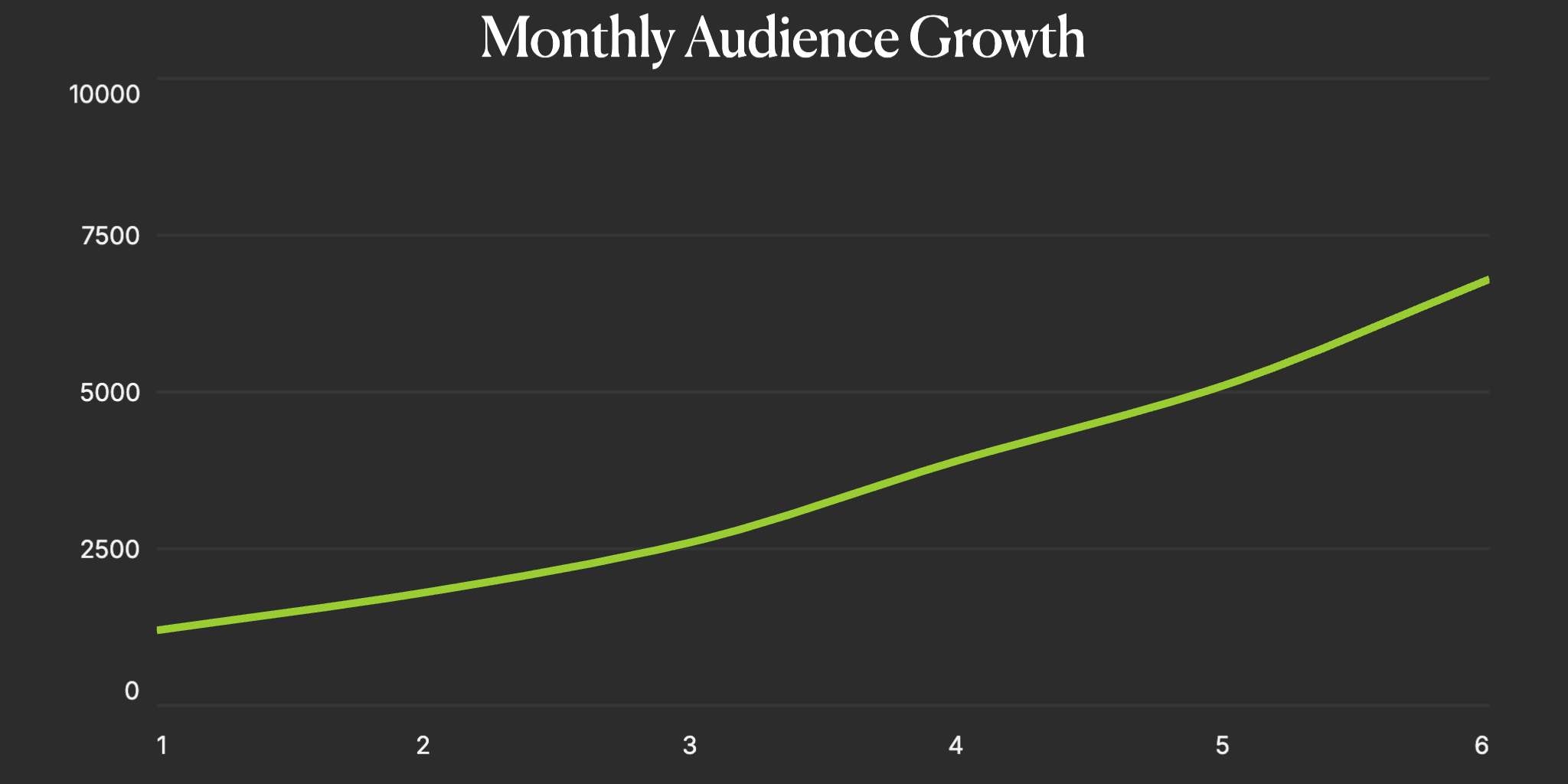
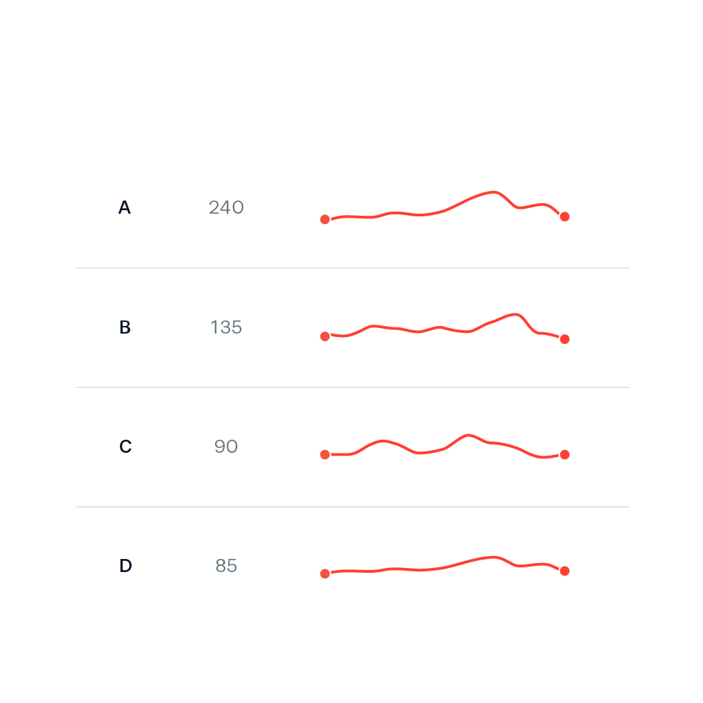
Basic Line Chart
The fundamental line chart connects data points with straight or curved lines to show trends over time. Basic line charts are the go-to choice for displaying continuous data, tracking changes, and identifying patterns. The animated version draws the line progressively, creating an engaging reveal of your data story.
- Perfect for time series data (daily, monthly, yearly)
- Shows trends, patterns, and direction of change
- Works with continuous and sequential data
- Ideal for stock prices, growth metrics, and performance tracking
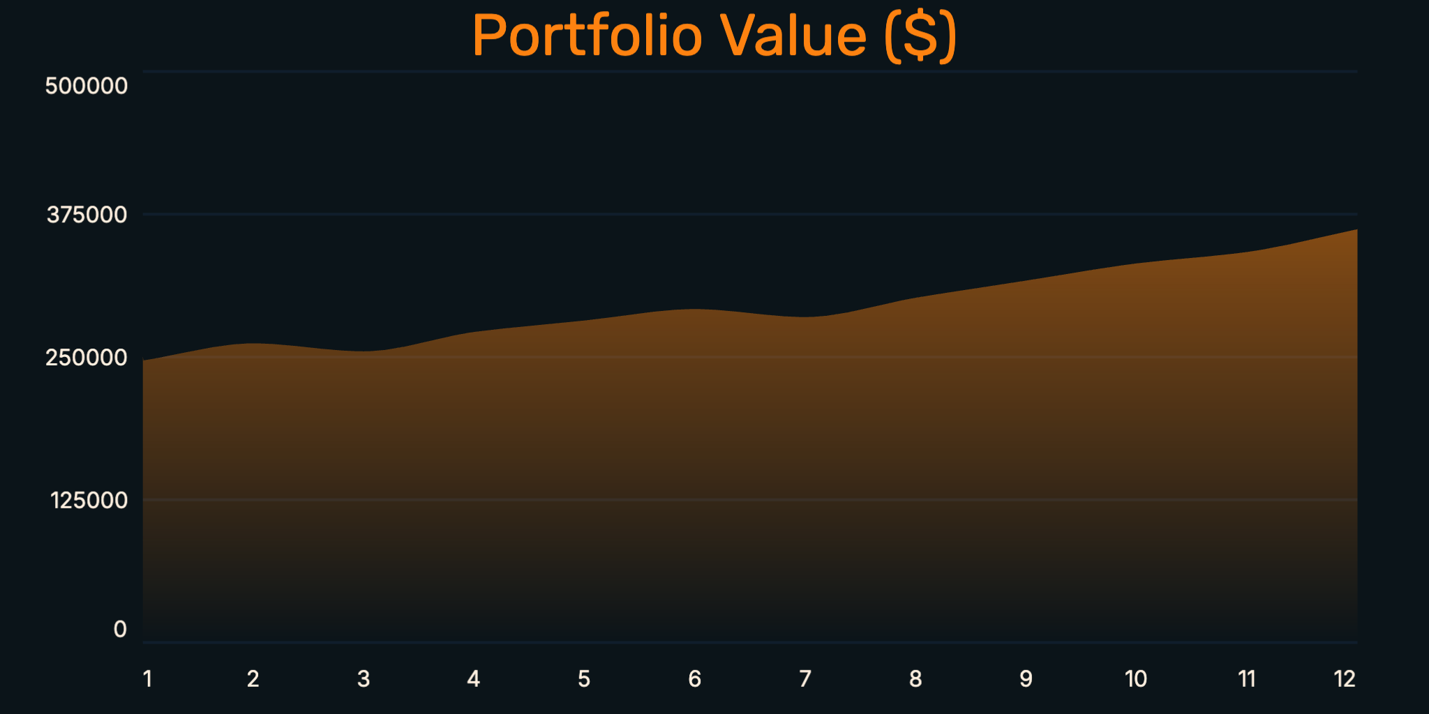
Area Chart
Area charts are line charts with the space below the line filled in with color. This creates a stronger visual emphasis on the magnitude of values and changes over time. Area charts are particularly effective for showing cumulative totals and making the volume of data more apparent at a glance.
- Emphasizes volume and magnitude of data
- Great for showing cumulative values
- Creates stronger visual impact than simple lines
- Perfect for revenue trends, resource usage, and cumulative metrics
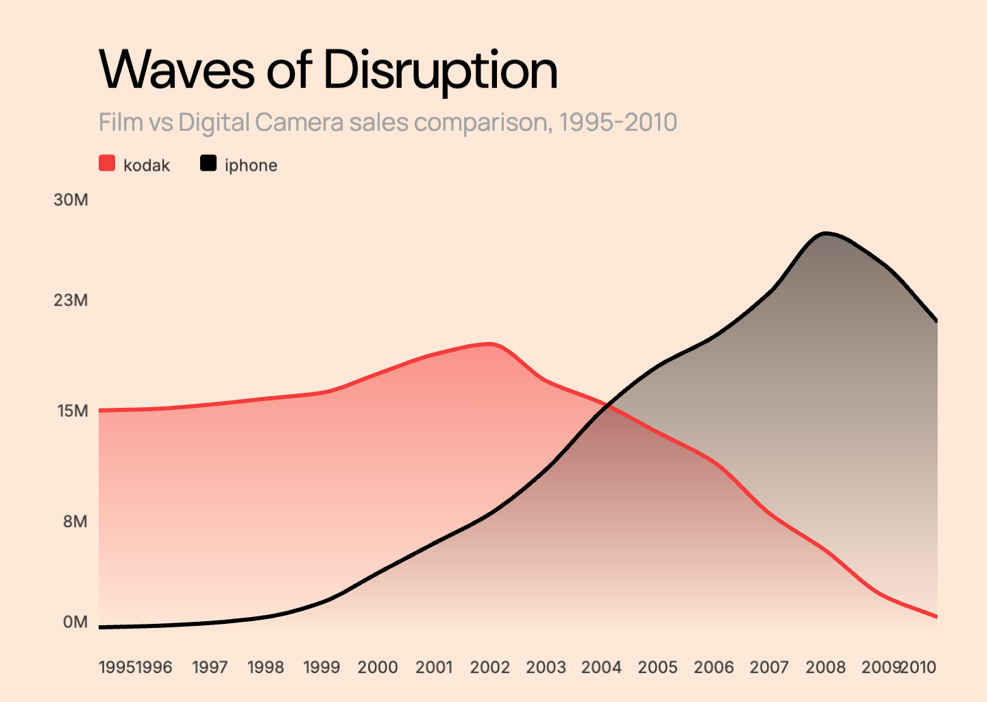
Multi-Line Chart
Multi-line charts display multiple data series on the same axes, allowing direct comparison between different datasets. Each line typically has a distinct color, making it easy to track and compare trends across categories, products, or time periods simultaneously.
- Compares multiple data series directly
- Shows relative performance between groups
- Best with 2-5 lines to maintain clarity
- Ideal for competitor analysis, A/B testing, and regional comparisons
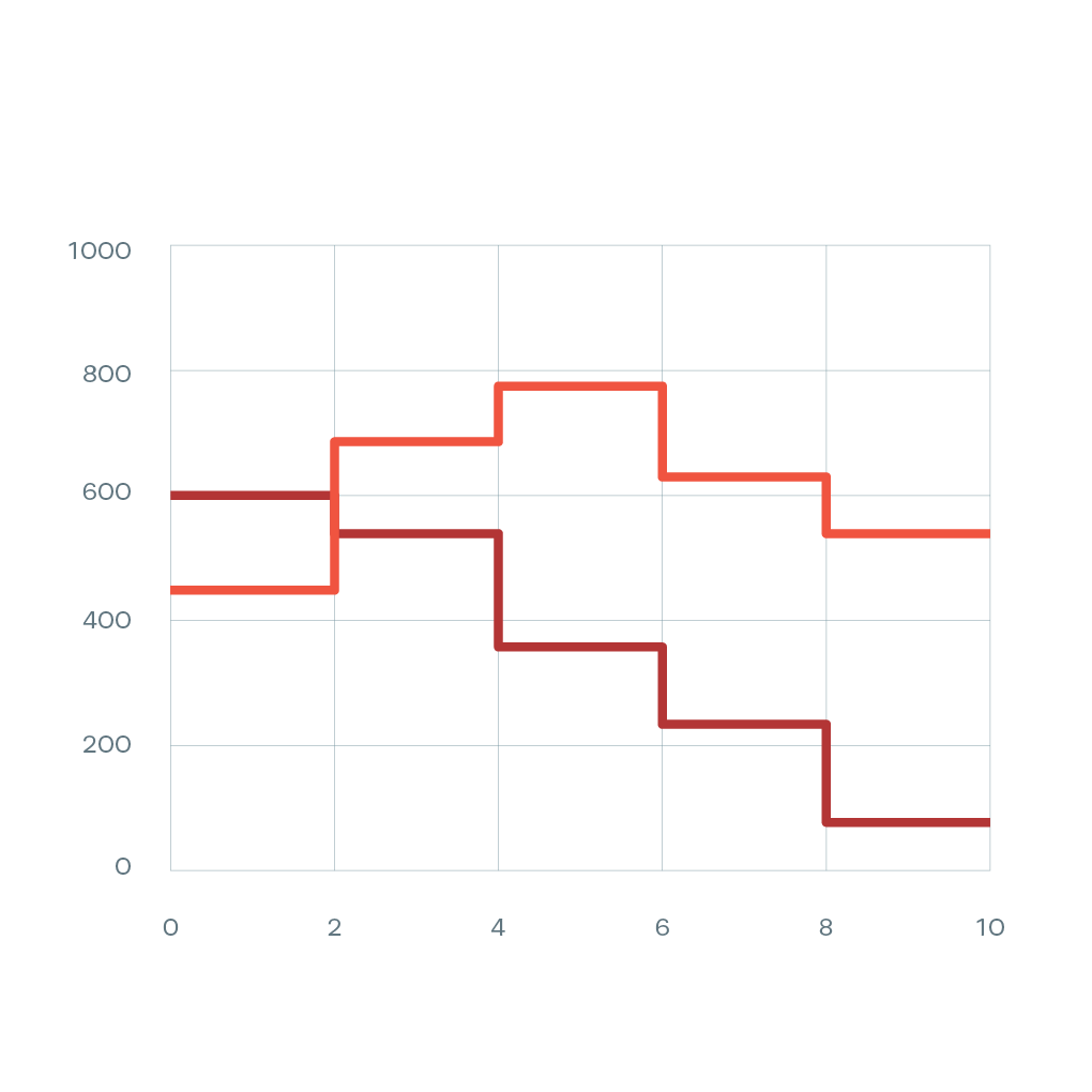
Step Line Chart
Step line charts connect data points with horizontal and vertical lines, creating a staircase pattern. Unlike smooth lines, step charts show that values remain constant between data points before suddenly changing. This is essential for data that changes in discrete jumps rather than gradually.
- Shows discrete changes, not gradual transitions
- Accurate for pricing tiers and stepped data
- Clear visualization of when changes occur
- Perfect for pricing plans, inventory levels, and policy changes
Sparkline
Sparklines are compact, simple line charts designed to fit within a small space, often inline with text or in table cells. They show trends at a glance without axes or labels, making them perfect for dashboards and data-dense environments where you need to show many trends quickly.
- Compact visualization for space-constrained layouts
- Shows trend direction without detailed values
- Perfect for dashboards and data tables
- Great for KPI summaries and quick trend indicators
What is a Line Chart?
A line chart is a data visualization that displays information as a series of points connected by straight or curved line segments. The horizontal axis typically represents time or a sequential variable, while the vertical axis shows the measured values. Line charts are particularly effective at revealing trends, patterns, and changes over continuous intervals. They are one of the most common chart types used in business reporting, scientific research, financial analysis, and everyday data communication because they clearly show how values evolve and relate to each other over time.
Purpose of Line Charts
Line charts are designed to show trends and patterns in data over time or across ordered categories. They excel at answering questions like 'Is this metric increasing or decreasing?', 'When did the trend change?', and 'How do these patterns compare?' Line charts are ideal for tracking stock prices, monitoring website traffic, analyzing sales trends, displaying temperature changes, and any scenario where understanding the direction and rate of change matters more than comparing discrete values. The continuous nature of the line helps viewers perceive the flow and momentum of data in ways that bar charts cannot.
Common Line Chart Mistakes to Avoid
- Using line charts for categorical data that should be bar charts
- Including too many lines (6+) which creates visual clutter
- Not using consistent time intervals on the X-axis
- Truncating the Y-axis in a misleading way
- Using similar colors for multiple lines, making them hard to distinguish
- Forgetting to label the axes or provide context for the data
Line Chart Templates
Start with a professionally designed template and customize it with your data.
Line Chart Examples
See how line charts are used in real-world scenarios with these interactive examples.
Monthly Growth Chart
Track month-over-month growth trends with an animated line chart.
Cumulative Sales Chart
Visualize cumulative sales building up over time with area fills.
User Growth Chart
Show user acquisition and growth patterns over weeks or months.
Trend Over Time Chart
Display any time-series data with smooth animated line transitions.
Explore More Chart Types
Looking for other chart types? Explore our guides on types of bar charts, types of pie charts and more.
Create Your Animated Line Chart Video
Transform your data into engaging animated line chart videos. Choose a template, paste your data, and export in minutes. No design skills required.