9 Types of Pie Charts (With Examples & When to Use Each)
Pie charts excel at showing how parts relate to a whole. From classic pie charts to modern donut variations, each type offers unique advantages for different data storytelling needs. Learn which pie chart type works best for your data and create animated videos that make your proportions pop.
All Types of Pie Charts at a Glance
- Standard Pie Chart - shows parts of a whole at a glance
- Donut Chart - modern, clean aesthetic
- Semi-Circle (Half Pie) Chart - space-efficient horizontal layout
- Exploded Pie Chart - emphasizes specific segments
- Nested Donut Chart - compares multiple related datasets
- 3D Pie Chart - eye-catching, dramatic visual effect
- Polar Area Chart (Rose Chart) - equal angles, varying radii based on value
- Sunburst Chart - visualizes multi-level hierarchical data
- Waffle Chart - grid-based alternative to circular charts
Pie Chart Examples and Variations
There are many different types of pie charts, each designed for specific data visualization needs. The most common pie chart variations include standard pies, donut charts, and exploded pies - but the full range of pie chart examples extends to specialized formats like sunburst charts for hierarchical data and waffle charts for precise percentage displays. Below, we explore each type with real-world examples and clear guidance on when to use them.
What is a Pie Chart?
A pie chart is a circular statistical graphic divided into slices that represent proportions of a whole. Each slice's size corresponds to the quantity it represents relative to the total, with all slices together forming a complete circle (100%). Pie charts use both the angle and area of each slice to convey proportional relationships. They are among the most recognizable data visualizations, appearing everywhere from business presentations to news graphics, and are particularly effective when you want audiences to quickly grasp how individual parts contribute to a total.
Purpose of Pie Charts
Pie charts are designed to show part-to-whole relationships and make proportional comparisons intuitive. They answer questions like "What percentage of the total does each category represent?" and "How do these parts compare to each other?" Pie charts are ideal for displaying market share distributions, budget breakdowns, survey response percentages, demographic compositions, and any scenario where the emphasis is on how individual segments contribute to a complete picture. They work best with a small number of categories (3-7) where at least one slice is notably different in size from the others.
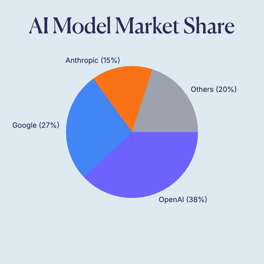
Standard Pie Chart
The classic pie chart displays data as slices of a circle, where each slice represents a proportion of the whole. Standard pie charts are immediately recognizable and effective for showing simple part-to-whole relationships. The animated version reveals slices one by one, creating an engaging build-up effect.
- Shows parts of a whole at a glance
- Best for 3-7 categories
- Instantly recognizable format
- Ideal for market share, budget allocation, and survey results
When to Use
- Showing market share or budget breakdowns with 3-6 categories
- Presenting survey results where percentages matter
- Audiences unfamiliar with data visualization (universally understood)
When Not to Use
- Comparing values across multiple time periods (use line charts)
- Displaying more than 7 categories (becomes unreadable)
- When precise value comparison matters (bar charts are better)
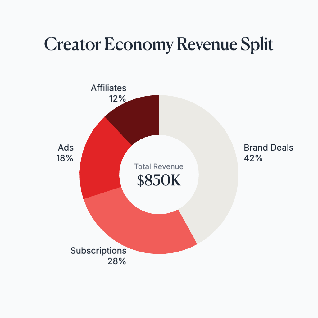
Donut Chart
Donut charts are pie charts with a hole in the center, creating a ring shape. The center space can display additional information like totals, labels, or icons. Donut charts have a modern aesthetic and can be easier to read than standard pies because they encourage comparison of arc lengths rather than areas.
- Modern, clean aesthetic
- Center space for key metrics or totals
- Better for comparing arc lengths
- Perfect for KPIs, completion rates, and minimalist dashboards
When to Use
- Dashboard designs where you need to show a key metric in the center
- Displaying progress or completion percentages
- Modern, minimalist design contexts
When Not to Use
- When the center space would be wasted (use standard pie instead)
- Print materials where small donut holes may not reproduce well
- When you need to emphasize individual slice areas over arc lengths
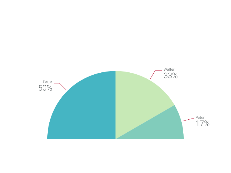
Semi-Circle (Half Pie) Chart
Semi-circle or half-pie charts display data in a 180-degree arc rather than a full circle. This layout can be more space-efficient and works well in certain design contexts. Half-pie charts are often used for gauge-like visualizations or when you want to emphasize a comparison between two main categories.
- Space-efficient horizontal layout
- Gauge-like appearance
- Good for binary or few-category comparisons
- Ideal for satisfaction scores, completion percentages, and balanced comparisons
When to Use
- Gauge-style metrics like satisfaction scores or performance ratings
- Comparing two opposing categories (e.g., approve vs. disapprove)
- Horizontal layouts where vertical space is limited
When Not to Use
- More than 4-5 categories (slices become too narrow)
- When you need the visual completeness of a full circle
- Data that doesn't conceptually fit a 'meter' or 'gauge' metaphor
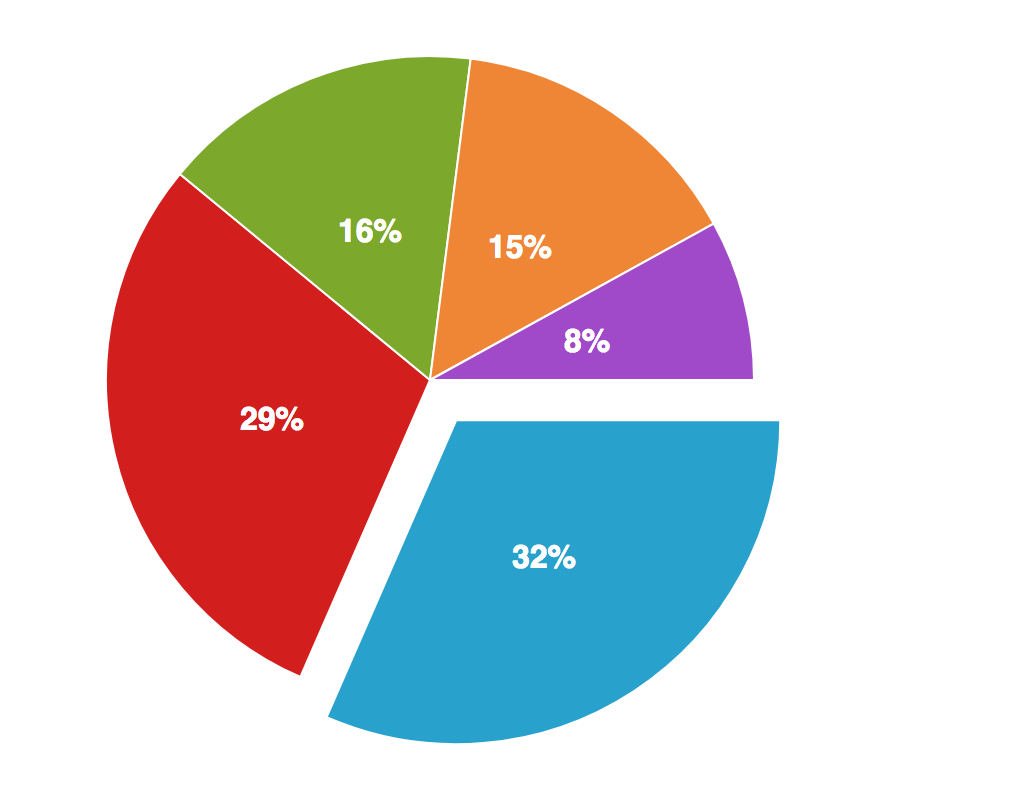
Exploded Pie Chart
Exploded pie charts pull one or more slices away from the center, creating visual emphasis on specific segments. This technique draws attention to important data points while maintaining the context of the whole. Use explosion sparingly to highlight key findings without overwhelming the viewer.
- Emphasizes specific segments
- Draws attention to key data points
- Maintains context of the whole
- Best for highlighting winners, problems, or featured categories
When to Use
- Highlighting a winning category or key finding in a presentation
- Drawing attention to a problem area that needs focus
- Creating visual interest in otherwise static charts
When Not to Use
- When all categories are equally important
- Exploding multiple slices (defeats the purpose of emphasis)
- Data-heavy contexts where distortion could mislead
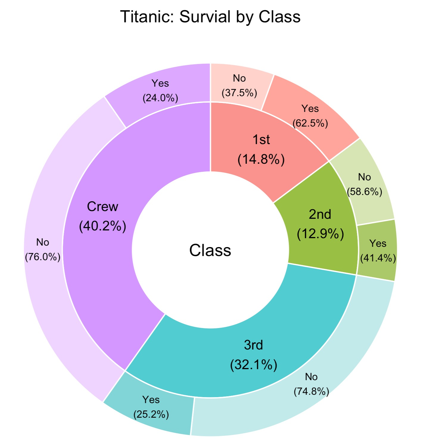
Nested Donut Chart
Nested donut charts stack multiple donut rings concentrically, allowing comparison of related datasets or showing hierarchical data. The inner ring might show high-level categories while outer rings break down subcategories. This creates a rich, multi-layered visualization that tells a complete story.
- Compares multiple related datasets
- Shows hierarchical relationships
- Compact way to display more data
- Great for year-over-year comparisons and category hierarchies
When to Use
- Comparing the same categories across two time periods
- Showing category breakdowns with subcategories
- Displaying hierarchical data in a compact space
When Not to Use
- More than 3 rings (becomes difficult to read)
- When rings have very different total values
- Audiences unfamiliar with nested visualizations
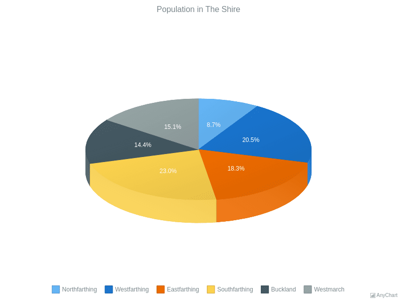
3D Pie Chart
3D pie charts add depth and perspective to the standard pie format, creating a more visually striking appearance. While they can look impressive in presentations, the 3D effect distorts proportions - slices at the front appear larger than those at the back. Most data visualization experts advise against 3D pies for accurate data representation, but they remain popular for stylistic purposes.
- Eye-catching, dramatic visual effect
- Popular in business presentations and marketing
- Adds perceived depth and dimension
- Best used when visual impact matters more than precision
When to Use
- Marketing materials where visual impact is the priority
- Presentations where approximate proportions are acceptable
- When the audience expects a polished, corporate aesthetic
When Not to Use
- Scientific or financial reporting requiring accuracy
- When small differences between slices matter
- Data journalism or any context where distortion is problematic
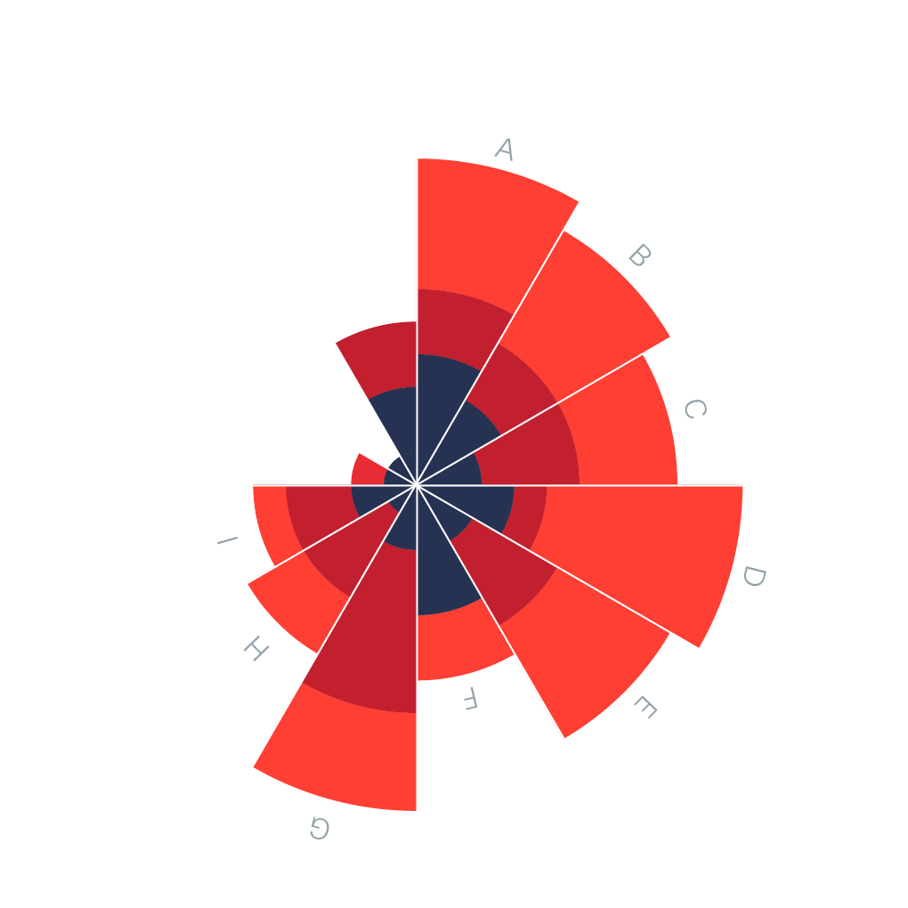
Polar Area Chart (Rose Chart)
Polar area charts, also known as rose charts or Coxcomb charts (popularized by Florence Nightingale), use segments of equal angles but varying radii. Unlike pie charts where the angle represents value, polar area charts use the area of each segment. This makes them better for comparing magnitudes while maintaining a circular layout.
- Equal angles, varying radii based on value
- Better for comparing magnitudes than standard pies
- Historical significance (Nightingale's mortality charts)
- Effective for cyclical data like months or directions
When to Use
- Cyclical data like monthly sales or seasonal patterns
- When you need to compare magnitudes, not just proportions
- Data with a natural circular ordering (compass directions, hours)
When Not to Use
- Part-to-whole relationships (standard pie is clearer)
- When audience is unfamiliar with the format
- Non-cyclical categorical data
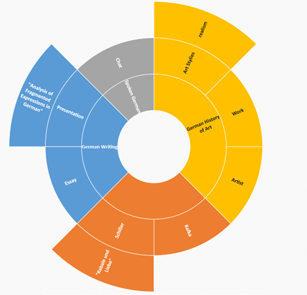
Sunburst Chart
Sunburst charts display hierarchical data using concentric rings. The innermost ring represents the top level of the hierarchy, with each subsequent ring showing the next level of detail. They're excellent for showing how categories break down into subcategories, like organizational structures or file system usage.
- Visualizes multi-level hierarchical data
- Shows parent-child relationships clearly
- Interactive versions allow drilling down into segments
- Perfect for org charts, file systems, and category taxonomies
When to Use
- Hierarchical data with 2-4 levels of depth
- Showing how top-level categories break into subcategories
- Interactive dashboards where users can explore the hierarchy
When Not to Use
- Flat, non-hierarchical data (use standard pie)
- More than 4 levels deep (becomes unreadable)
- When the hierarchy has very uneven branch depths
Waffle Chart
Waffle charts use a grid of squares (typically 10x10 = 100 squares) where filled squares represent percentages. They're a modern alternative to pie charts that makes it easier to compare values and read exact percentages. Waffle charts are particularly effective for showing progress toward goals or comparing two percentages side by side.
- Grid-based alternative to circular charts
- Easy to read exact percentages (each square = 1%)
- Excellent for comparing two values side by side
- Modern aesthetic popular in infographics
When to Use
- Showing progress toward a goal (e.g., 73% complete)
- Comparing two percentages side by side
- When precise percentage reading matters
When Not to Use
- More than 2-3 categories (use grouped waffle or different chart)
- Values that don't convert cleanly to percentages
- When the circular pie metaphor is important for your story
Pie Chart Comparison Table: Which Type Should You Use?
Use this comparison to choose the right pie chart type for your data and presentation needs.
| Chart Type | Data Size | Best Use Case | Avoid When | Video Fit |
|---|---|---|---|---|
| Standard Pie | 3-7 categories | Simple part-to-whole | Comparing across time periods | Excellent - slice reveal |
| Donut Chart | 3-8 categories | Dashboards, KPIs with center metric | Print at small sizes | Excellent - ring fill |
| Semi-Circle | 2-5 categories | Gauges, binary comparisons | More than 5 categories | Good - sweep animation |
| Exploded Pie | 4-7 categories | Highlighting one key segment | All segments equally important | Good - pop-out effect |
| Nested Donut | 2-3 rings, 3-5 slices each | Year-over-year, hierarchical | Unfamiliar audiences | Good - layered build-up |
| 3D Pie | 3-6 categories | Marketing, visual impact | Accuracy matters | Good - rotation effects |
| Polar Area | 6-12 categories | Cyclical data, magnitude comparison | Part-to-whole relationships | Good - radial growth |
| Sunburst | 2-4 hierarchy levels | Hierarchical breakdowns | Flat, non-hierarchical data | Excellent - level-by-level reveal |
| Waffle | 1-3 categories | Progress, exact percentages | Many categories | Excellent - grid fill animation |
Common Pie Chart Mistakes to Avoid
- Using too many slices (8+) which makes the chart hard to read
- Including slices that are too similar in size to distinguish
- Using 3D effects that distort proportions and perception
- Not ordering slices logically (largest to smallest or by category)
- Using colors that don't provide enough contrast between adjacent slices
- Labeling every tiny slice, creating visual clutter
- Comparing multiple pie charts side by side (grouped bars work better)
- Using pies for data that doesn't sum to a meaningful whole
Pie Chart Alternatives: When to Use Something Else
Pie Charts aren't always the best choice. Here are alternatives that may work better for certain data types.
Bar Chart
When you need precise comparisons between categories, bar charts outperform pies. The human eye compares lengths more accurately than angles or areas.
Use instead when: Comparing more than 7 categories or when exact values matter
Treemap
For hierarchical part-to-whole relationships with many categories, treemaps use nested rectangles to show proportions while accommodating more data.
Use instead when: Hierarchical data with many leaf nodes
Stacked Bar Chart
Shows part-to-whole relationships while also enabling comparison across multiple groups or time periods - something pie charts cannot do.
Use instead when: Comparing composition across multiple groups
Pie Chart Templates
Start with a professionally designed template and customize it with your data.
Pie Chart Examples
See how pie charts are used in real-world scenarios with these interactive examples.
Explore More Chart Types
Looking for other chart types? Explore our guides on types of bar charts, types of line charts and more.
Create Your Animated Pie Chart Video
Transform your data into engaging animated pie chart videos. Choose a template, paste your data, and export in minutes. No design skills required.