Sales Chart Examples
Revenue by client, by service line, by geography, QBR charts, and sales cycle tracking — built for sales teams and revenue leaders.
Sales Cycle Length
Measure how long it actually takes to close deals — broken down by rep, segment, or deal size. This chart gives sales leaders and revenue operations teams a clear view of pipeline velocity, making it easy to benchmark performance, identify bottlenecks, and track whether process changes are speeding up deal closure.
Use this template →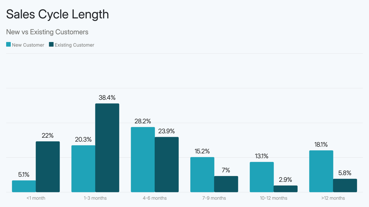
Revenue by Service Line
Break down total revenue by service line, practice area, or product category to show which parts of the business are growing, which are mature, and where to invest next. This horizontal bar chart is essential for professional services firms and multi-line businesses presenting to partners, investors, or strategic buyers.
Use this template →Revenue by Client Chart
Rank your clients by revenue contribution to understand concentration risk, identify your most valuable relationships, and make a compelling case in investor or acquisition conversations. This horizontal bar chart immediately shows whether your business is dependent on a handful of large clients — or has healthy diversification.
Use this template →Quarterly Business Review Chart Template
Present quarterly performance across key metrics — revenue, gross margin, customer count, and growth rate — in a single, structured bar chart built for board meetings, investor updates, and strategic partner reviews. A QBR chart template turns raw data into a narrative of whether the business is on track.
Use this template →Revenue by Geography Chart
Show how revenue is distributed across regions, states, or countries to demonstrate market reach, identify geographic concentration, and make the case for expansion. This horizontal bar chart is essential for e-commerce brands entering new markets, multi-location businesses, and any founder pitching geographic expansion to investors.
Use this template →