5 Types of Bar Charts (With Examples & When to Use Each)
Bar charts are one of the most versatile and widely-used data visualization tools. From simple vertical bars to dynamic bar race animations, each type serves specific purposes. Learn when to use each bar chart type and create stunning animated versions for your presentations and social media.
All Types of Bar Charts at a Glance
- Vertical Bar Chart - best for comparing 3-10 categories
- Horizontal Bar Chart - perfect for long category labels
- Bar Race Chart - shows ranking changes over time periods
- Stacked Bar Chart - shows part-to-whole relationships within categories
- Grouped Bar Chart - direct comparison between multiple data series
Bar Chart Examples and Variations
There are many different types of bar charts, each designed for specific data visualization needs. The most common bar chart variations include vertical bars, horizontal bars, and grouped bars — but the full range of bar chart examples extends to animated formats like bar race charts for time-series rankings and stacked bars for composition. Below, we explore each type with real-world examples and clear guidance on when to use them.
What is a Bar Chart?
A bar chart is a graphical representation that uses rectangular bars to display and compare data across different categories. Each bar's length or height corresponds to the value it represents, making it easy to visually compare quantities at a glance. Bar charts can be oriented vertically (column charts) or horizontally, and are one of the most fundamental and widely-recognized data visualization types used across business, science, education, and media. They excel at showing discrete, categorical data where each category is independent of the others.
Purpose of Bar Charts
Bar charts are designed to make comparisons between categories clear and intuitive. They help audiences quickly identify which categories have the highest or lowest values, spot patterns and outliers, and understand the relative magnitude of different data points. Bar charts are ideal for presenting survey results, comparing sales across products or regions, showing rankings, displaying budget allocations, and any scenario where you need to answer questions like 'which is bigger?' or 'how do these compare?' Their simplicity and familiarity make them effective for audiences of all backgrounds.
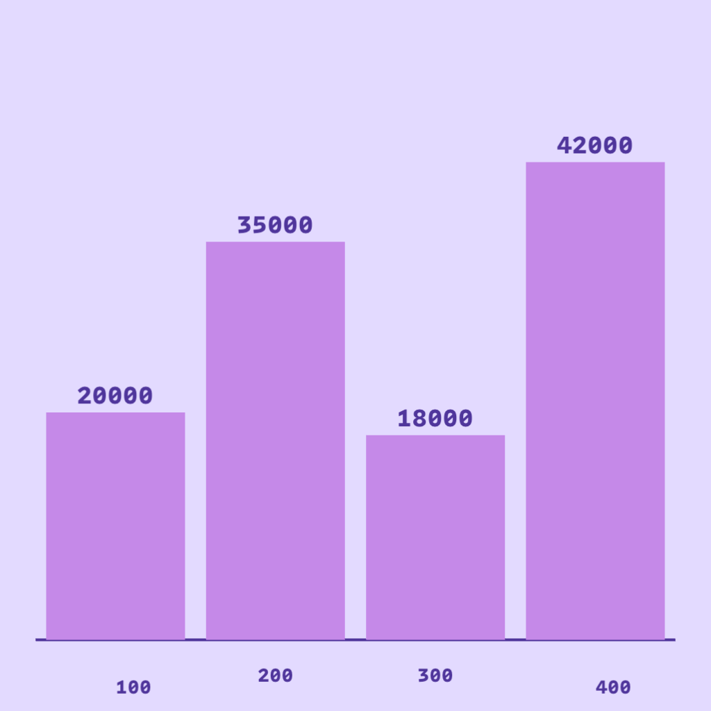
Vertical Bar Chart
The classic bar chart with vertical bars extending upward from a horizontal axis. Vertical bar charts are ideal for comparing values across different categories, showing rankings, and displaying discrete data points. The height of each bar represents the value, making it easy to compare magnitudes at a glance.
- Best for comparing 3-10 categories
- Easy to read labels on the horizontal axis
- Great for showing rankings and comparisons
- Works well for sales data, survey results, and performance metrics
When to Use
- Comparing a small number of categories (3-10) where height differences are meaningful
- Showing rankings or performance across products, regions, or time periods
- Presenting discrete data where each category stands on its own
When Not to Use
- When category labels are long — they overlap or require angling (use horizontal bars instead)
- More than 10-12 categories (chart becomes crowded and hard to read)
- Showing trends over continuous time (use a line chart)
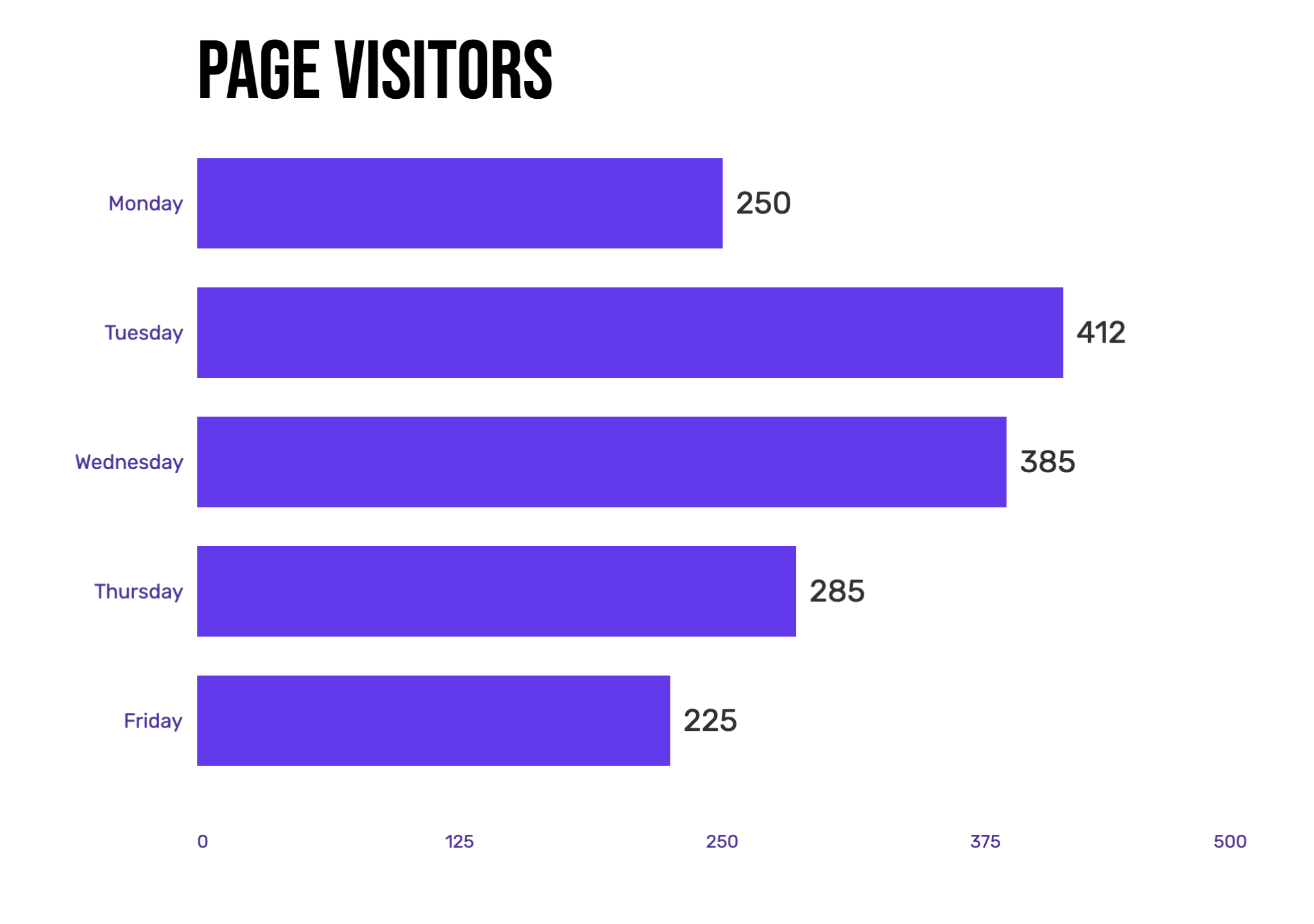
Horizontal Bar Chart
Horizontal bar charts flip the traditional bar chart on its side, with bars extending from left to right. This orientation is particularly useful when you have long category names or many categories to display. The horizontal layout allows for easier reading of text labels and can accommodate more items without crowding.
- Perfect for long category labels
- Accommodates more categories (10-20+)
- Natural reading flow from top to bottom
- Ideal for leaderboards, rankings, and survey responses
When to Use
- Category names are long phrases or multi-word labels
- Displaying many categories (10 or more) where a vertical chart would be cramped
- Ranking-style charts where top-to-bottom order feels natural to the audience
When Not to Use
- Time-series data where left-to-right implies chronological order (use line or vertical bar)
- Small datasets where a simple vertical bar chart would suffice
- When the number of items changes dynamically (use a bar race chart instead)
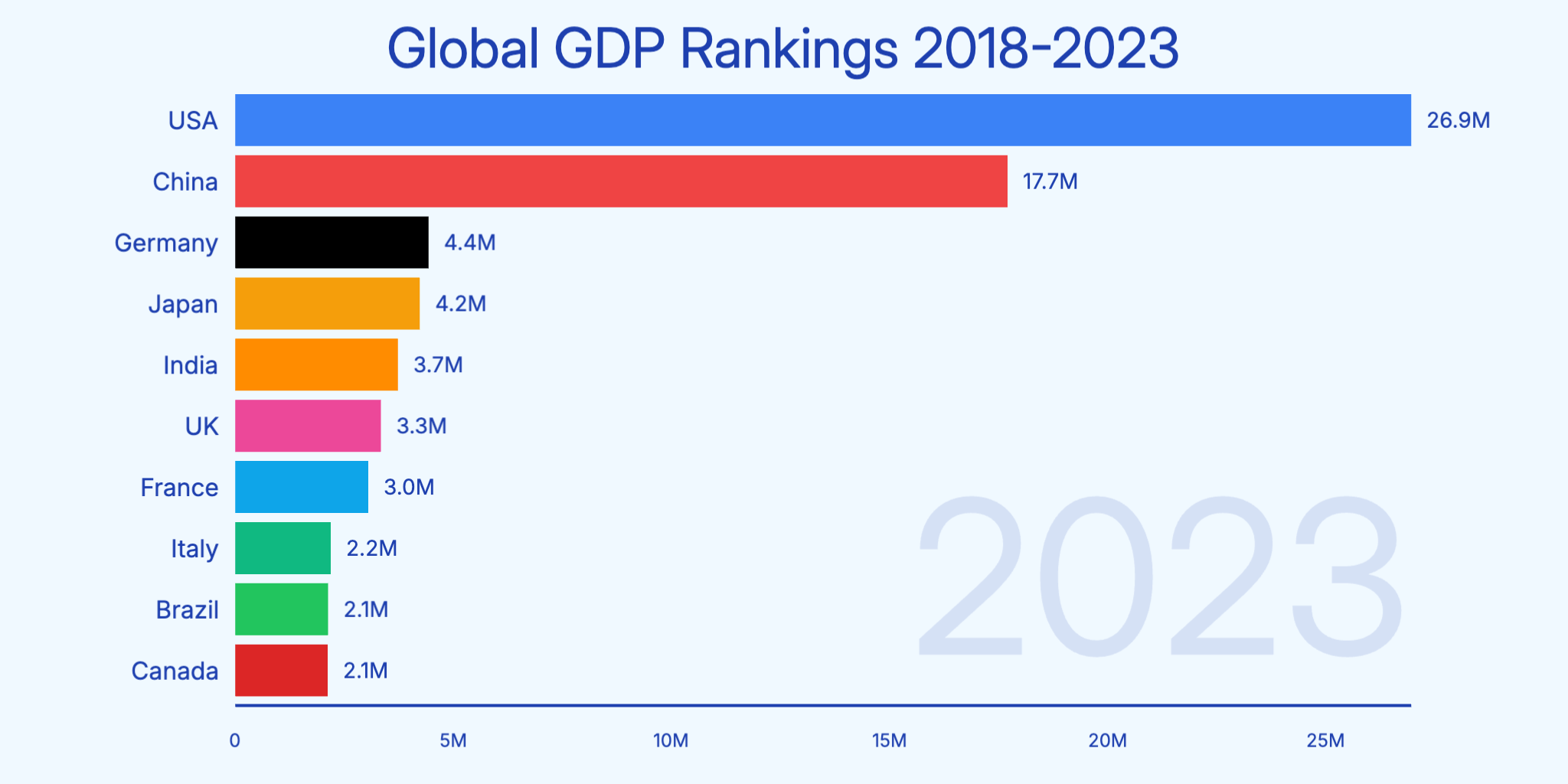
Bar Race Chart
Bar race charts are animated horizontal bar charts that show how rankings change over time. As the animation plays, bars move up and down to reflect changing values, creating an engaging visual story. These charts are perfect for showing competition, growth trends, and dynamic data that evolves over time.
- Shows ranking changes over time periods
- Highly engaging animation for social media
- Perfect for historical data and time series
- Great for GDP rankings, sports statistics, and market trends
When to Use
- Time-series data where rankings or relative positions shift (e.g., market share by year)
- Social media videos or presentations where you want high audience engagement
- Historical datasets spanning many years where the narrative is in the change
When Not to Use
- Static snapshots where rankings don't change — a plain bar chart tells the story better
- Fewer than 3 time periods (not enough motion to be meaningful)
- When exact values at each point matter more than the competitive race
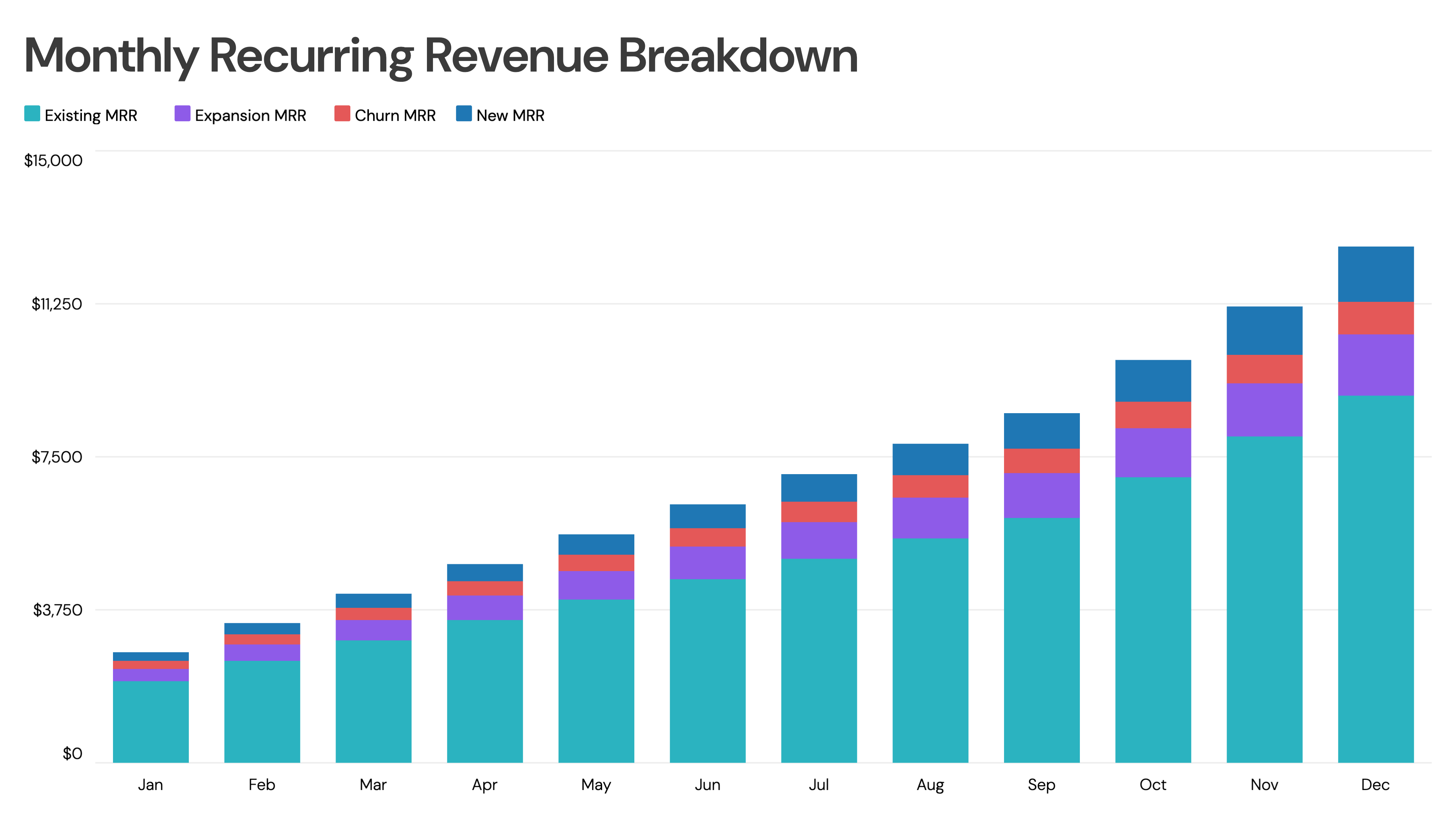
Stacked Bar Chart
Stacked bar charts (also called segmented bar charts) divide each bar into segments that represent different subcategories. Each segment's size shows its contribution to the total. This chart type is excellent for showing both individual values and their sum, making it easy to compare totals while understanding composition.
- Shows part-to-whole relationships within categories
- Compares totals and composition simultaneously
- Best for 2-4 subcategories per bar
- Ideal for budget breakdowns, revenue by segment, and survey results
When to Use
- Comparing the total across groups while also showing how each group is composed
- 2-4 subcategories that together make up a meaningful whole
- Budget, revenue, or demographic breakdowns over multiple categories
When Not to Use
- More than 4-5 subcategories — inner segments become impossible to compare
- When precise comparison of non-baseline segments is needed (use grouped bars)
- Negative values (stacked bars are visually misleading with negatives)

Grouped Bar Chart
Grouped bar charts place multiple bars side by side for each category, allowing direct comparison between groups. Unlike stacked bars, each value gets its own bar, making it easier to compare specific values across categories. This chart type is perfect when you need to compare multiple data series.
- Direct comparison between multiple data series
- Easy to see individual values
- Best for 2-4 groups per category
- Great for A/B comparisons, year-over-year data, and product comparisons
When to Use
- Comparing two or more series side-by-side for each category (e.g., this year vs. last year)
- When all individual values matter equally — no need to emphasize the total
- A/B testing results, product feature comparisons, or multi-region data
When Not to Use
- More than 4 groups per category — bars become too narrow to distinguish
- When showing totals or composition is the main goal (use stacked bars)
- More than 6-8 categories combined with multiple groups (very crowded)
Bar Chart Comparison Table: Which Type Should You Use?
Use this comparison to choose the right bar chart type for your data and presentation needs.
| Chart Type | Data Size | Best Use Case | Avoid When | Video Fit |
|---|---|---|---|---|
| Vertical Bar | 3-10 categories | Simple comparisons, sales data | Long labels or 10+ categories | Excellent - clean animation |
| Horizontal Bar | 5-20+ categories | Rankings, long labels | Time-series data | Excellent - easy to follow |
| Bar Race | 5-15 items over time | Time-series rankings, competitions | Static data, fewer than 3 time periods | Outstanding - highly engaging |
| Stacked Bar | 3-8 categories, 2-4 segments | Part-to-whole, composition | Negative values or 5+ segments | Good - shows build-up |
| Grouped Bar | 3-6 categories, 2-4 groups | Multi-series comparison | Totals are the main focus | Good - parallel animation |
Common Bar Chart Mistakes to Avoid
- Using too many categories (10+) in a vertical bar chart — consider horizontal bars instead
- Not starting the Y-axis at zero, which can exaggerate differences
- Using 3D effects that distort perception of bar heights
- Choosing colors that are too similar, making bars hard to distinguish
- Overcrowding with too many labels or data points
- Using bar charts for continuous data that would be better as a line chart
- Stacking more than 4 segments, making inner segments impossible to compare
- Ignoring bar race charts for time-series ranking data that would tell a more engaging story
Bar Chart Alternatives: When to Use Something Else
Bar Charts aren't always the best choice. Here are alternatives that may work better for certain data types.
Line Chart
When your data is continuous over time and the trend matters more than individual values, line charts connect data points to show momentum and direction better than bars.
Use instead when: Continuous time-series data where trends, peaks, and dips are the story
Pie / Donut Chart
When you need to emphasize part-to-whole relationships and have fewer than 7 categories, circular charts make proportions more intuitive than stacked bars.
Use instead when: Showing how a whole is divided among 3-7 categories
Scatter Plot
When you want to show the relationship or correlation between two continuous variables across many data points, scatter plots reveal patterns that bar charts cannot.
Use instead when: Exploring correlations, distributions, or outliers across two dimensions
Bar Chart Templates
Start with a professionally designed template and customize it with your data.
Bar Chart Examples
See how bar charts are used in real-world scenarios with these interactive examples.
Sales Bar Chart
Animated bar chart showing quarterly sales performance across product categories.
Revenue Comparison Chart
Compare revenue figures across different business units or time periods.
Data Distribution Chart
Visualize how data is distributed across different categories or ranges.
Profit vs Revenue Chart
Side-by-side comparison of profit and revenue metrics over time.
Explore More Chart Types
Looking for other chart types? Explore our guides on types of line charts, types of pie charts and more.
Create Your Animated Bar Chart Video
Transform your data into engaging animated bar chart videos. Choose a template, paste your data, and export in minutes. No design skills required.