Tech & SaaS Chart Examples
MRR, CAC vs LTV, user growth, feature usage, and website traffic charts built for SaaS companies and tech teams.
CAC vs LTV Chart
The most important unit economics chart for any SaaS business. This grouped bar chart puts Customer Acquisition Cost and Lifetime Value side by side, making it immediately clear whether your growth is profitable. Essential for investor decks, board updates, and quarterly business reviews.
Use this template →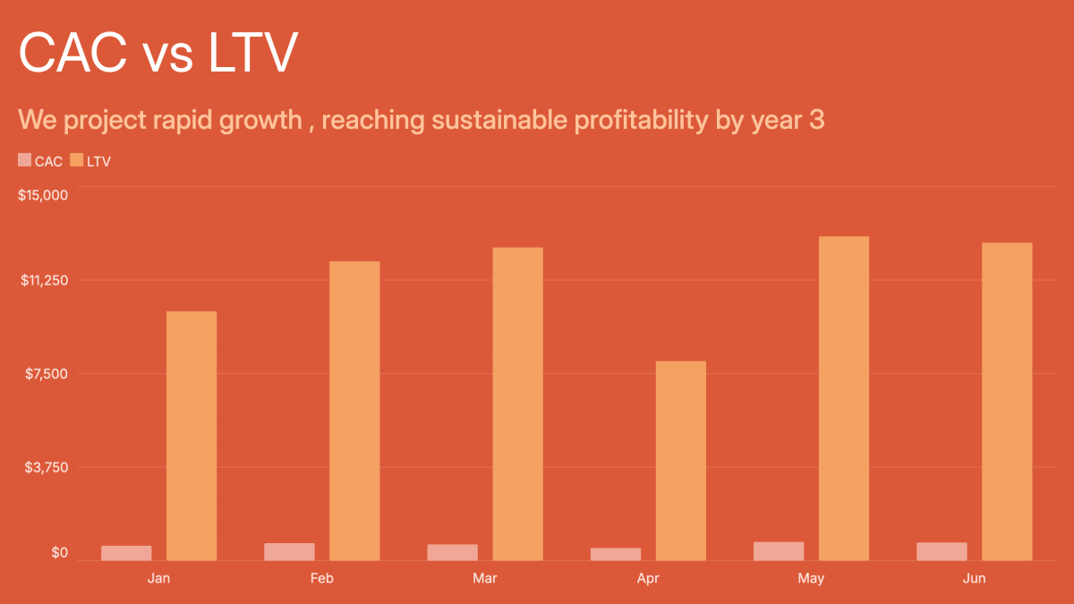
MRR Chart
Monthly Recurring Revenue is the pulse of any SaaS business. This line chart tracks MRR growth month by month, making growth rate and momentum immediately visible. Use it in investor updates, board presentations, or weekly team standups to keep everyone aligned on the number that matters most.
Use this template →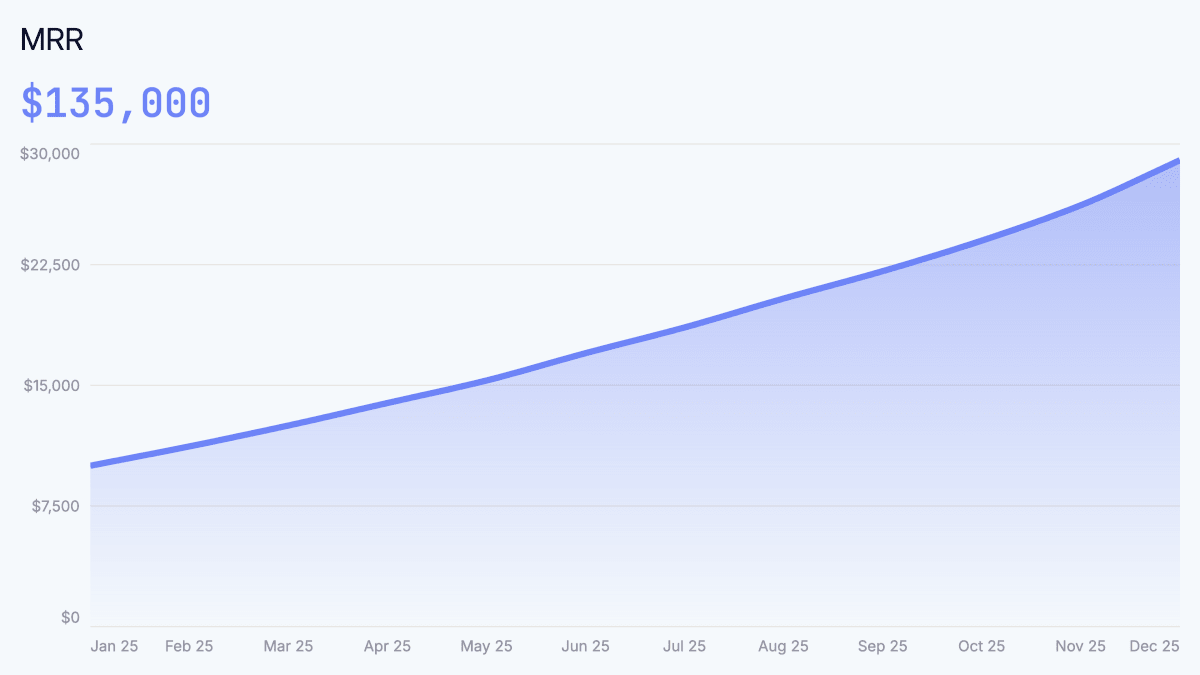
Revenue Distribution by Source
Know exactly where your revenue comes from. This bar chart breaks down total revenue by acquisition channel, making it easy to spot your best-performing sources, identify concentration risk, and make smarter decisions about where to invest in growth. A staple of any go-to-market review or investor deck.
Use this template →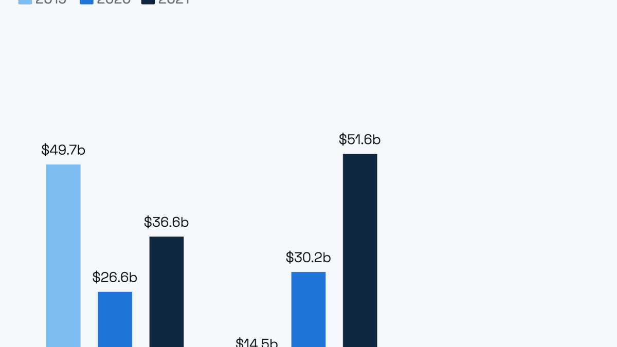
Website Traffic by Source Chart Template
Understand where your visitors come from at a glance. This treemap visualizes traffic channel mix — organic, paid, direct, social, referral — with block size proportional to volume. Great for marketing reviews, SEO reports, and growth presentations where you want to show channel contribution without getting lost in numbers.
Use this template →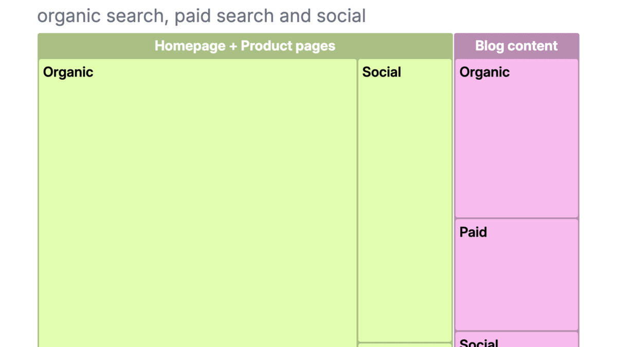
Monthly Recurring Revenue Breakdown
Go beyond headline MRR and see exactly where your growth comes from. This chart breaks MRR into new, expansion, and churned components — making it easy to spot whether growth is driven by acquisition, upsells, or is being eroded by churn. Essential for SaaS investor decks, board updates, and monthly business reviews.
Use this template →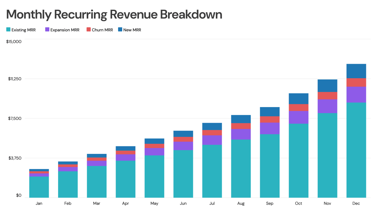
Feature Usage
See which features your users actually engage with — and how that changes over time. This line chart tracks feature adoption and usage trends, giving product teams clear signal on what's working, what's being ignored, and where to focus next. Use it in product reviews, roadmap discussions, and investor updates to demonstrate product engagement depth.
Use this template →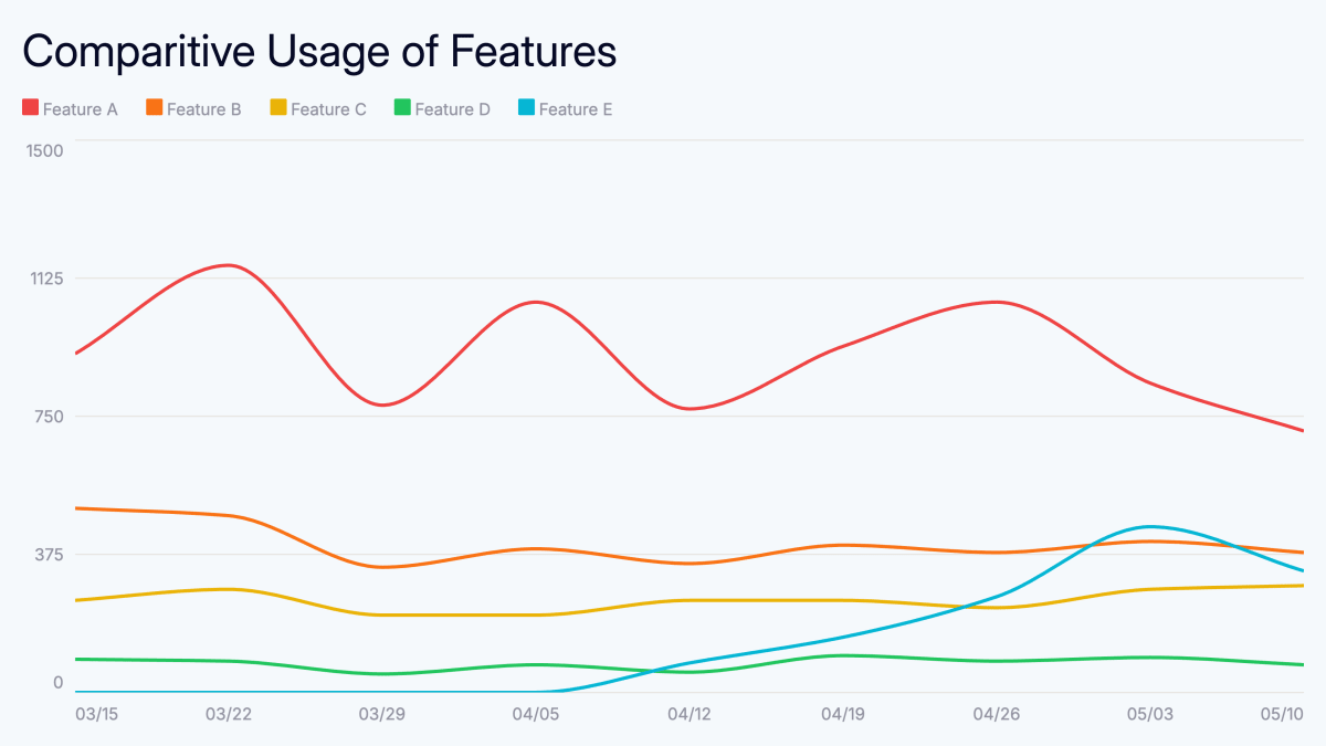
User Growth Chart
Track user acquisition and growth trends with this animated line chart. Perfect for startup metrics, investor updates, and product team dashboards.
Use this template →Data Distribution Chart
Analyze how data spreads across categories with this animated chart. Ideal for survey results, demographic analysis, and statistical presentations.
Use this template →