Mekko Chart Maker, Create Marimekko (100% Height) Charts Online for Free
A Marimekko chart encodes two variables at once: column width shows category size, and every column fills the full plot height, so stacked height shows the share breakdown within each column. Use AECharts to build Marimekko charts from your Excel or Google Sheets data for market landscape analysis, competitive positioning, and strategy presentations. Need column height to show actual totals instead of shares? Use the Bar Mekko chart maker instead, same variable-width columns, but height reflects real values on a shared scale.
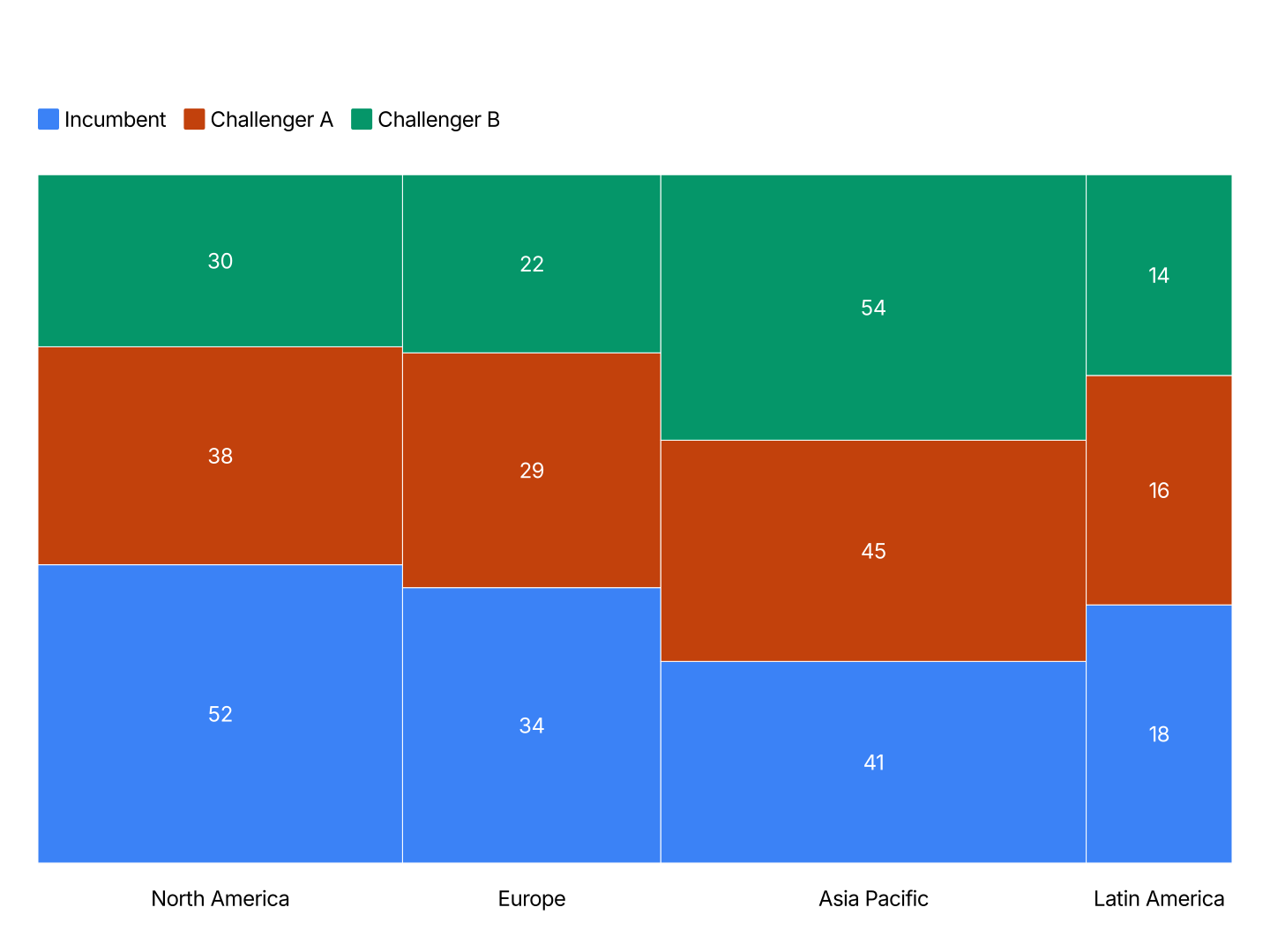
Mekko Chart Maker Features
- Two Dimensions, One Chart: Column width encodes market or revenue size. Stacked heights encode segment share. A single chart communicates what usually takes two charts plus a table.
- Automatic Width Scaling: AECharts calculates column widths proportionally to your size values. No manual pixel sizing. Change a market size value and the chart redraws instantly.
- Export Straight to PowerPoint: Export and drop it directly into PowerPoint, Google Slides, or reports.
- Consistent Segment Colors: Each segment keeps the same color across all columns. Audiences can track a segment through the full market landscape without reading labels at every bar.
- Real-time Preview: See every change instantly. What you see in the editor is exactly what exports.
- No Design Skills Needed: Templates are professionally designed. Import your data, adjust colors if needed, and export. Most users are done in under two minutes.
When to Use a Mekko Chart
Mekko charts work best when both the size and the composition of categories matter, when a stacked bar chart would miss the fact that some markets are much larger than others.
- Market Landscape: Column width = total market size per segment. Stacked height = market share by competitor. One chart shows where the large markets are and who dominates them.
- Revenue by Customer Segment: Column width = total revenue per product. Stacked height = share by customer size (enterprise, mid-market, SMB). Reveals where revenue is concentrated and how exposure varies by product.
- Portfolio Analysis: Column width = category spend. Stacked height = vendor share. Procurement teams use this to find consolidation opportunities across a complex supplier landscape.
- Channel Mix: Column width = total sales per region. Stacked height = channel share (direct, partner, online). Compare how channel strategy differs across markets.
- Competitive Positioning: Column width = segment size. Stacked height = share of wallet. Used in strategy consulting to surface where a client is strong, weak, and where white space exists.
- Budget Allocation: Column width = total budget per function. Stacked height = sub-category share. Finance teams use this to visualize how resource allocation compares across departments.
Mekko Chart vs Stacked Bar Chart: Which Should You Use?
Both show segment breakdown, but Mekko charts also show size.
Mekko Chart
- Best for: Market analysis where both the size of each market and the share within it matter.
- Strength: Encodes three variables in one chart: column size, segment share, and segment identity. Standard in consulting and strategy decks.
- Use when: Market landscape, competitive positioning, portfolio analysis, channel mix by region.
Stacked Bar Chart
- Best for: Showing part-to-whole breakdown across categories when all categories are comparable in scale.
- Strength: Cleaner and easier to read. Better when the audience does not need to account for differences in category size.
- Use when: Revenue mix, budget allocation, survey results, when columns represent comparable totals.
If the columns in your stacked bar chart all have the same total, use a stacked bar. If the column totals differ significantly and that difference is part of the story, use a Mekko chart.
How to Create a Mekko Chart
Select the Mekko chart type. Open the AECharts editor and select Mekko Chart from the chart type picker. If you want a different visual style, browse the template explorer on the right panel and click any template to apply it instantly.
Enter your data. Click "Edit Data" in the top-right corner to open the spreadsheet. Put your category names in the first column. Each row becomes one stacked column in the chart. Add values in the columns to the right. Each additional column becomes a segment stacked within each category. AECharts calculates column widths and stacked heights automatically. Import directly from Excel or Google Sheets, or upload a CSV or Excel file.
Adjust styling. Use the top menu bar to customize the look. Set a color for each segment so they stay consistent across all columns. Adjust stroke color and stroke width on the bars, plus the usual label, tick, axis, and grid options, font, size, and color. Every change previews instantly.
Export. When you're ready, export and drop the chart straight into PowerPoint or Google Slides, or save it as an image for reports.