Half Donut Chart Maker, Create Semicircle Donut Charts Online for Free
Paste your data, pick a template, and export and use in PowerPoint or Google Slides. Built for KPI dashboards, goal attainment, portfolio splits, and any time you need a proportional arc with a headline metric in the center. Free to start.
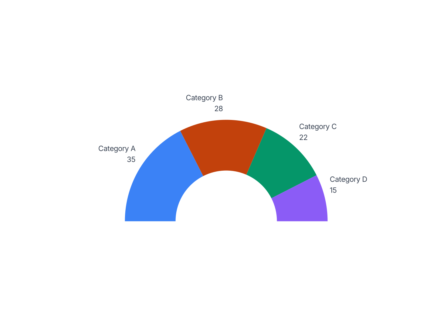
When to Use a Half Donut Chart
Half donut charts work best when you have 2–3 proportional categories and one key metric worth anchoring in the center of the arc.
- Goal & Quota Attainment: Sales at 84% of target. A filled arc sweeping to 84° with the percentage in the center is more immediate than a progress bar, and more polished than a number in text.
- Dashboard KPI Card: A single metric, NPS, retention rate, utilization, as a half arc with the value centered below. Fits cleanly in a card-style dashboard panel without competing with surrounding content.
- Portfolio Allocation: Two or three asset classes across the arc, equities, bonds, alternatives, with total AUM in the center. The flat baseline makes it natural in a two-column fund report.
- Budget Split: Marketing, headcount, and infrastructure across the arc, with total spend in the center. Compact enough to sit alongside a data table in a quarterly review deck.
- Survey Sentiment: Positive, neutral, and negative response rates as three arc segments. The center shows total respondents or the headline agree percentage at a glance.
- Market Share: Your share vs competitors across the semicircle, your percentage in the center. The arc format reads like a speedometer, making the dominant position feel authoritative.
Half Donut vs Full Donut vs Gauge Chart
Three ring-style charts, each suited to a different kind of data.
Half Donut Chart
- Best for: 2–3 proportional categories with a center metric, in a compact horizontal format.
- Strength: Flat baseline anchors visually in dashboards and two-column layouts. Center space below the arc is natural for a headline number.
- Use when: KPI cards, goal completion, portfolio splits, or dashboard panels.
Full Donut Chart
- Best for: 2–5 categories with a center metric, where the full-circle format is preferred.
- Strength: More segment capacity than a half donut, up to 5 readable slices. Center accommodates larger text.
- Use when: Revenue by segment, budget allocation, or any 3–5 category split where total context matters.
Gauge Chart
- Best for: A single value on a defined scale, progress toward a target or a score out of 100.
- Strength: Needle or filled arc makes the position on a scale immediately readable. No categories needed.
- Use when: NPS score, completion rate, satisfaction index, one number on a defined range.
AECharts supports all three. Switch between half donut, full donut, and gauge to match your data and layout.
How to Create a Half Donut Chart
Choose a template. Browse half donut chart templates and pick one that matches your style.
Paste your data. Copy from Excel or Google Sheets. One row per category with a value, AECharts builds the arc segments automatically.
Customize colors and style. Assign a color to each segment, set the center label, and match your brand. Adjust ring thickness and background.
Export. Export and drop it directly into PowerPoint, Google Slides, or reports.