Grouped Bar Chart Maker, Create Grouped Bar Charts Online for Free
Paste your data, pick a template, and export and use in PowerPoint or Google Slides. Built for financial comparisons, regional breakdowns, survey results, any time you need multiple data series side by side. Free to start.
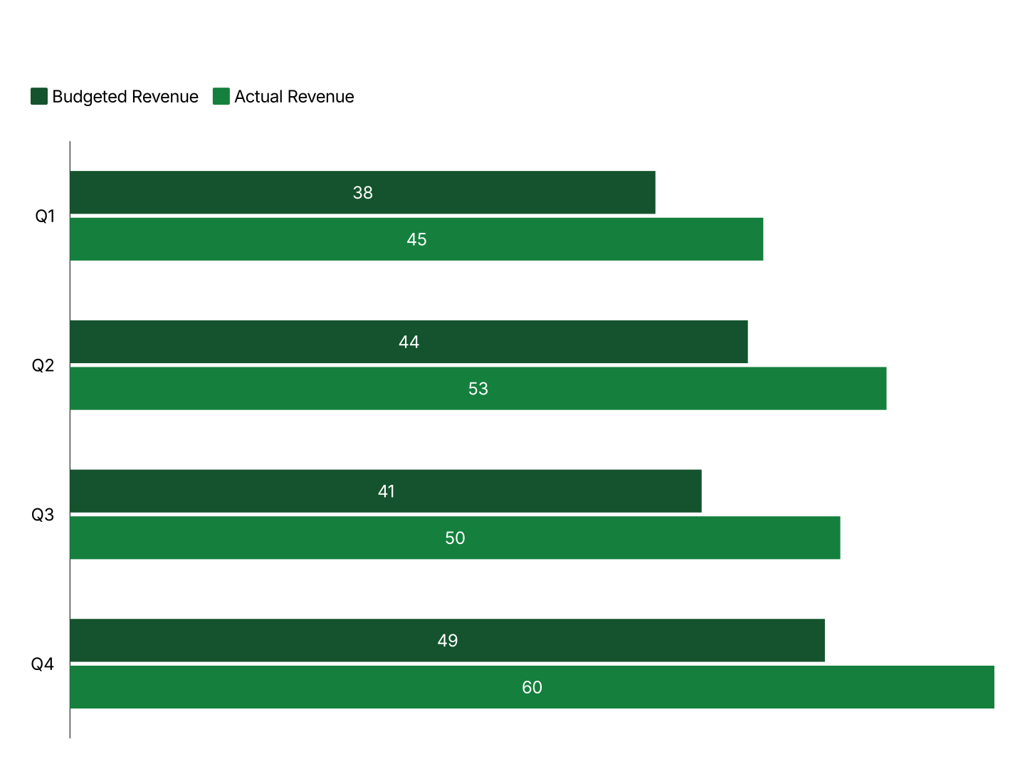
Everything You Need to Create Grouped Bar Charts
- Easy Data Import: Paste directly from Excel or Google Sheets. One column per group, AECharts builds the chart automatically. No reformatting needed.
- Multiple Data Series: Compare 2, 3, or 4 groups side by side within each category. Each series gets its own color and legend entry.
- Custom Colors & Fonts: Assign distinct colors to each group and match your brand palette. Adjust fonts, backgrounds, and label styles.
- Grouped & Stacked Modes: Switch between grouped (side by side) and stacked with one click. Find the right view for your data instantly.
- Export Straight to PowerPoint: Export and drop it directly into PowerPoint, Google Slides, or reports.
- Real-time Preview: See every change instantly. What you see in the editor is exactly what exports.
When to Use a Grouped Bar Chart
Grouped bar charts are best when you need to compare individual values across multiple series, not totals, but the numbers side by side.
- Sales vs Costs vs Revenue: Compare three financial metrics across quarters or years. Each cluster shows the full picture for one period.
- Regional Comparison: Show performance across North, South, East, West side by side. Spot which regions are ahead and by how much.
- Year-over-Year: This year vs last year across categories. The side-by-side layout makes growth or decline impossible to miss.
- Budget vs Actual: Two bars per category, planned vs actual. Immediately shows where you're over or under budget.
- Survey Results by Segment: Compare how different demographics answered each question. Grouped bars let you read exact values for each group.
- Product Comparison: Compare metrics across products or SKUs, revenue, units sold, margin. Side-by-side bars make the winner obvious.
Grouped vs Stacked Bar Chart
Both show multiple data series, but they answer different questions.
Grouped Bar Chart
- Best for: Comparing individual values, is Sales higher in Q1 or Q3?
- Strength: Precise comparisons, readers gauge exact differences without mental arithmetic.
- Use when: Financial analysis, performance reviews, before/after data.
Stacked Bar Chart
- Best for: Showing totals and composition, what's the total, and how does it break down?
- Strength: Part-to-whole relationships, size of each segment and the total in one glance.
- Use when: Revenue by product line, budget by department, demographic breakdowns.
AECharts supports both modes. Switch between grouped and stacked with one click.
How to Create a Grouped Bar Chart
Choose a template. Browse bar chart templates and pick one that matches your style. Every template supports multiple data series.
Paste your data. Copy from Excel or Google Sheets and paste it in. One column per group. AECharts builds the grouped chart automatically.
Customize colors and style. Assign a color to each group, adjust fonts, and match your brand. Switch between grouped and stacked with one click.
Export. Export and drop it directly into PowerPoint, Google Slides, or reports.