Concentric Circle Chart Maker, Create Onion Diagrams Online for Free
Visualize nested hierarchies, TAM/SAM/SOM, population layers, market hierarchies. Paste your data, customize colors, and export and use in PowerPoint or Google Slides. Free to start.
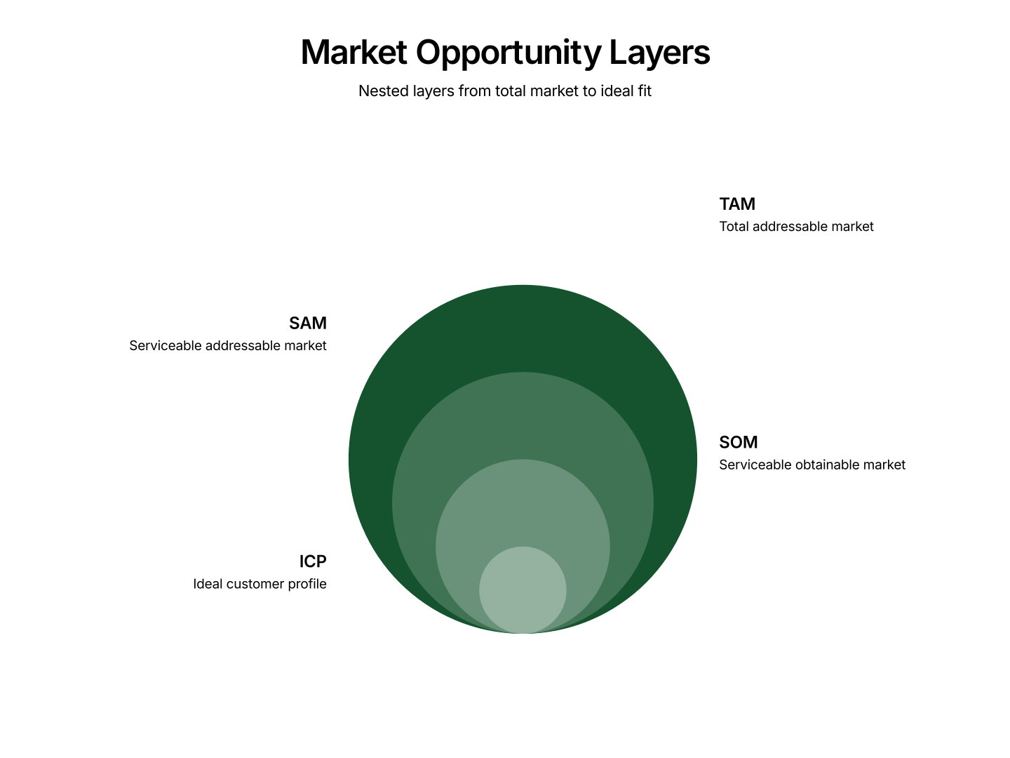
Everything You Need to Build Concentric Circle Charts
- Automatic Scaling: Enter your values and AECharts sizes each ring proportionally. No manual math, just paste your data.
- Custom Ring Colors: Each ring has its own fill color. Use a monochromatic palette or distinct colors per category to match your brand.
- Export Straight to PowerPoint: Export and drop it directly into PowerPoint, Google Slides, or reports.
- Value Labels: Display formatted values inside each ring with prefix/suffix support: $44B, 2.4M users, 68%. Full control over font and size.
- Automatic Layout: Rings are sized and spaced automatically based on your values, so the hierarchy reads clearly without manual adjustment.
- No Design Skills Needed: Templates handle layout, sizing, and spacing automatically. Paste your data and export, most users finish in under a minute.
When to Use a Concentric Circle Chart
Concentric circle charts work best when each value is a subset of the one outside it, or when you want to show the relative scale of multiple independent numbers side by side.
- TAM / SAM / SOM: The classic use case. Total addressable market wraps around serviceable addressable market, which wraps around serviceable obtainable market. The nested structure makes the hierarchy self-evident.
- Market Size Comparisons: Show your market vs. a competitor, or your product category vs. the industry. The difference in ring size conveys scale without needing a bar chart axis.
- Population Layers: Total users to active users to paying users to power users. Each inner ring is a subset of the outer. The visual makes retention and conversion immediately obvious.
- Funding Milestones: Seed, Series A, Series B, current valuation. Show how funding rounds stack inside the total company value to date.
- Revenue vs. Industry: Your revenue inside your segment, inside the broader category, inside the total industry. Useful for investor updates and competitive positioning slides.
- Hierarchical Budgets: Total budget, department budget, team budget, project allocation. Concentric rings show the chain without a complex tree diagram.
Concentric Circle Chart vs Pie Chart vs Bubble Chart
Three circular chart types, each suited to different data.
Concentric Circle
- Best for: Nested subsets, TAM/SAM/SOM, population layers, hierarchical budgets.
- Strength: Shows "this number lives inside that number" without requiring values to sum to 100%.
- Use when: You have 3–5 values in a clear hierarchy.
Pie Chart
- Best for: Part-of-whole breakdowns where all slices sum to 100%.
- Strength: Familiar format. Good for 3–6 categories that partition a total.
- Use when: Budget allocation, survey results, market share among known competitors.
Bubble Chart
- Best for: Three-variable data, X axis, Y axis, and bubble size.
- Strength: Encodes more dimensions per data point. Good for scatter-style analysis.
- Use when: Comparing entities on two metrics while also showing their scale.
How to Create a Concentric Circle Chart
Open the editor. Click 'Start Creating' to open AECharts with a concentric circle template ready to go.
Enter your data. Add your labels and values, one row per ring. AECharts scales circles from largest (outermost) to smallest (innermost) automatically.
Customize colors and style. Assign a fill color to each ring. Adjust fonts and background to match your brand.
Export. Export and drop it directly into PowerPoint, Google Slides, or reports.