Area Chart Maker
An area chart shades the region under a line to show a trend's magnitude, not just its direction. It's the right choice for a single time series, traffic, revenue, usage, where you want the audience to feel the scale of the number, not just read its slope.
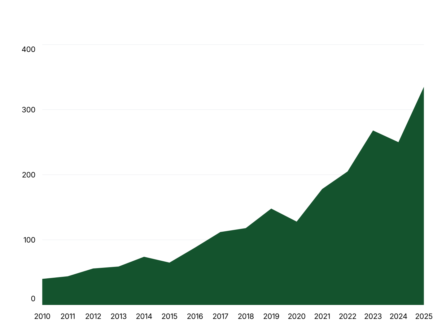
Area Chart Features
- Shaded Fill: The area under the line is shaded by default, using the same color as the line unless you override it per series.
- Smooth or Straight Lines: Toggle spline smoothing on or off. The fill follows whichever curve style you choose for the line.
- Easy Data Import: Import from Excel or Google Sheets. First column is your X-axis; each additional column becomes a shaded series.
- Custom Colors & Fonts: Set fill and line colors per series to match your brand palette. Adjust fonts, backgrounds, and axis label styles.
- Export Straight to PowerPoint: Export ready for PowerPoint or Google Slides. Every chart drops directly into PowerPoint and Google Slides.
- Real-time Preview: See every change instantly. What you see in the editor is exactly what exports.
When to Use an Area Chart
Area charts work best with one or two series where magnitude is part of the message. For three or more overlapping series, a stacked area chart or a plain line chart usually reads more clearly.
- Website Traffic Over Time: One shaded series showing daily or monthly visitors. The fill makes traffic growth feel substantial in a slide, not just a thin upward line.
- Monthly Recurring Revenue: Track MRR growth month over month. The shaded area reinforces cumulative scale alongside the growth trend.
- Cumulative Growth: Running totals, cumulative sign-ups, cumulative fundraising, cumulative units shipped. The area fill visually represents the running total building up.
- App Usage or Engagement: Daily active users or session counts over weeks or months. Area emphasizes the scale of engagement, not just whether it's trending up.
- Inventory or Stock Levels: Track a quantity that rises and falls over time. The filled area makes it easy to see periods of surplus versus depletion at a glance.
- Fundraising Progress: Track capital raised against a goal over time. A single shaded area communicates progress toward a target more viscerally than a line alone.
Area Chart vs Line Chart vs Stacked Area Chart
All three plot values over a continuous axis, but each fits a different number of series and a different message.
Area Chart
- Best for: One or two series where magnitude matters alongside trend.
- Strength: The shaded fill makes a single trend feel substantial.
- Use when: Traffic, MRR, cumulative growth, single-metric tracking.
Line Chart
- Best for: Comparing several series' trends precisely.
- Strength: No fill means no visual overlap, even with many series.
- Use when: Comparing multiple metrics or entities over time.
Stacked Area Chart
- Best for: Showing how several series sum to a changing total.
- Strength: Fills stack instead of overlapping, so both total and composition are visible.
- Use when: Traffic by channel, revenue by segment, usage by platform.
AECharts supports all three. Switch chart types without re-entering data to find the right format for your story.
How to Create an Area Chart
Select the area chart type. Open the AECharts editor and select Area Chart from the chart type picker. Browse the template explorer on the right panel to apply a visual style instantly.
Enter your data. Click "Edit Data" in the top-right corner. The first column is your X-axis, a date, category, or number. Each additional column is one series, shaded independently. Import directly from Excel or Google Sheets, or upload a CSV or Excel file.
Adjust styling. Use the top menu bar to set fill and line colors per series, toggle smooth curves, and adjust fill opacity. All label, axis, and grid options are available. Every change previews instantly.
Export. Export ready for PowerPoint or Google Slides. Every chart drops directly into PowerPoint and Google Slides.