100% Stacked Bar Chart Maker
A 100% stacked bar chart normalizes every horizontal bar to the same length so the audience sees proportion, not scale. Segments show each category's share of the total as a percentage. It is the right chart when you're comparing composition across categories with very different totals, or when long category labels rule out a vertical layout.
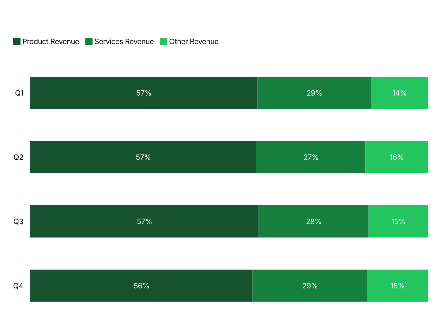
100% Stacked Bar Chart Features
- Horizontal Layout: Bars run left to right. Category labels sit on the vertical axis with room to breathe, no rotation, no truncation, even with long names.
- Automatic Rescaling: Paste raw numbers. AECharts rescales every bar to 100% and calculates each segment's share automatically.
- One-Click Mode Switch: Toggle between standard stacked (absolute totals) and 100% stacked (proportion only) without re-entering data.
- Percentage Labels by Default: Segment labels default to percentages so the chart reads correctly without a separate legend lookup.
- Consistent Segment Colors: Each segment keeps the same color across all bars, so audiences can track a segment's share across categories.
- Export Straight to PowerPoint: Export ready for PowerPoint or Google Slides. Every chart drops directly into PowerPoint and Google Slides.
When to Use a 100% Stacked Bar Chart
Use a 100% stacked bar chart when categories differ widely in total size and the story is about composition, not scale. The horizontal layout also handles long category labels better than a vertical chart.
- Market Share by Region: Each bar = one region, sized very differently by total revenue. Normalizing to 100% lets you compare competitor share fairly across a small region and a large one.
- Survey Response Mix by Group: Each bar = one respondent group with a different sample size. Segments = response options. 100% stacking removes sample-size differences so only sentiment mix is compared.
- Revenue Channel Mix by Country: Each bar = one country. Segments = channels. Countries vary widely in total revenue, 100% stacking isolates the channel mix question from the size question.
- Budget Allocation by Department: Each bar = one department with a different total budget. Segments = spending categories. Shows how each department allocates its budget, independent of department size.
- Headcount Composition by Office: Each bar = one office, some much larger than others. Segments = functions. 100% stacking makes the functional mix comparable across a 5-person office and a 200-person office.
- Customer Tier Mix by Segment: Each bar = one customer segment or industry. Segments = plan tiers. Shows which segments skew toward higher-value tiers, regardless of how many total customers each segment has.
100% Stacked Bar vs Segmented Bar vs 100% Stacked Column
All three normalize or stack composition, but each fits a different situation.
100% Stacked Bar (horizontal)
- Best for: Comparing composition across categories with long labels or very different totals.
- Strength: Labels have room to breathe; normalization removes scale differences.
- Use when: Market share by region, response mix by group, budget allocation by department.
Segmented Bar Chart
- Best for: Showing totals and composition together, horizontally.
- Strength: Bar length carries real information, total size is visible alongside mix.
- Use when: Revenue by country, headcount by department, ranked composition.
100% Stacked Column
- Best for: The same proportion story, but when the axis is time and labels are short.
- Strength: Vertical layout reads naturally for time series.
- Use when: Market share over time, channel mix by quarter.
AECharts supports all three. Switch between horizontal and vertical, and between standard and 100% stacked, without re-entering data.
How to Create a 100% Stacked Bar Chart
Select the 100% stacked bar chart type. Open the AECharts editor, it loads directly into the horizontal 100% stacked mode. Browse the template explorer on the right panel to apply a visual style instantly.
Enter your data. Click "Edit Data" in the top-right corner. The first column holds your category names, each row becomes one horizontal bar. Additional columns are your segments, enter raw values, AECharts converts each bar to percentages automatically. Import directly from Excel or Google Sheets, or upload a CSV or Excel file.
Adjust styling. Use the top menu bar to assign a color to each segment. Adjust bar height, stroke color, and stroke width. Switch back to standard stacked mode with one click if you need absolute totals instead. Every change previews instantly.
Export. Export ready for PowerPoint or Google Slides. Every chart drops directly into PowerPoint and Google Slides.