Waterfall Chart Maker, Create Waterfall Charts Online for Free
Built for P&L statements, cash flow analysis, budget bridges, and any time you need to show how components add up to a total. Free to start.
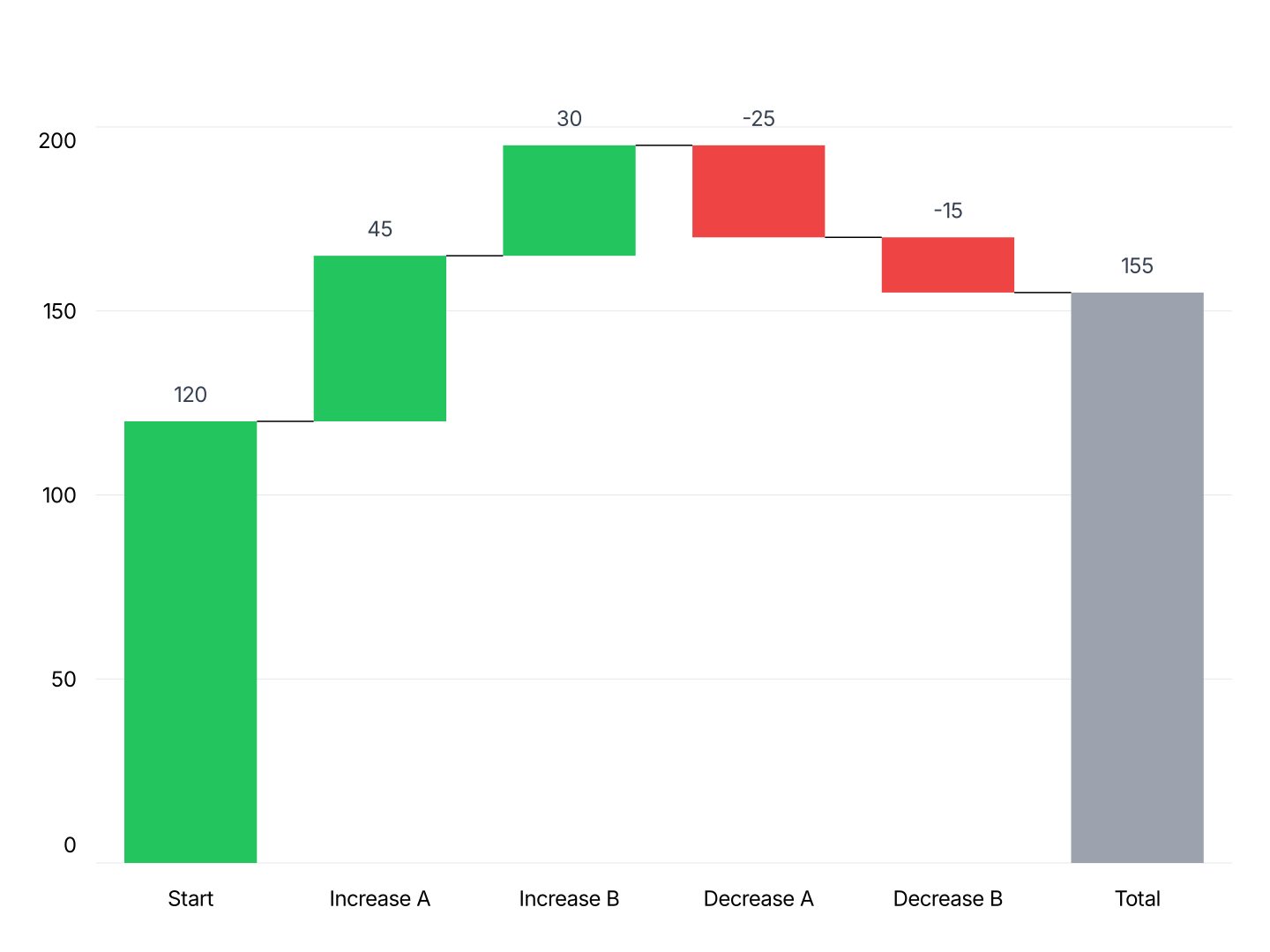
When to Use a Waterfall Chart
Waterfall charts work best when you need to explain how you got from one number to another, what drove the change, and by how much.
- P&L Bridge: Start with gross revenue, subtract COGS, operating expenses, and taxes to arrive at net profit. Each line item becomes a visible component.
- Cash Flow Analysis: Show operating cash inflows and outflows, investment activity, and financing to explain the change in cash position.
- Budget Variance: Show the gap between budget and actual by component, which categories came in under, which went over, and the net impact.
- Revenue Bridge: Explain the change in revenue from one period to the next: new customers, expansion, churn, price changes, each as a separate bar.
- Headcount Change: Starting headcount, hires, attrition, and ending headcount. A waterfall makes workforce changes transparent at a glance.
- Cost Breakdown: Decompose a total cost into components, materials, labor, overhead, margin, so stakeholders understand where money goes.
Native Chart Support: PowerPoint vs Google Slides
Both have some form of native charting. Neither handles waterfall charts well.
- Waterfall chart in PowerPoint: Can't connect bars automatically, connector lines between them aren't built in. Can't stack multiple categories in one waterfall. Can't set a bar as a subtotal or total without clicking into each bar individually. Can't hold up to a data change, it doesn't understand subtotal logic, so adding or editing a line item usually means rebuilding the chart.
- Waterfall chart in Google Slides: Can't make a waterfall chart at all, it's not one of Sheets' native chart types, and Slides charts are built from Sheets. Can't preview style changes on the slide, edits happen in Sheets, then get re-imported. Can't resize cleanly on the slide, charts stretch and distort, and fixing it means going back to Sheets and re-linking. See the full walkthrough at /waterfall-chart-google-slides.
Waterfall Chart vs Bar Chart
Both use vertical bars, but they answer different questions.
Waterfall Chart
- Best for: Decomposition, showing how a total is built up or broken down step by step.
- Strength: Makes cumulative effects visible, audiences immediately see which components contribute most and in which direction.
- Use when: Explaining a P&L, budget bridge, cash flow, or variance analysis.
Bar Chart
- Best for: Comparison, showing independent values side by side.
- Strength: Simple and widely understood, every bar starts at zero, making absolute values easy to compare.
- Use when: Comparing revenue by region, product, or time period where values are independent.
AECharts supports both. Switch between waterfall and bar to find the right format for your data.
How to Create a Waterfall Chart
Choose a template. Browse waterfall chart templates and pick one that matches your style.
Paste your data. Copy from Excel or Google Sheets. One row per component with a positive or negative value. AECharts builds the stacked bars automatically.
Customize colors and style. Set colors for gains, losses, and totals. Match your brand or use a built-in theme.
Export. Export and drop it directly into PowerPoint, Google Slides, or reports.