Waffle Chart Maker, Create Waffle Charts Online for Free
Built for decks and reports, from market share to survey results, goal completion, and any time a single percentage deserves a proper visual. Paste your data, pick a template, and export as an image to drop into PowerPoint or Google Slides. Free to start.
What Is a Waffle Chart?
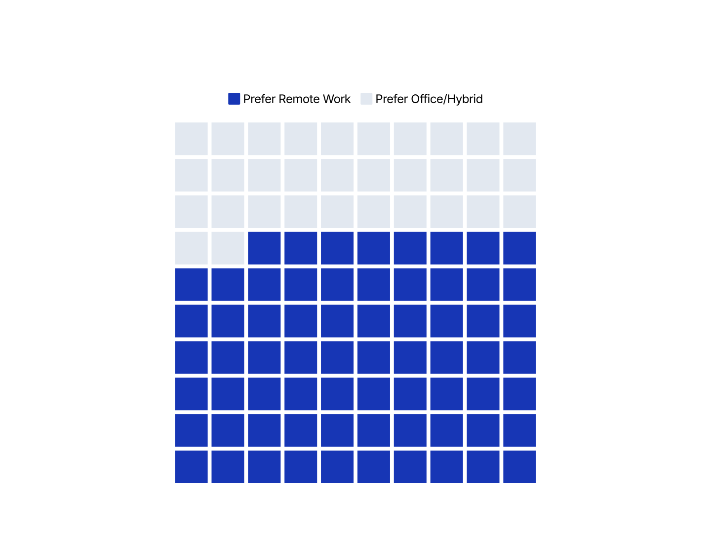
A waffle chart is a 10×10 grid of 100 cells used to show percentages and part-to-whole data. Each cell represents 1% of a total, so a value of 72% fills 72 of the 100 cells. It works best for one number or a simple 2–3 category split. The grid makes the proportion immediately countable, without asking the reader to estimate an angle or read a label.
When to Use a Waffle Chart
Waffle charts work best when you have one number worth visualizing, such as a percentage, a share, or a completion rate.
- Market Share: 72 cells vs 28 cells. The dominant position is immediately obvious, more impactful than a pie slice or a percentage in text.
- Survey Results: “68% of respondents agree.” A waffle chart makes a single survey stat stand on its own as a visual in a report or slide.
- Goal & Quota Attainment: Sales at 84% of target. The unfilled cells show the gap clearly, more intuitive than a progress bar for a single KPI.
- Conversion Rate: Show what percentage of visitors, leads, or trials converted. The grid makes the ratio tangible.
- Budget Used: What share of the budget has been spent. Useful in financial updates and board decks where simplicity matters.
- Completion Rate: Project, onboarding, or survey completion. A waffle chart communicates the number without needing a label.
What Data You Need
- Categories: One column with category names. Two to three is ideal. Four starts to look cluttered.
- Values: One column with numeric values. They don't need to add up to 100. AECharts normalizes them automatically.
Waffle Chart vs Pie Chart: Which Should You Use?
Both show part-to-whole data, but they have different strengths.
Waffle Chart
- Best for: 1–3 categories, especially single percentages or binary splits.
- Strength: Cells are easy to count. Readers perceive the proportion instantly without estimating angles.
- Use when: Infographics, dashboards, KPI cards, survey callouts.
Pie Chart
- Best for: 3–6 categories where the circular format aids recognition.
- Strength: Familiar and compact. Works well in tight spaces alongside other charts.
- Use when: Budget breakdowns, portfolio allocation, category splits with more than two items.
AECharts supports both. Switch between waffle and pie to find the right format for your data.
How to Create a Waffle Chart
Select Chart Type. Choose Waffle Chart from AECharts' chart type gallery, or click "Create Waffle Chart" above to jump straight into the editor with it already set up.
Enter your data. Paste from Excel or Google Sheets, upload a CSV or Excel file, or connect a Google Sheet directly. One row per category with a value. AECharts builds the grid automatically.
Customize colors and style. Assign a color to each category, add percentage or category labels, position the legend, and adjust fonts and background to match your brand.
Export. Export as PNG, JPG, or PNG with a transparent background, and drop it directly into PowerPoint, Google Slides, or a report.