Treemap Maker, Create Treemaps Online for Free
Built for budget breakdowns, revenue by segment, portfolio composition, and any time you need to show proportions across a two-level hierarchy. Free to start.
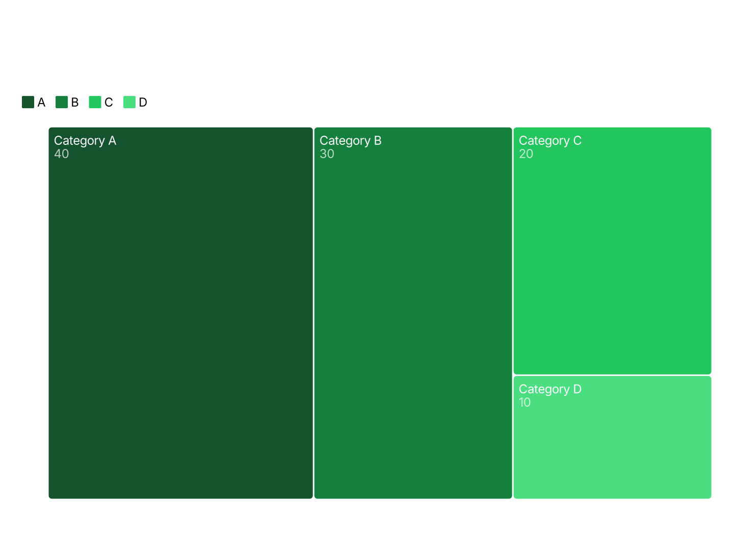
Everything You Need to Create Treemap Charts
- Easy Data Input: Paste from Excel or Google Sheets. Three columns: category, label, value. AECharts computes rectangle sizes and arranges the layout automatically.
- Two-Level Hierarchy: Group items into color-coded categories. Each group gets its own region on the chart, with items sized by value inside.
- Export Straight to PowerPoint: Export and drop it directly into PowerPoint, Google Slides, or reports.
- Custom Colors: Each category group gets its own color, fully customizable. Match your brand palette or use a built-in color scheme.
- Real-time Preview: See every change instantly. What you see in the editor is exactly what exports.
- No Design Skills Needed: Templates are professionally designed. Paste your data, adjust colors, and export, most users are done in under a minute.
When to Use a Treemap
Treemaps work best when you have many items across a few groups and want to show both the group totals and the individual item sizes at the same time.
- Budget Breakdown: Show department budgets and their line items. The rectangle size makes overspend or underspend immediately obvious without a table.
- Revenue by Segment: Group revenue by region or business unit, with individual products or accounts inside. Lets leadership see the full picture in one view.
- Portfolio Composition: Show asset allocation by category (equities, bonds, alternatives) and individual holdings. Proportions are instantly readable.
- Market Share by Sector: Visualize industry sectors and the companies within them sized by market cap or revenue. Works well in investor presentations.
- Product Sales Mix: Group products by category and size them by units sold or revenue. Spots top performers and underperformers at a glance.
- Expense Breakdown: Show where money is going across departments and line items. More scannable than a table in a board deck or QBR.
Treemap vs Pie Chart vs Bar Chart
Each chart type has a sweet spot. Here's how to choose.
Treemap
- Best for: Many items across a few groups where size conveys meaning.
- Strength: Shows hierarchy and proportion in a single view, no need for two separate charts.
- Use when: Budget reviews, portfolio breakdowns, revenue by product line.
Pie Chart
- Best for: 3–6 top-level categories with no sub-items.
- Strength: Familiar and compact, everyone knows how to read a pie chart.
- Use when: Simple splits with few categories and no drill-down needed.
Bar Chart
- Best for: Comparing exact values across many categories.
- Strength: Precise, bar length is easier to compare than rectangle area.
- Use when: Ranking items or showing changes over time.
AECharts supports all three. Switch between chart types to find the right format for your data.
How to Create a Treemap Chart
Choose a template. Browse treemap chart templates and pick one that matches your style.
Paste your data. Copy from Excel or Google Sheets. Three columns: category, label, and value. AECharts builds the treemap automatically.
Customize colors and style. Assign a color to each category group and match your brand. Adjust fonts and background.
Export. Export and drop it directly into PowerPoint, Google Slides, or reports.