Dumbbell Chart
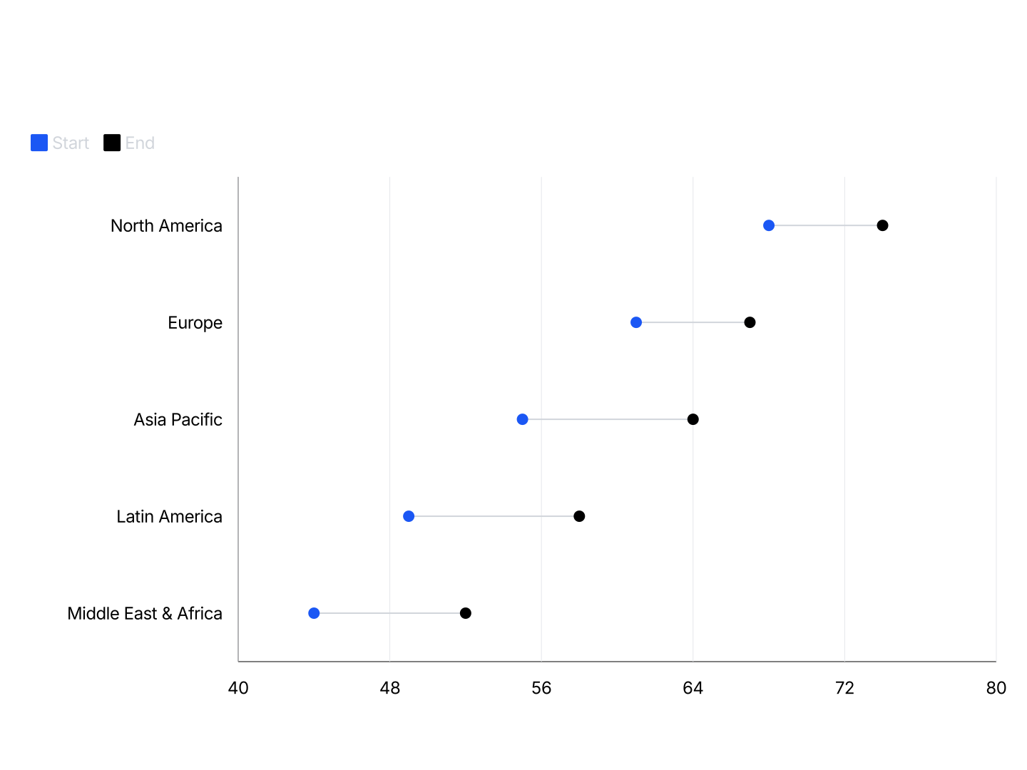
A dumbbell chart, also called a dumbbell plot, connected dot plot, range plot, or barbell chart, shows two values per category connected by a horizontal line. The dots mark the two endpoints and the line makes the gap between them immediately visible. Use AECharts to build dumbbell charts from your Excel or Google Sheets data for before/after comparisons, target vs actual analysis, and year-over-year performance.
Dumbbell Chart Maker Features
- Easy Data Import: Import from Excel or Google Sheets. Three columns: category, first value, second value. AECharts builds the connected dot chart automatically.
- Custom Colors per Endpoint: Each endpoint dot gets its own color. Use contrasting colors to make the gap immediately visible.
- Export Straight to PowerPoint: Export and drop it directly into PowerPoint, Google Slides, or reports.
- Labels & Values: Show exact values next to each dot. Control number formatting, prefix, suffix, and label position from the editor.
- Real-time Preview: See every change instantly. What you see in the editor is exactly what exports.
- No Design Skills Needed: Templates are professionally designed. Import your data, adjust colors, and export. Most users are done in under a minute.
When to Use a Dumbbell Chart
Dumbbell charts work best when you have exactly two values per category and the gap between them is the story.
- Before vs After: Show the impact of a change, revenue before and after a product launch, churn before and after a retention campaign, NPS before and after a redesign.
- Target vs Actual: Quota vs closed deals by rep. Budget vs actual spend by department. OKR target vs current result by team. The gap tells the story.
- Year-over-Year Comparison: Revenue, headcount, or key metrics this year vs last year across multiple segments, regions, or product lines in a single clean chart.
- Plan vs Result: Forecast vs actual at the end of the quarter. Show where you outperformed and where you missed across multiple lines of business.
- Competitive Benchmarking: Your metric vs industry average across categories: NPS, gross margin, CAC, churn. Each category gets a dot for you and a dot for the benchmark.
- Survey Comparison: Employee satisfaction scores this year vs last year by department. Or pre-survey vs post-survey results after an intervention.
Dumbbell Chart vs Grouped Bar Chart
Both compare two values per category, but they emphasize different things.
Dumbbell Chart
- Best for: Highlighting the gap between two values: before/after, plan/actual, this year/last year.
- Strength: The connecting line makes the difference immediately visible. Cleaner and less cluttered than two bars per category.
- Use when: The change or gap is the headline, not the absolute values.
Grouped Bar Chart
- Best for: Comparing absolute values side by side when both values matter equally.
- Strength: Bar height is easy to compare and familiar to most audiences.
- Use when: You want readers to compare both values individually, not just the gap.
AECharts supports both. Switch between dumbbell and grouped bar to find the right format for your data.
How to Create a Dumbbell Chart
Select the dumbbell chart type. Open the AECharts editor and select Dumbbell Chart from the chart type picker. If you want a different visual style, browse the template explorer on the right panel and click any template to apply it instantly.
Enter your data. Click "Edit Data" in the top-right corner to open the spreadsheet. The first column holds your category names, each row becomes one dumbbell. The second column is the first value (for example, last year or the target) and the third column is the second value (for example, this year or the result). Import directly from Excel or Google Sheets, or upload a CSV or Excel file.
Adjust styling. Use the top menu bar to customize the look. Set a color for each endpoint dot independently so the two values are visually distinct. Adjust the connecting line color and width, and the dot radius. Show value labels next to each dot and control the number format, prefix, and suffix. The usual label, tick, axis, and grid options including font, size, and color are all available. Every change previews instantly.
Export. When you're ready, export ready for PowerPoint or Google Slides. Drop into slides, reports, or share directly.