Chart Maker for Operations Teams
AECharts builds the chart types operations reviews run on: Gantt timelines, Pareto root-cause charts, cost bridges, and before/after comparisons, plus distribution and matrix charts, like box plots and heatmaps, that most teams skip because PowerPoint doesn't build them natively.
How it works
- Choose a chart type. Gantt, Pareto, waterfall, or dumbbell.
- Add data or describe the chart. Paste from Excel, Google Sheets, or CSV, or use an AI prompt to create a first draft.
- Customize and download. Edit labels, colors, fonts, and axes, then drop into PowerPoint or Google Slides.
Chart types built for planning and review cycles
The charts that replace a SmartArt timeline and a spreadsheet pivot table.
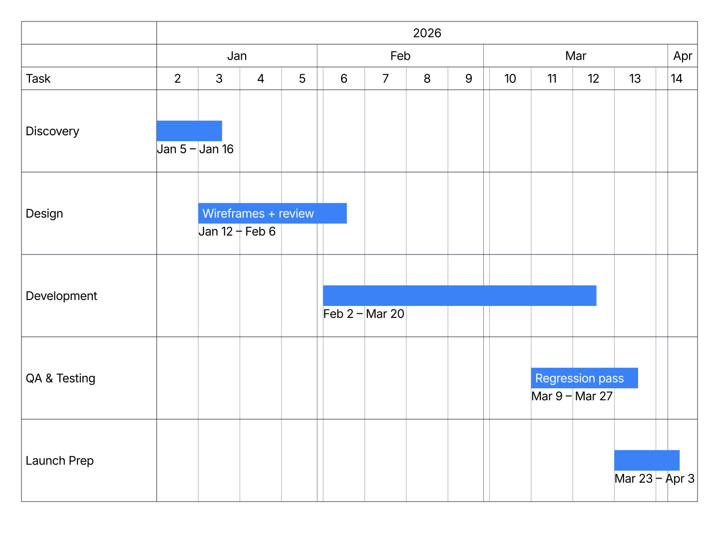
- Gantt: Implementation roadmaps and status update timelines for planning and review cycles.
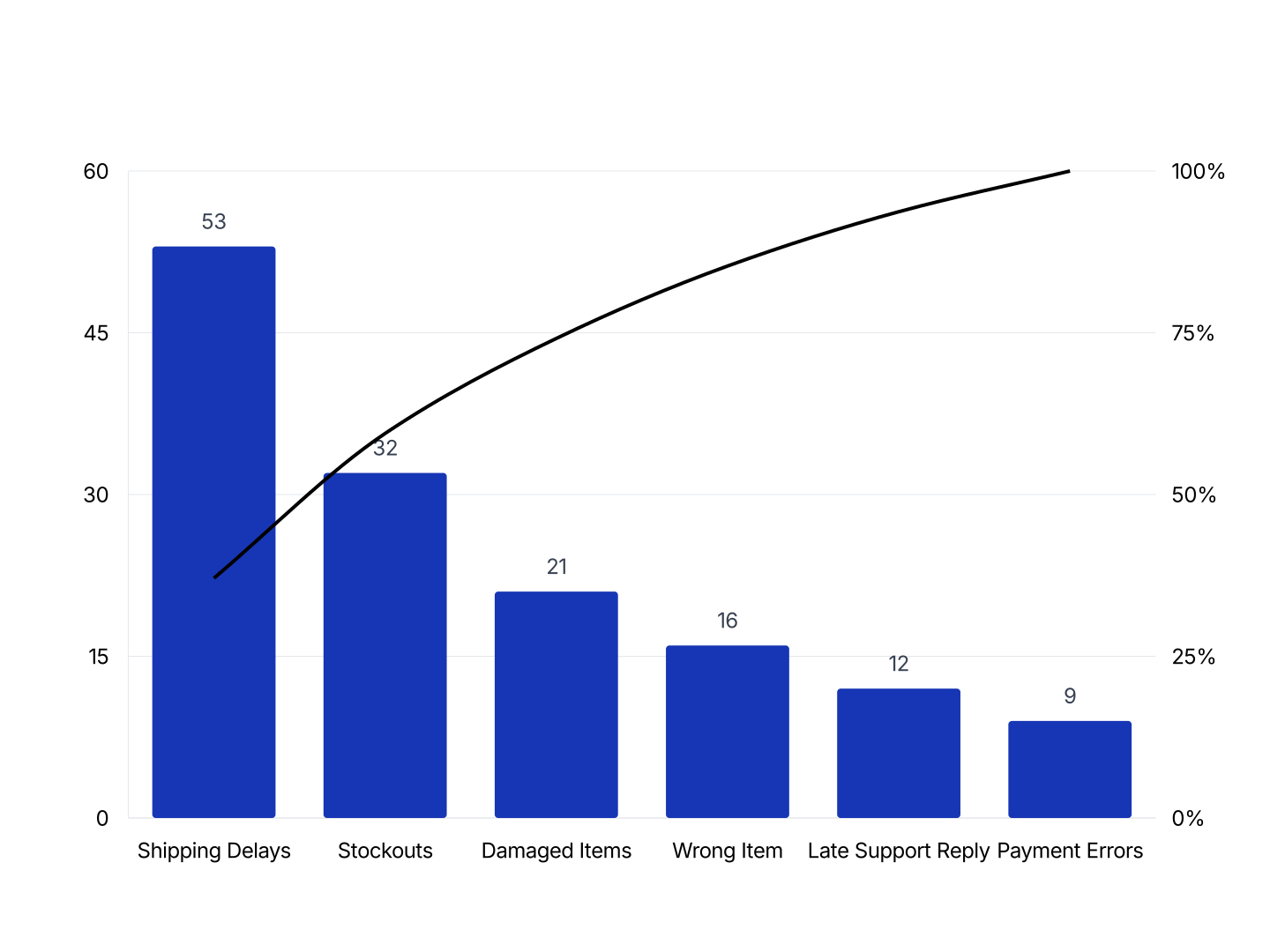
- Pareto: Defect analysis and root-cause prioritization. The standard chart in Six Sigma and lean processes.
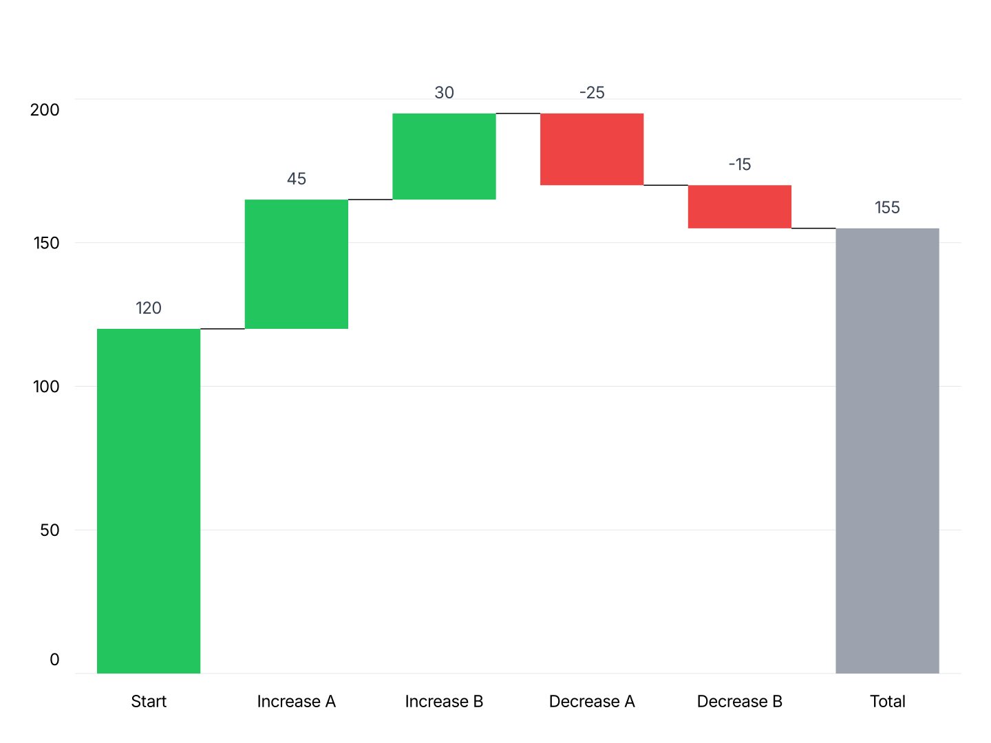
- Waterfall: Cost bridges and budget variance. Shows what drove a cost or cycle-time change.
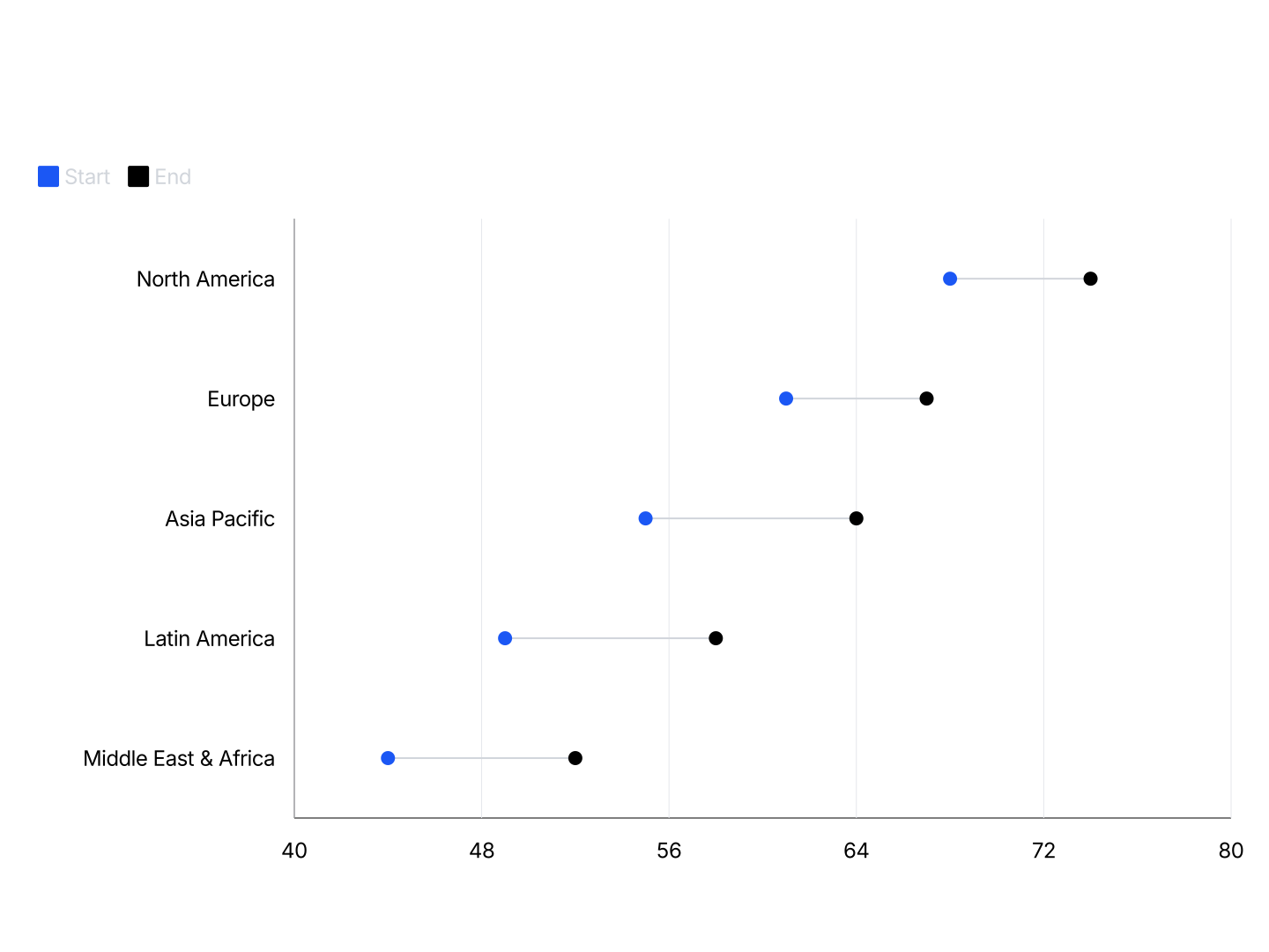
- Dumbbell: Before/after and current-vs-target comparisons across process steps, facilities, or vendors.
- Box Whisker Plot: Delivery time and resolution time by team or region. Spread and outliers, not just the average.
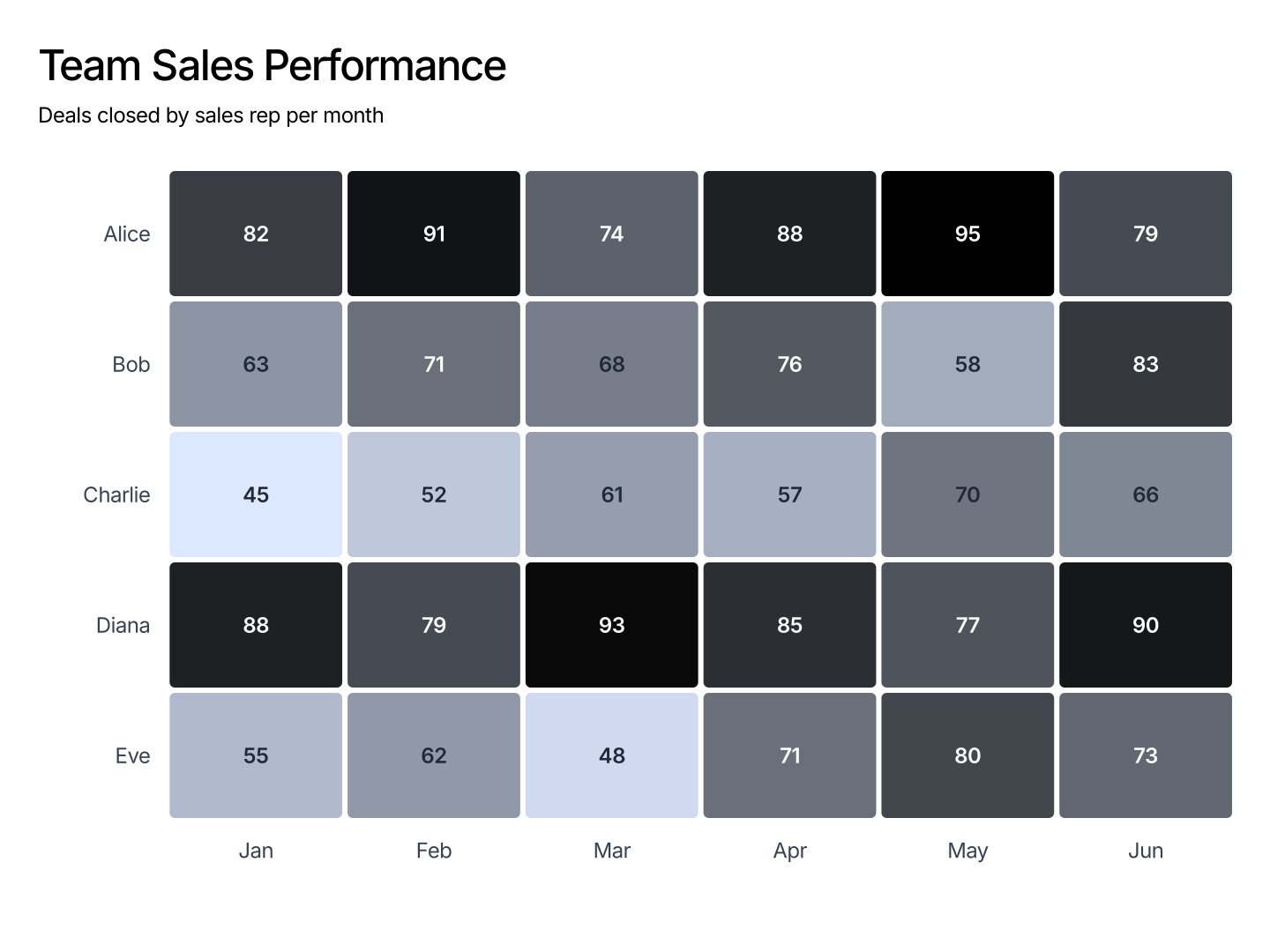
- Heatmap: Performance comparison matrix, team vs metric or region vs metric. Spot under- and over-performing cells at a glance.
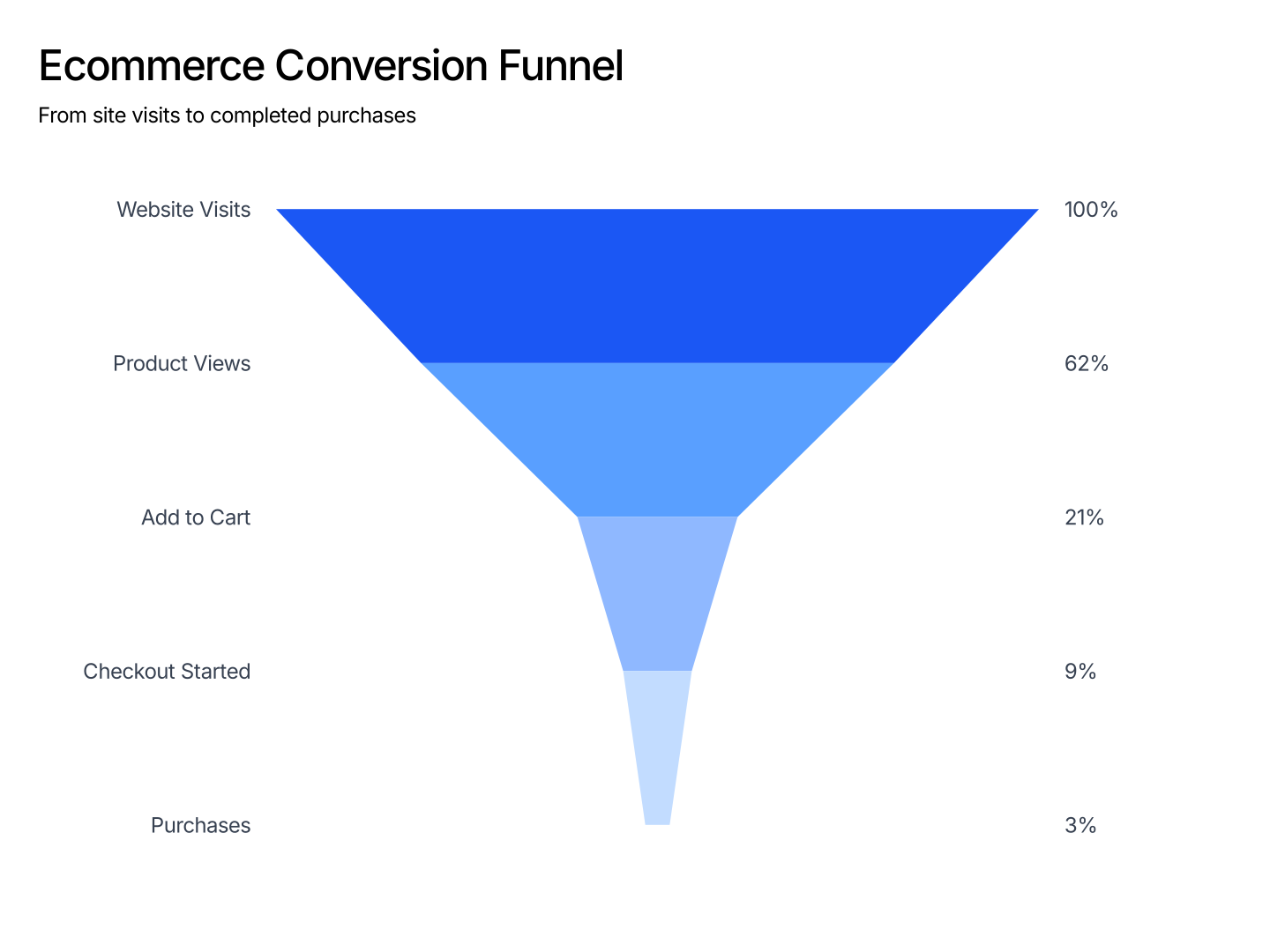
- Funnel: Process pipelines. Shows where drop-off happens across stages.
- Stacked Column: Headcount by function over time. Shows total headcount growth and how the mix is shifting.
- Bullet: Project progress vs milestone, and OKR tracking. Actual vs target in a compact row.
- Tornado: Shows which variable moves a forecast most. Useful when testing planning assumptions.
FAQ
Paste your data, pick a chart type, and drop it into PowerPoint or Google Slides.
Related