Chart Maker for Finance Teams
AECharts covers the reporting-cycle chart set: P&L waterfalls, budget-vs-actual bars, and margin trend lines, plus less common ones. A Mekko chart for budget allocation, a bullet chart for a KPI row in the board pack.
How it works
- Choose a chart type. Waterfall, Mekko, bar, or line.
- Add data or describe the chart. Paste from Excel, Google Sheets, or CSV, or use an AI prompt to create a first draft.
- Customize and download. Edit labels, colors, fonts, and axes, then drop into PowerPoint or Google Slides.
Chart types built for the reporting cycle
The charts that show up in every monthly close and quarterly board report.
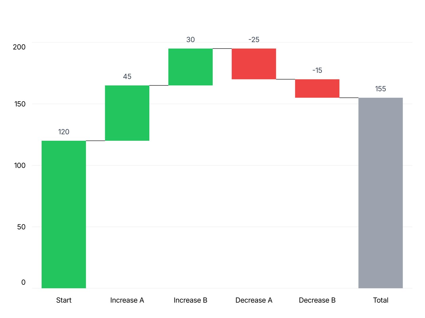
- Waterfall: P&L bridges, cash flow analysis, and budget variance. The core reporting-cycle chart.
- Stacked Waterfall: EBITDA walks and revenue bridges broken into sub-components.
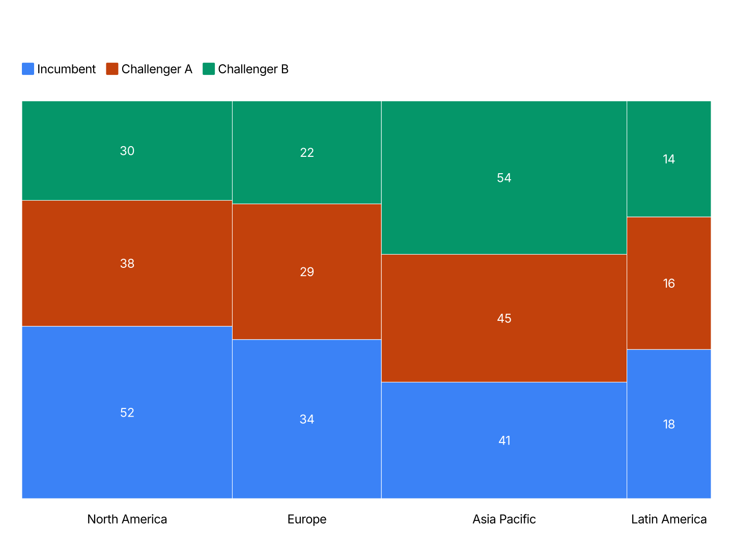
- Mekko: Budget allocation across departments. Column width shows total budget, stacked height shows sub-category share.
- Line: Trend analysis for revenue, margin, or headcount across a reporting period.
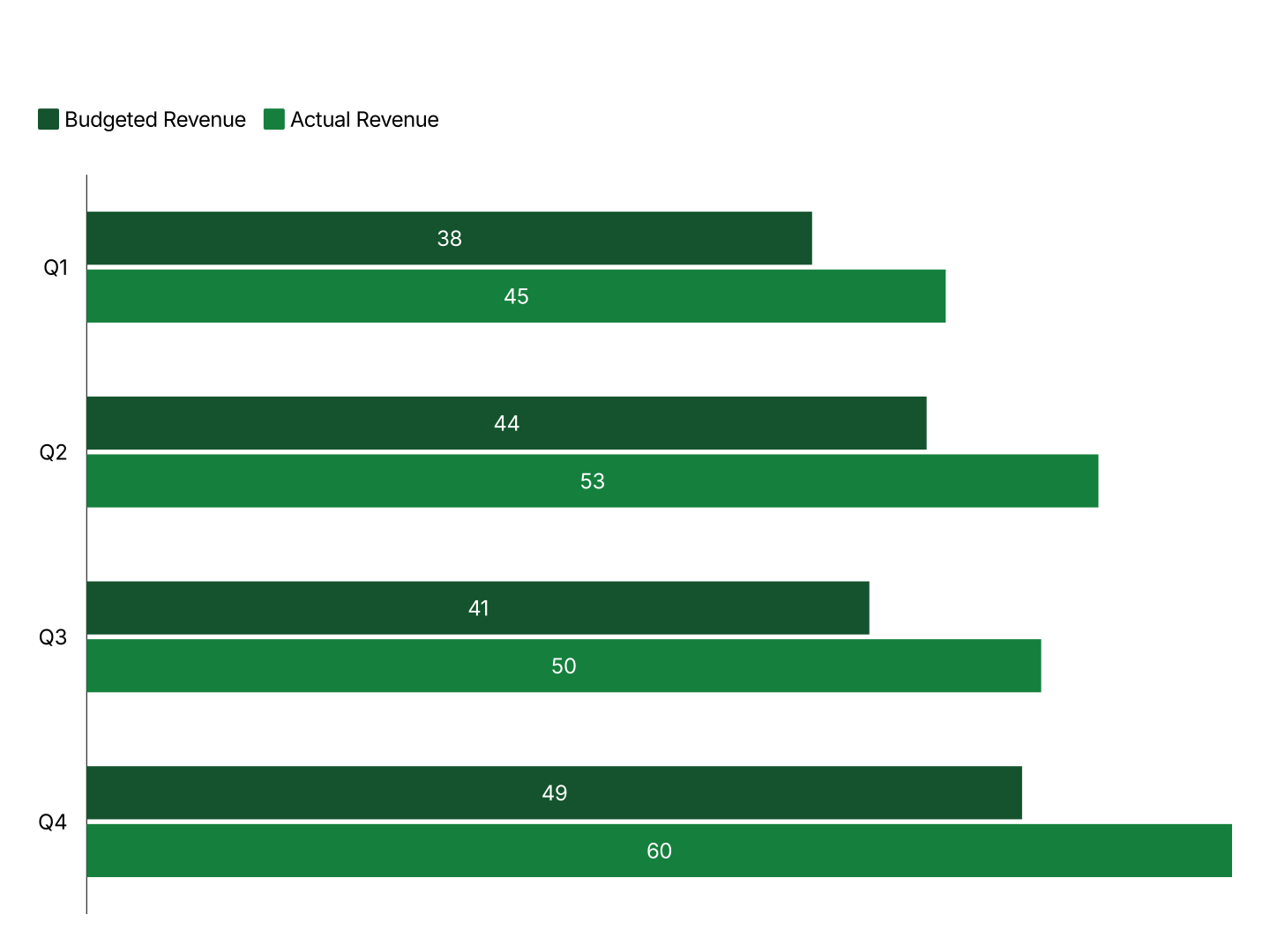
- Grouped Bar: Budget vs actual, two bars per category. Shows over or under at a glance.
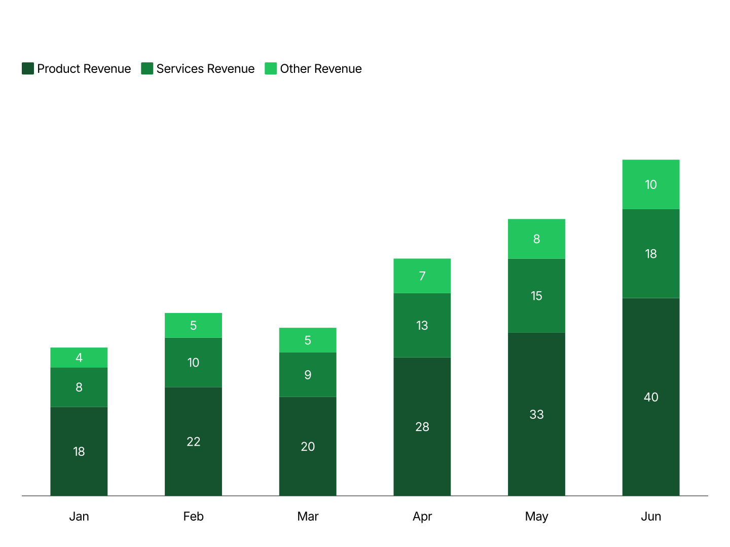
- Stacked Column: Cost structure and P&L composition over time. Total and mix in one chart.
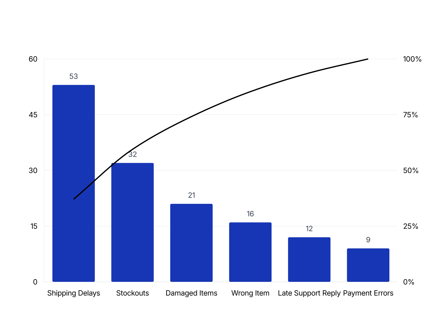
- Pareto: Cost reduction and revenue by product. Ranks line items by cumulative impact.
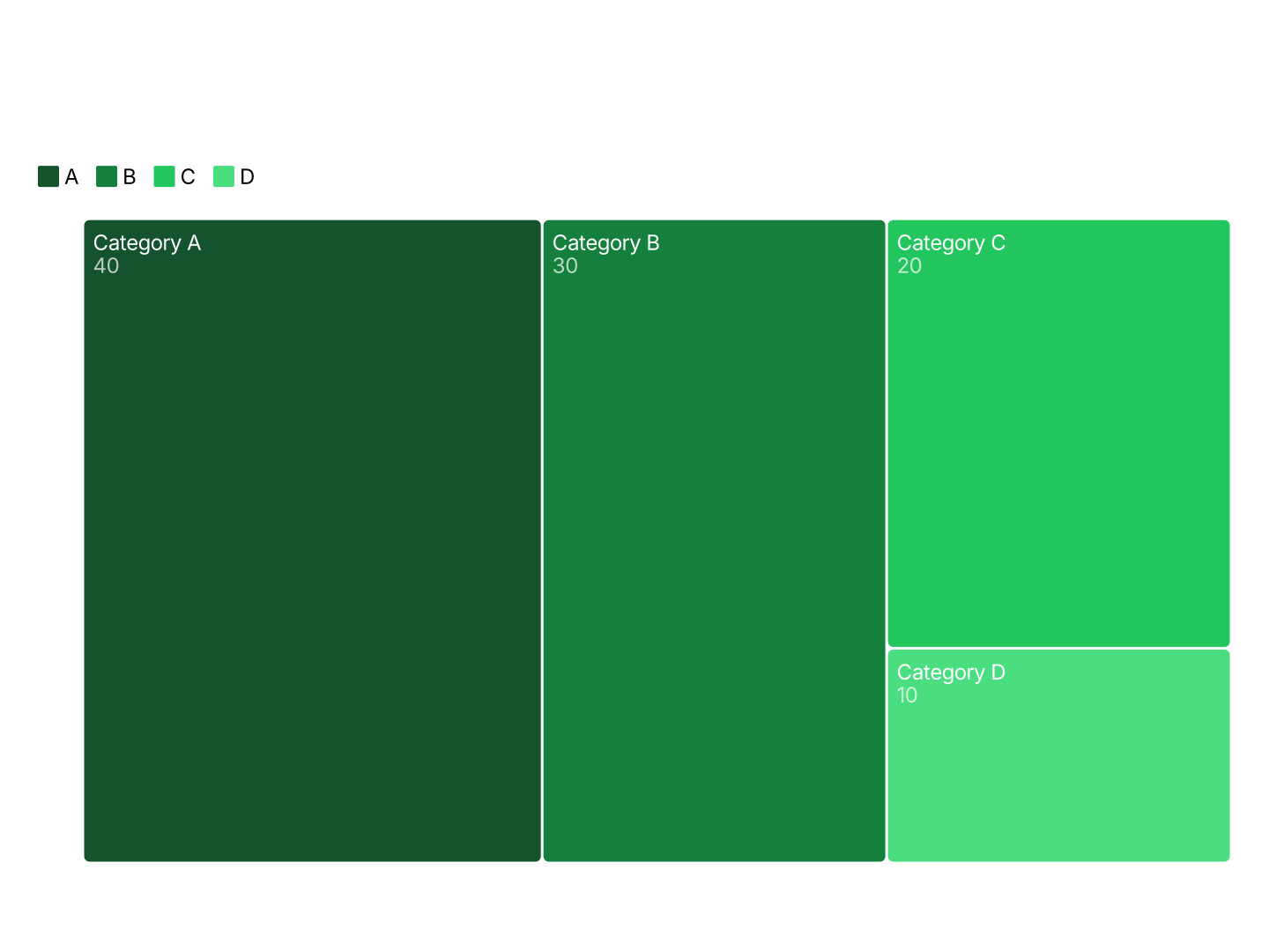
- Treemap: Budget breakdowns and revenue by segment across a two-level hierarchy.
- Bullet: KPI dashboards and budget utilization. Actual vs target in a compact row for the board pack.
- Tornado: DCF valuations and budget assumption testing. Shows which variable moves a forecast most.
FAQ
Paste your data, pick a chart type, and drop it into PowerPoint or Google Slides.
Related