Power Consumption by Sector
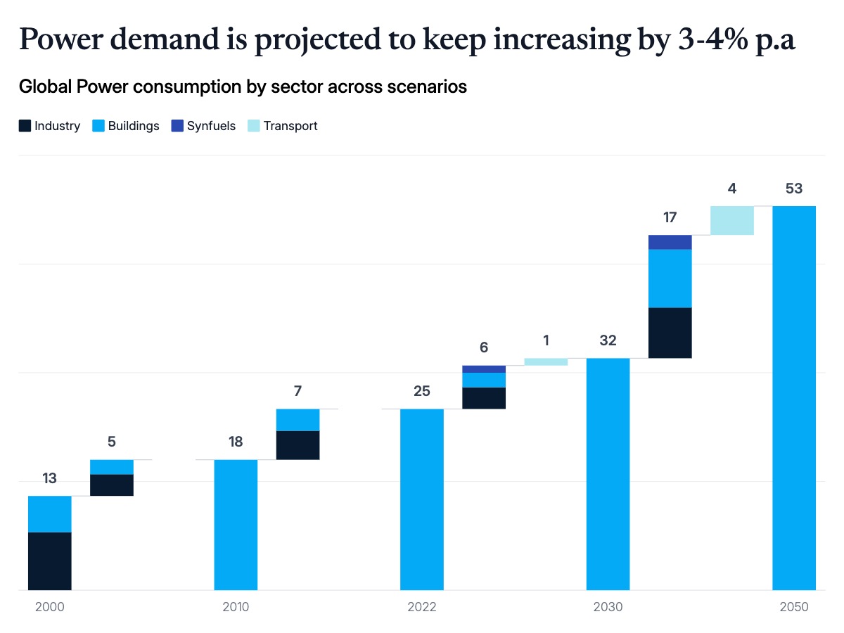
A waterfall chart is the clearest way to show how a total is built from sector-by-sector contributions over time. Each bar represents a period, and within it, each segment stacks the incremental contribution of a distinct driver: industry, buildings, transport, hydrogen, and trajectory scenarios. The result lets readers see both the total and its composition simultaneously, without switching between a summary chart and a breakdown table.
This format is standard in energy transition reports, climate scenario analyses, and infrastructure investment decks. Consultants and energy research firms use it to compare actual consumption trends against forecast scenarios, placing a visual boundary between known history and projected futures. The separation of actuals from forecasts, typically marked by a dividing line or shaded region, signals to readers which numbers are measured and which are modeled, a distinction that matters in regulatory filings, board presentations, and investor materials.
The chart works well when the number of sectors is three to six and the time periods span a meaningful horizon, typically ten to thirty years. Label totals above each column so readers can extract the headline number without summing segments mentally. Use consistent segment ordering across all bars so the eye can track any single sector across time without searching. Color-code segments by type rather than by period, since the sector breakdown is the primary insight. All segment names, values, colors, and scenario labels can be edited in the chart editor, and the finished chart exports as PPTX, PNG, or MP4.