Market Balance Waterfall
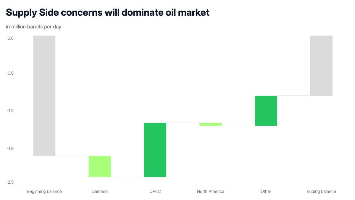
A market balance waterfall chart decomposes the move from one equilibrium to another. The first bar sets the starting position, each middle bar shows the contribution of a specific factor, and the final bar lands at the new balance. When all bars sit below zero, the chart is showing a structural deficit: every factor either deepens or partially offsets it, and the ending bar tells you whether conditions improved or worsened. Color-coding the bars by direction, one color for factors that worsen the balance and another for those that improve it, makes the driver breakdown legible at a glance.
This format is standard in commodity research, energy market analysis, and macro investment presentations. Oil and gas analysts use it to show how OPEC cuts, demand growth, and non-OPEC supply changes combine to shift the market balance from one period to the next. Agricultural and metals analysts use the same structure for their respective supply-demand models. Macro strategists use it in fixed income and currency decks when they need to show how a current account or fiscal balance shifts across scenarios.
The waterfall works for any situation where a total change can be attributed to a set of named factors. The starting and ending bars should use a neutral color to signal they are totals, not contributors. Keep the number of middle bars to four to six so the chart stays readable in a single slide. When the balance runs negative throughout — as in a structural supply deficit — all bars sit below the zero axis, which is the standard convention in commodity research. The same layout works for positive balances by shifting the axis range and reversing the color assignments.