Mining Peer Comparison Bubble Chart
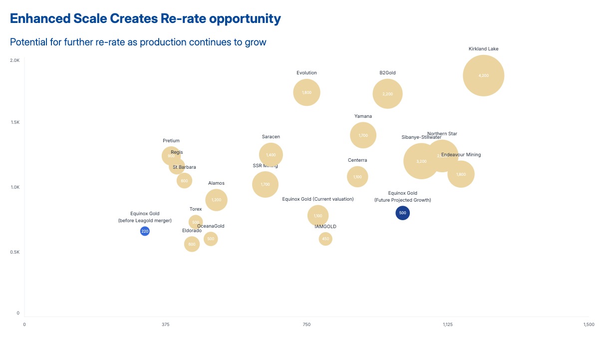
A peer comparison bubble chart places each company in a competitive landscape defined by two financial or operational variables. In this template, the x-axis is annual gold production in koz, the y-axis is the P/NAV valuation multiple, and bubble size represents market cap. A reader can immediately see which peers are being rewarded with a premium multiple for their scale, and which are trading at a discount despite comparable production — making the investment thesis visible without a single word of explanation.
This format is standard in equity research for mining, energy, and any capital-intensive sector where valuation is driven by asset quality and scale. Sell-side analysts use it to show where a covered company trades relative to sector comps. Buy-side teams use it to screen for mispriced names. Investment bankers use it in fairness opinions and M&A pitch books to establish valuation context. The subject company is highlighted in a contrasting color so readers immediately anchor on it and compare outward to the peer group.
The chart works for any sector with two comparable operating metrics and a size variable: oil and gas (production vs. EV/EBITDA, sized by reserves), biotech (pipeline count vs. price-to-book, sized by cash runway), or SaaS (ARR vs. EV/revenue multiple, sized by headcount). The peer labels, axis variables, and color of the highlighted company are all editable in the chart editor. The finished chart exports as PPTX, PNG, or MP4.