Active ETF Growth by Year
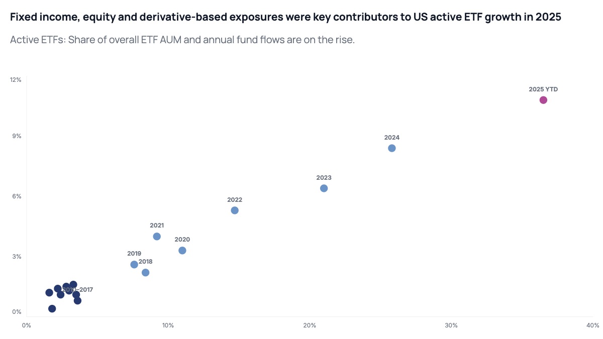
A labeled scatter chart turns a time series into a trajectory. Instead of connecting points with a line, each year stands as its own dot, positioned by two metrics simultaneously. Readers can see not just where things ended up but how fast the trajectory accelerated — years clustered tightly in the lower left signal slow early growth, while dots that jump to the upper right in quick succession show a market tipping point. Labeling each dot by year lets readers anchor specific events to specific positions without needing to cross-reference a table.
This format is standard in asset management strategy decks, market structure analyses, and investor day presentations. A fund manager uses it to show how their category has moved from niche to mainstream over a decade. A consultant uses it to map how a market has evolved across two dimensions at once, such as market share and profitability, or penetration and growth rate. Highlighting the most recent data point in a distinct color signals where the market stands today and creates a visual anchor for the forward-looking narrative that follows.
The chart works best when the trajectory has a clear directional story and the two axes are meaningfully correlated. If the dots scatter randomly, the format does not add insight over two separate bar charts. Use consistent dot sizes to avoid introducing a spurious third variable. Label only the key years — a cluster of early years can be grouped under a single range label to reduce noise. All dot positions, labels, colors, and axis ranges can be edited in the chart editor, and the finished chart exports as PPTX, PNG, or MP4.