Satisfaction Survey Donut Chart
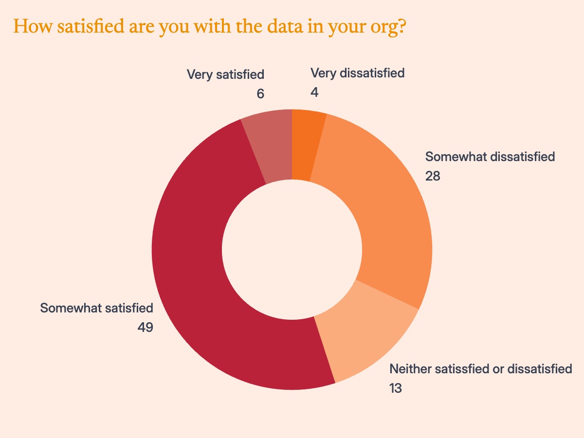
A donut chart is the standard visualization for single-question survey results on a satisfaction scale. A five-segment structure maps directly to the most widely used Likert format: Very satisfied, Somewhat satisfied, Neither satisfied nor dissatisfied, Somewhat dissatisfied, and Very dissatisfied. Each arc is proportional to the share of respondents who selected that option. The center hole is intentional — it draws the eye to the overall composition rather than to individual segment sizes, which is the right emphasis when the story is about where most respondents landed on the scale rather than any single number.
HR teams and people analytics functions use this format in employee experience reports, engagement survey readouts, and culture assessments. Customer experience teams use it in satisfaction tracking decks and voice-of-customer studies. Research firms including Gartner, IDC, and McKinsey publish single-question distributions in this format when the headline finding is the share of respondents at the positive or negative poles. A common convention is the top-two-box summary: combining Very satisfied and Somewhat satisfied into a single percentage and displaying the full distribution in the donut underneath to show how that number is composed.
The color scheme should reinforce the scale direction — the most positive segment gets the deepest, most saturated tone, and the palette fades toward neutral as sentiment decreases. This makes the chart readable without referring to a legend, since readers can infer direction from color weight alone. Segment order should follow the satisfaction scale clockwise from the top, starting with the most positive outcome. When the neutral middle category is large relative to the others, a horizontal stacked bar chart ordered low to high often communicates the full distribution more precisely.