Interest Coverage Ratio Breakdown
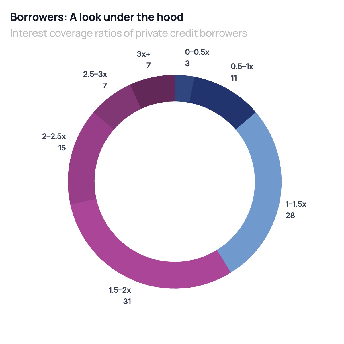
A donut chart is the right format when the story is about how a population distributes across ordered buckets rather than unordered categories. Interest coverage ratio breakdowns, credit rating distributions, loan-to-value buckets, and age cohort splits all share this structure: the categories have a natural order, the shares sum to 100%, and the key question is how concentrated the distribution is in the riskiest or most important bucket. The hole in the center is not decoration — it removes the area distortion that makes pie slices hard to compare, forcing the reader to use arc length, which is more accurate.
This format is standard in private credit, leveraged finance, and structured products presentations. A credit fund uses it to show LPs how the portfolio distributes across coverage ratio buckets, signaling whether the book is concentrated in stressed borrowers or has a healthy spread into stronger credits. A bank uses it in credit risk reports to show how the loan portfolio has shifted between rating categories over time. A ratings agency uses it in sector commentary to compare coverage distributions across industries or economic cycles.
Order the segments to tell a directional story: start with the weakest bucket at the top and move clockwise through progressively stronger coverage. Use a two-color palette where the stressed end of the spectrum gets a distinct color and the stronger end shares a second color in varying shades — this makes the risk concentration readable at a glance without requiring readers to parse a legend. All segment labels, colors, and values can be edited in the chart editor, and the finished chart exports as PPTX, PNG, or MP4.