Free Pie Chart Templates
Browse pie and donut chart templates for market share, budget splits, portfolio allocation, and other part-to-whole visuals. Every template is customizable and export-ready.
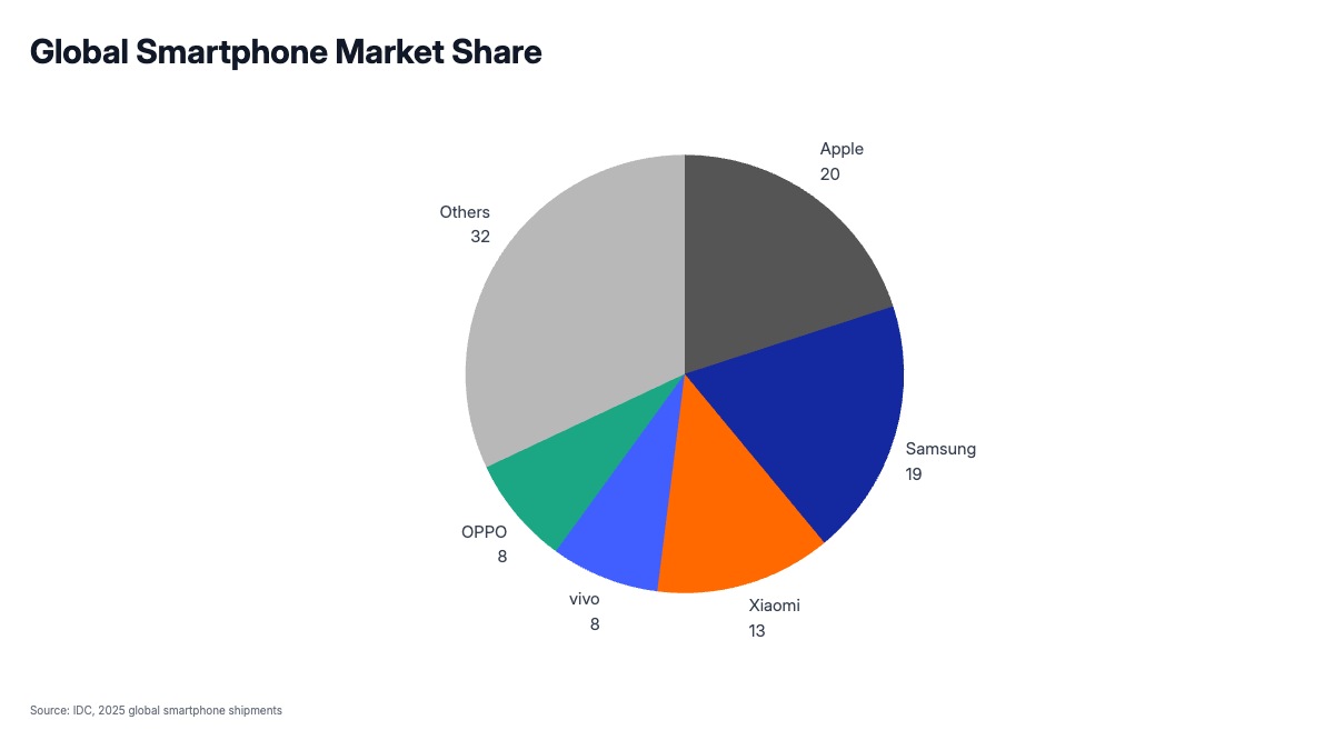
Pie and donut chart templates for presentations
Pie and donut charts show how a whole breaks into parts: market share, budget allocation, survey responses, or portfolio composition. Pick a template, paste your data, and drop a clean chart straight into PowerPoint or Google Slides.
When should I use a pie chart vs a bar chart?
Pie charts work best with a small number of categories (5 or fewer) where the part-of-whole relationship matters: market share, vote split, budget breakdown. For more categories or when precise comparison matters, a bar chart is easier to read.
Can I make a donut chart?
Yes. The pie chart templates include donut-style variants with a center hole, useful for displaying a single percentage or adding a summary label in the middle.