Private Market Valuation Growth
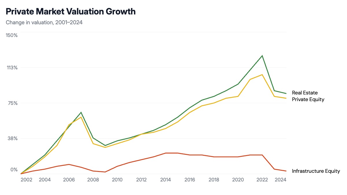
A cumulative return line chart re-bases all series to zero at a common start date, so every line shows total growth from the same origin point. This makes it possible to compare assets that have very different absolute values — comparing a real estate index to a private equity index on the same axis is only meaningful if both start at zero. The chart reveals three things at once: which asset class compounded fastest over the full period, which was most volatile through downturns, and which showed the steadiest growth.
This format is standard in alternatives investment presentations, endowment and pension fund allocation reviews, and manager due diligence decks. An asset allocator uses it to justify a tilt toward one asset class over another by showing long-run compounding advantages. A fund manager uses it to show their strategy outperforming a benchmark from a common start date. A consultant uses it to frame the opportunity cost of holding cash or public equities versus private alternatives over a decade.
The chart works best when the time horizon is long enough to show at least one full cycle, including a downturn and recovery. Labeling the lines directly at their endpoints is cleaner than a legend box for three or fewer series. The lines should be thick enough to distinguish easily, and the y-axis should be labeled in percentage points so readers know they are looking at cumulative growth rather than an index value. All series names, colors, data points, and axis labels can be edited in the chart editor, and the finished chart exports as PPTX, PNG, or MP4.