Composition of Total Equity Returns
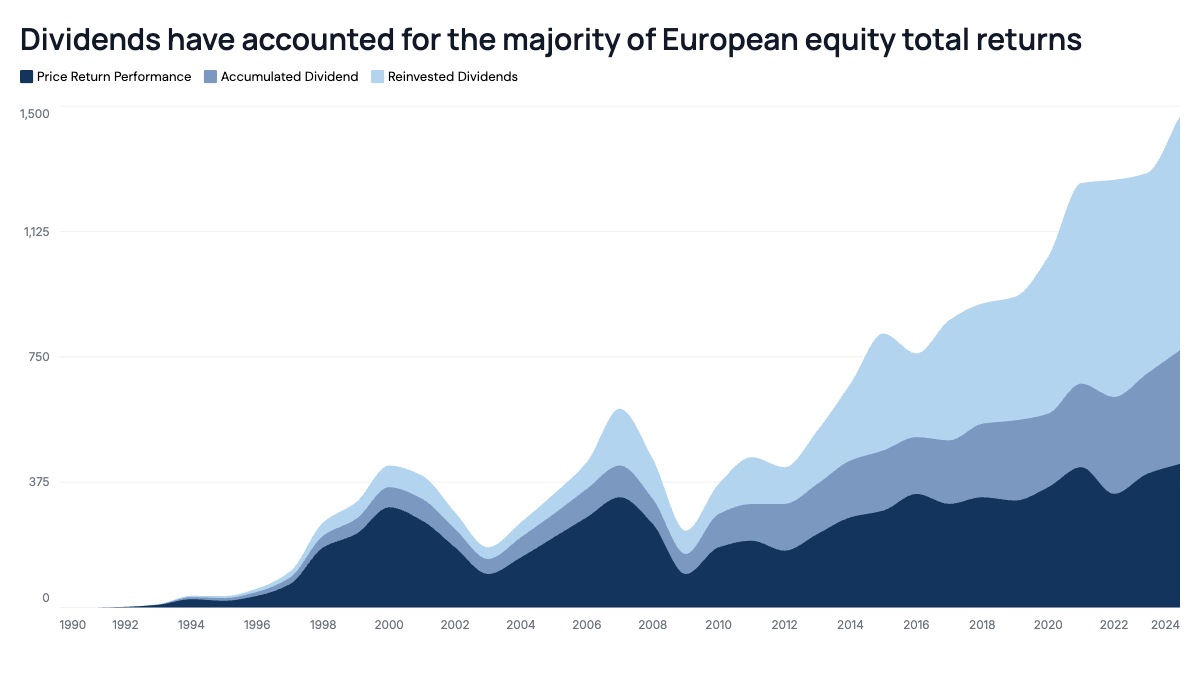
Each band in the stack represents one component of total return, plotted cumulatively so the top edge of the stack traces the compounded total. In this structure, the bottom band shows raw price return, the middle band adds the return from dividends collected but not reinvested, and the top band adds the extra return generated by reinvesting those dividends back into the index. Reading the chart top to bottom at any point in time shows exactly how much of the total return came from each source, and the growing gap between the top of the stack and the bottom band over decades makes the compounding effect of reinvested dividends visually obvious in a way a single line never could.
This format is standard in asset management factsheets, index provider research, and wealth management client communications, wherever the goal is to justify why dividend reinvestment matters over a multi-decade holding period. Equity strategists use it to compare total return composition across regions or sectors. Wealth managers use it in client reviews to explain why a portfolio's total return outpaces its quoted index level. It also appears in academic and sell-side research on equity risk premia, where separating price return from income return is central to the analysis.
Three bands work best. More than four makes the layers hard to distinguish once dividends compound over a long time horizon. Order bands from most volatile at the bottom, price return, to most stable at the top, since price return should anchor the shape of the chart and the income layers should read as a steady, compounding cushion above it. Use a single color family with increasing lightness for each layer so the stack reads as one continuous object rather than three unrelated series. One detail worth remembering: because each layer is drawn cumulatively, a shrinking price return band during a drawdown will still show total return holding up if the dividend layers are large enough, which is exactly the story this chart format is built to tell.