Customer Retention Curve
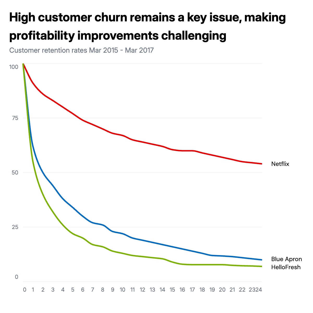
A customer retention curve shows what percentage of customers are still active at each month after acquisition. All lines start at 100 and decay at different rates, so the visual divergence is the entire story. A company that retains 55% of customers at month 24 is fundamentally different from one retaining 8%. The shape of each line tells you whether churn is front-loaded, a sharp early drop that flattens, or continuous, a steady slope that never stabilizes.
This format is standard in SaaS and subscription business investor presentations. Founders use it to compare their retention against public benchmarks. Investors use it during due diligence to assess whether a business has achieved product-market fit, since a flattening retention curve is one of the clearest signals that a core customer base has formed. Growth teams use it to compare cohorts over time, which surfaces whether onboarding improvements or product changes actually moved the retention curve.
The chart works best with two to four lines. More than four makes the divergence hard to follow. The reference company or the best performer should use the most distinct color so readers anchor on it and compare the others against it. All series names, colors, data points, and axis labels can be edited in the chart editor, and the finished chart exports as PPTX, PNG, or MP4.