AI Adoption Barriers by Region
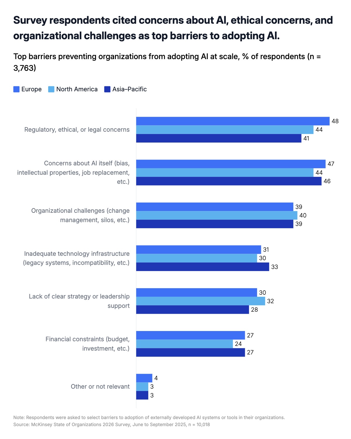
A grouped horizontal bar chart is one of the most effective formats for comparing multiple categories across a small number of segments. Unlike a stacked bar chart, which shows part-to-whole relationships, a grouped layout places bars side by side, making it easy to read exact values and spot which segment leads or lags on each dimension. This template is built around a three-group structure — Europe, North America, and Asia-Pacific in the example — but works equally well with two groups or up to five. The chart handles long category labels naturally by placing them on the left side of each bar cluster, keeping the reading direction left to right without rotation or truncation.
Survey results are the most common use case. When respondents from different regions, functions, or customer segments rank barriers, challenges, or priorities, a grouped horizontal bar chart lets readers see both the overall pattern and the segment-level variation in a single view. The format is familiar to audiences who read McKinsey, Bain, and BCG reports, making it a strong default for strategy presentations and board decks. In this template, categories are ordered by the highest-scoring segment so the most significant finding sits at the top — a deliberate choice, since audiences reading slides quickly tend to anchor on the first row.
The same structure works well beyond surveys. Revenue by product line broken out by quarter, NPS scores compared across customer tiers, headcount change by department and region, or cost drivers ranked across business units all fit naturally into this format. Any time you have a fixed set of categories and want to show how two to five segments compare within each one, this is the right chart. The color palette uses three shades of blue to distinguish groups without implying hierarchy — lighter shades recede, darker shades advance, so the segment you want to emphasize should get the darkest color. All colors, fonts, labels, and values can be edited directly in the chart editor, and the finished chart exports as PPTX, PNG, or MP4.