Market Breakdown by Region
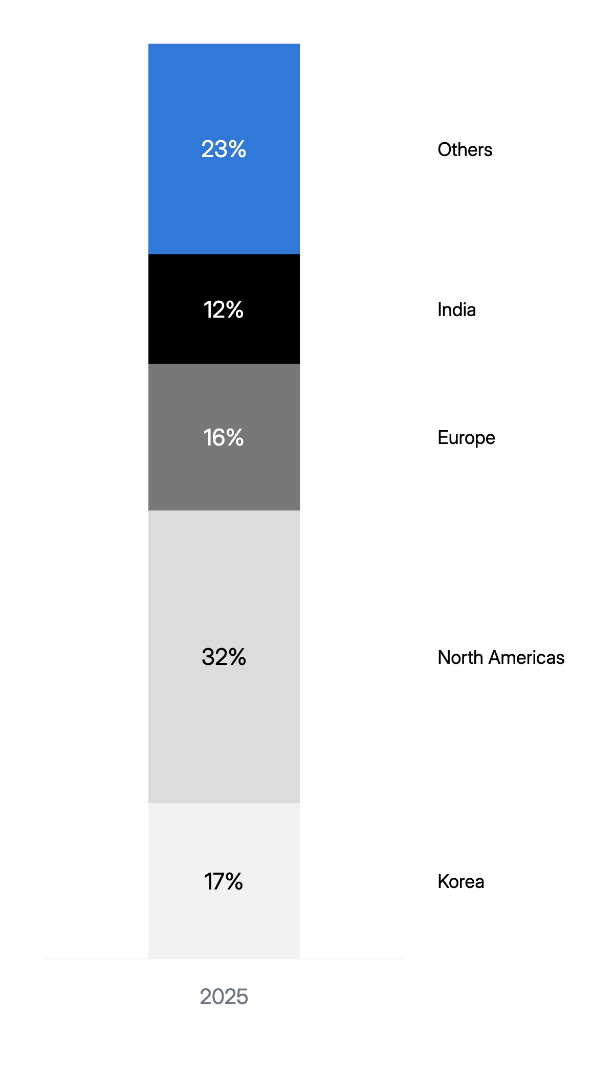
A single stacked column is the most compact way to show how a total is distributed across segments. The bar runs the full height of the chart, divided into colored sections for each market, product line, or category. Each section is labeled with the segment name and its percentage share. The total value sits above the bar, and the time period below. The result is a self-contained KPI snapshot that fits cleanly into a dashboard, earnings slide, or board deck without taking up the space a full chart would.
This format appears constantly in automotive, retail, and consumer goods investor presentations — wherever a company needs to show geographic or segment mix alongside a headline number. It is also standard in analyst research notes where space is limited and the key message is the composition of a total rather than a trend over time. The visual works because it eliminates the need to mentally reconstruct a whole from pie slices — readers can scan left to right and immediately see which segment dominates and how the rest are distributed.
The chart works best with three to six segments. More than six makes the segments too narrow to label clearly. The segment order matters: put the most important segment first (leftmost) so it anchors the reading. Color progression should use a consistent palette — same hue, varying shade — so the chart reads as one object rather than a collection of unrelated bars. All segment names, values, colors, and the header total can be edited in the chart editor. The finished chart exports as PPTX, PNG, or MP4.