Likert Impact Survey
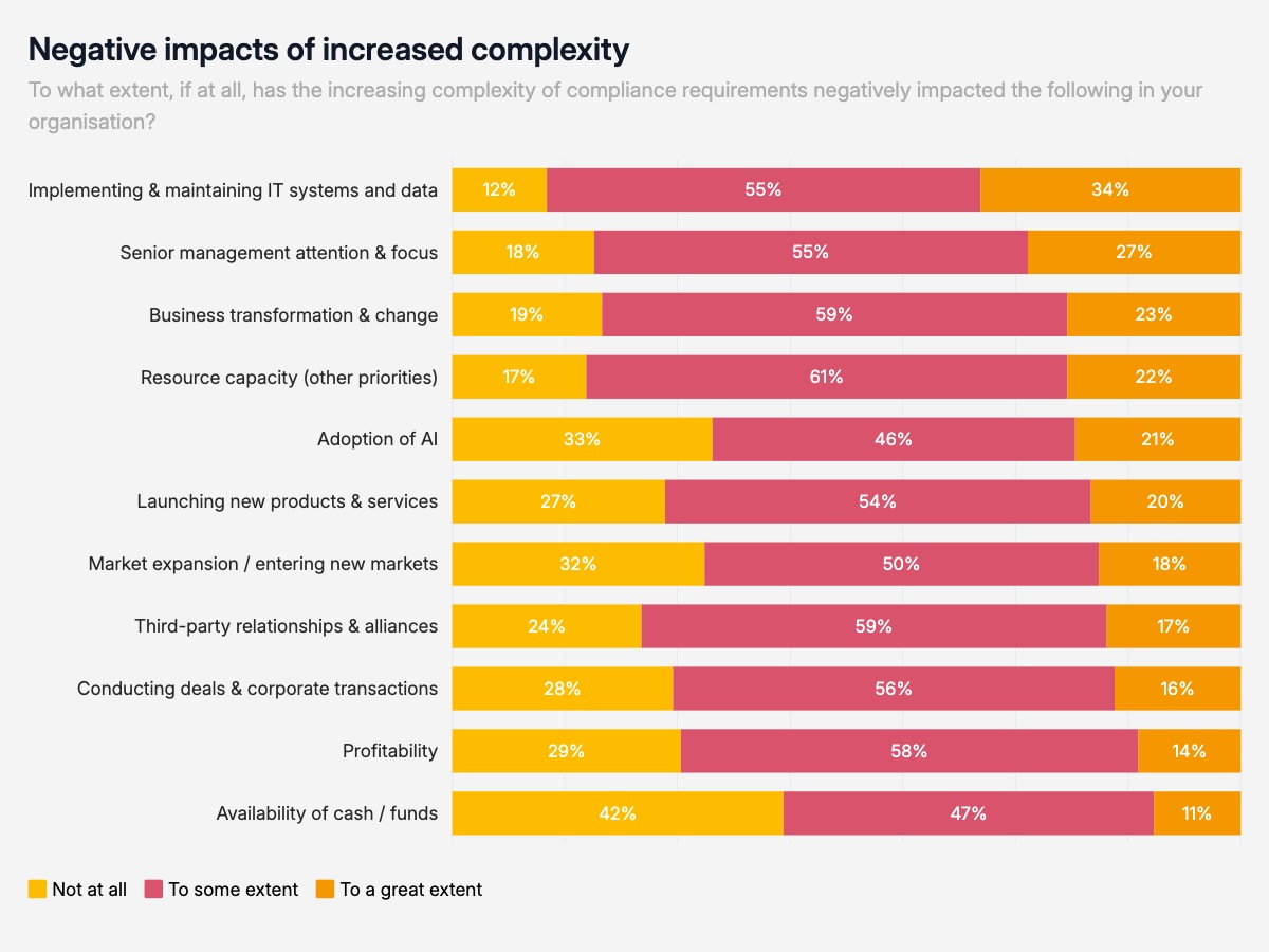
A stacked horizontal bar chart is the default format for showing how a population distributes across an ordered response scale for multiple topics simultaneously. Each row is a separate topic or question, and the three segments show what share of respondents fell into each response tier. Because all bars reach the same total width, the comparison is purely about distribution — which topics drew the strongest negative impact, and which were relatively insulated.
This format appears constantly in Big Four and consulting firm annual reports, regulatory compliance studies, and operational risk surveys. PwC, Deloitte, and KPMG use it when they publish survey data across multiple business impact dimensions. The horizontal orientation handles long category labels naturally, placing them to the left of each bar so nothing gets truncated or rotated. The three-segment structure maps directly to the most common Likert response scale used in business research: none, partial, and significant impact.
The chart is most readable when rows are sorted by the size of the rightmost segment — the strongest response — so the highest-impact topics sit at the top. Keep labels inside each segment to show exact percentages without requiring an axis. The color palette should use a single hue family with three intensities, moving from light for the lowest response to dark for the highest, so the visual weight reinforces the magnitude of impact. Three to five response tiers is the practical limit — beyond that, segments become too narrow to label and the color distinctions lose meaning at presentation size.