Asset Returns After the First Fed Cut
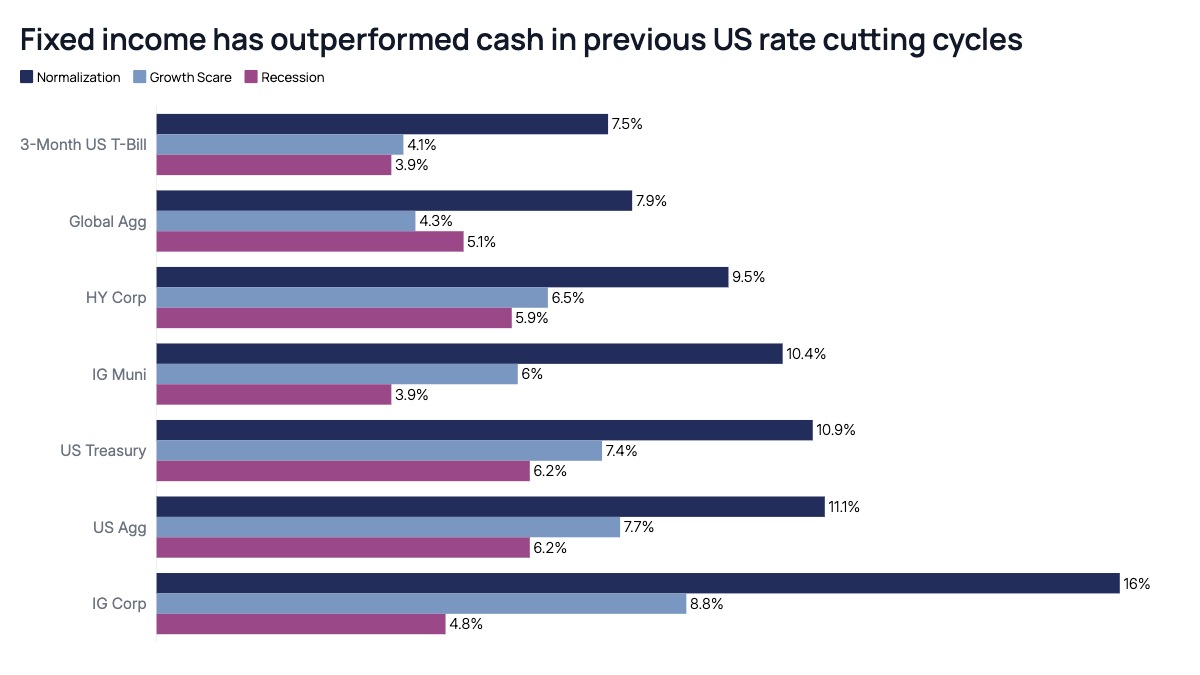
Each asset class sits on its own row, with three bars extending to the right representing average total return under three named macro scenarios, typically ordered from most benign to most severe. Placing the scenarios side by side rather than stacking them lets a reader compare the same asset class across scenarios and compare different asset classes within the same scenario, both in one glance. The asset classes are ordered by their return under the best-case scenario, so the chart reads as a ranking from lowest-returning, most defensive instruments at the top to highest-returning, most credit-sensitive instruments at the bottom.
This structure is a staple of fixed income and multi-asset strategy research, particularly around Federal Reserve policy pivots. Sell-side rates strategists and asset managers use it to publish scenario-based return expectations ahead of an anticipated cutting cycle. Investment committees use it to stress-test a bond allocation against a recession versus a soft-landing outcome. The same format works for comparing sector returns after a market shock, currency returns under different central bank paths, or equity factor returns across recession probability scenarios.
Three scenarios per row is the practical ceiling before the bars become hard to compare visually. Use a consistent color for each scenario across every row, and reserve the darkest or most saturated color for the base case so it reads as the anchor scenario. Label each bar with its exact value since readers of this chart are usually trying to extract a specific number for a model, not just a visual impression. The instructive detail in data like this is usually how narrow the spread is for short-duration instruments like T-bills across scenarios and how wide it becomes for credit, which is itself the argument for why scenario planning matters more the further you move down the credit spectrum.