Sales Pipeline Funnel Chart
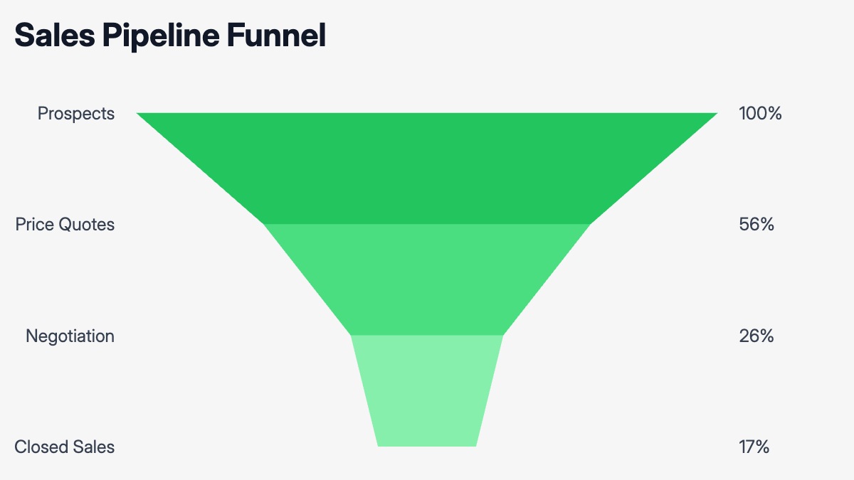
A sales pipeline funnel chart shows how many deals survive each stage of your sales process. The widest band at the top represents all leads or prospects entering the pipeline. Each stage below — qualified, demo scheduled, proposal sent, negotiation, closed-won — narrows to reflect the number of deals that made it through. The visual drop-off between stages is the key insight: a steep narrowing at one stage signals a conversion problem worth diagnosing, while a consistent slope suggests a well-tuned process.
This format is standard in sales reviews, QBRs, and pipeline health presentations. Sales leaders use it to show leadership where deals are getting stuck. Revenue teams use it to model how many top-of-funnel leads are needed to hit a closed-won target. Consultants working on go-to-market engagements use it to benchmark conversion rates across stages against industry norms. The chart works equally well with deal counts or deal values — switching between the two often surfaces different bottlenecks.
The most effective version of this chart pairs the funnel with the conversion rate between each consecutive stage, either as labels on the narrowing segments or as a secondary column. The template uses stage names that fit a typical B2B SaaS or professional services pipeline, but any sales process with three to seven sequential stages maps cleanly onto this structure. All stage names, values, colors, and labels can be edited in the chart editor, and the finished chart exports as PPTX, PNG, or MP4.