Email Marketing Funnel Chart
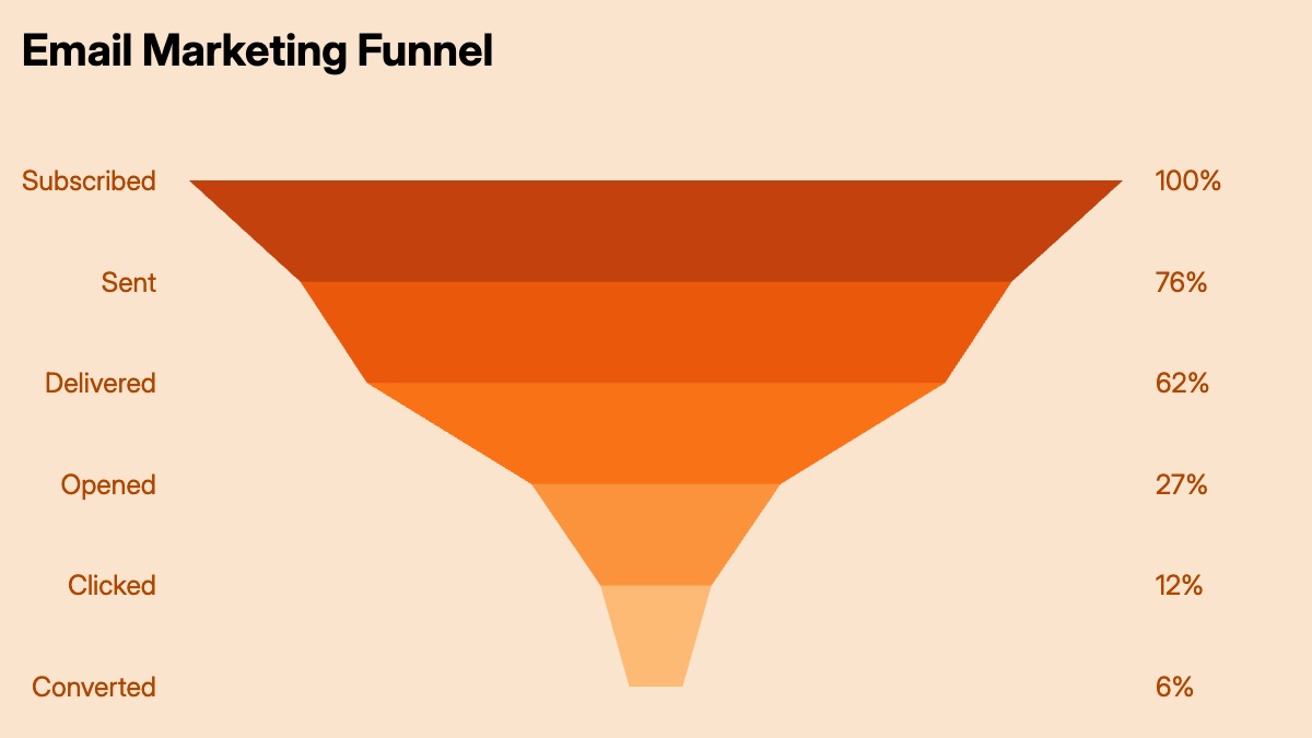
An email marketing funnel chart shows how a subscriber list shrinks at each stage of an email campaign. Starting with the number of emails sent, the funnel narrows through delivered, opened, clicked, and finally converted — whether that means a purchase, a sign-up, or another defined action. The percentage drop between each stage tells a specific story: a large gap between sent and delivered points to deliverability or list hygiene issues; a gap between opened and clicked suggests the email content or call to action needs work.
Marketing teams use this chart in campaign post-mortems, monthly performance reviews, and channel comparison decks. It is one of the clearest ways to show a non-technical audience how email performance compounds — a 5-point improvement in open rate affects every downstream metric. Growth and demand generation teams use it to model what list size and engagement rates are needed to hit a conversion target. Agencies use it to report campaign results to clients in a format that requires no explanation.
The template uses a five-stage email funnel as a starting point, but it works for any campaign with three to six sequential stages — including SMS campaigns, push notification funnels, or multi-step drip sequences. All stage names, counts, colors, and labels can be customized in the chart editor, and the finished chart exports as PPTX, PNG, or MP4.