Developed Market Policy Rate Outlook
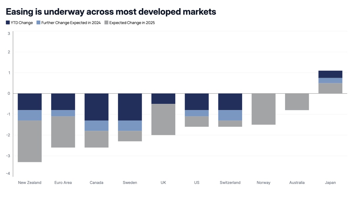
Each bar represents one country or currency area, built from stacked segments that combine into a single cumulative total: the change already realized this year, plus the further change the market or the analyst expects over the next one to two years. Because the segments stack directly off the zero line, the top or bottom edge of each bar shows the total expected move once the cycle plays out, while the individual segments show how much of that move has already happened versus how much is still ahead. Countries with bars extending below zero are in an easing cycle, while a bar extending above zero, an outlier hiking against the trend, immediately stands out against the rest of the group.
This format is common in central bank and rates strategy research published by sell-side economics teams, asset managers, and macro hedge funds around FOMC, ECB, and other policy meeting cycles. Fixed income portfolio managers use it to compare how much cutting is already priced across markets, which informs relative value trades between government bond markets. Currency strategists use it to frame rate differentials driving FX views. The same structure applies to comparing fiscal deficit paths, inflation forecast revisions, or GDP growth revisions across countries over a multi-year horizon.
Order countries by total expected change, from the deepest cutting cycle to the shallowest, so the ranking itself becomes part of the message. Keep the realized and expected segments in two clearly distinct shades of the same color rather than unrelated colors, since they represent the same directional move at different points in time, not two different things. A thin zero line is essential here since the whole point of the chart is to show which side of zero each country sits on. The detail worth noting is that a country breaking from the group direction, hiking while every peer cuts, carries more informational weight in this chart than any single large bar, so it deserves a distinct color rather than blending into the palette.