Maturity Assessment by Region
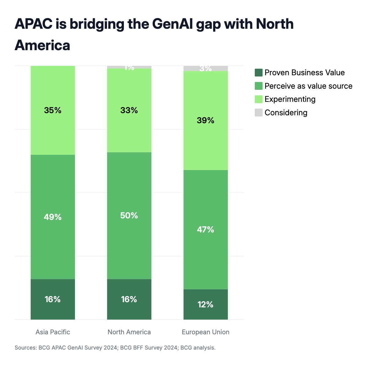
A 100% stacked bar chart is the standard format for comparing how a population is distributed across ordered stages — and the maturity assessment is one of the most common uses in strategy presentations. Every bar represents a region, business unit, or customer segment. Each segment of the bar shows the share of respondents at a given stage: not started, experimenting, scaling, or achieving proven results. Because all bars reach the same total height, the visual comparison is about distribution, not magnitude — which regions are more advanced, and which are still in early stages.
This chart type appears constantly in consulting reports from McKinsey, BCG, and Bain whenever they publish survey data. Market researchers use it to show technology adoption curves. Strategy teams use it to benchmark where different business units stand on a transformation initiative. HR and change management teams use it to show readiness across functions or geographies. Any question that produces a distribution across ordered categories — digital maturity, ESG commitment level, AI readiness, cloud adoption — maps directly onto this structure.
The color palette moves from light to dark as maturity increases, which reinforces the directionality without needing a lengthy legend explanation. Labels inside each segment show the percentage directly, so readers can extract exact numbers without referring to an axis. The title follows the BCG convention of stating the key finding rather than describing the chart — it should communicate the so-what, not just the what. All stage names, regions, colors, fonts, and label formats can be edited in the chart editor, and the finished chart exports as PPTX, PNG, or MP4.