Before/After Distribution Shift
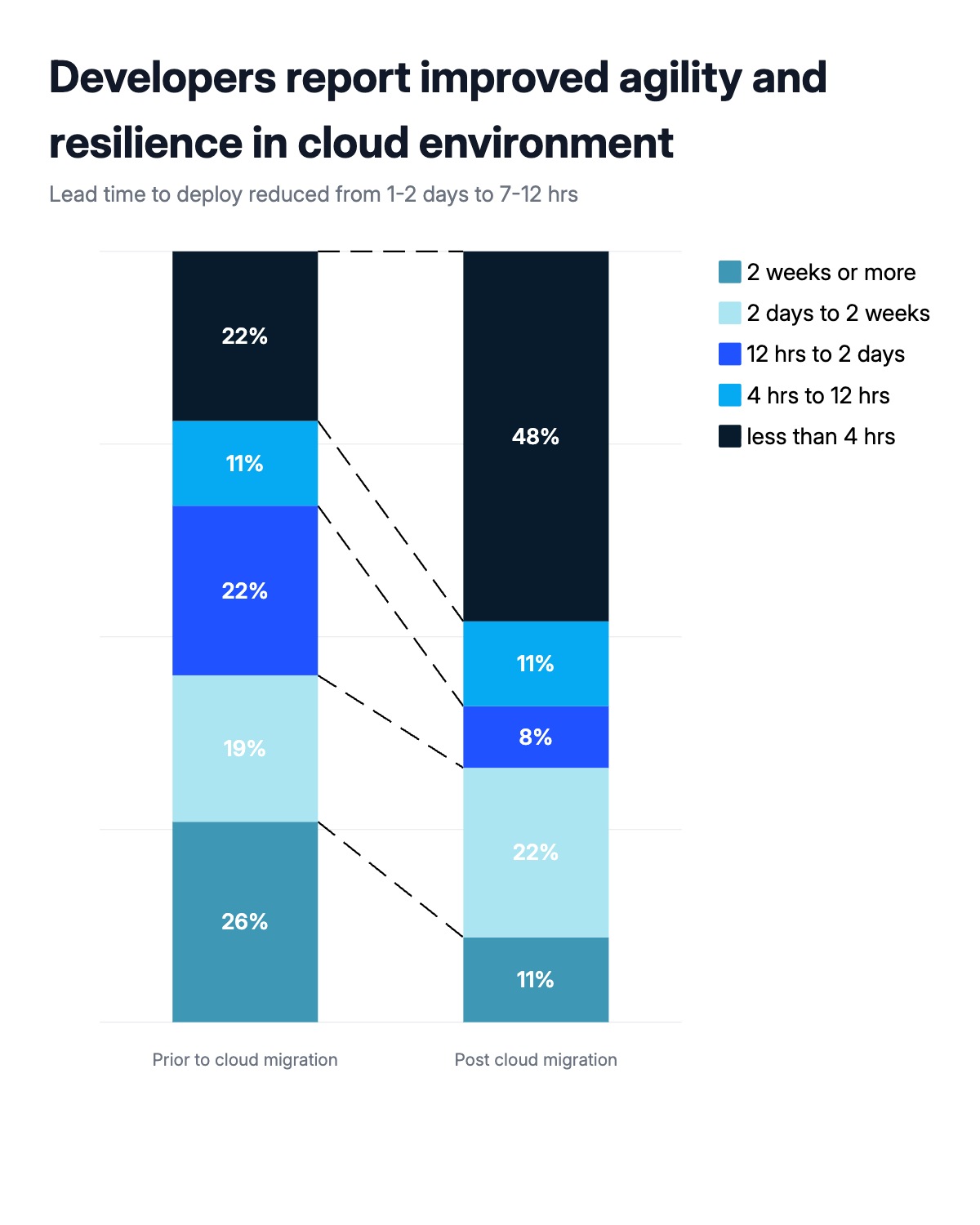
A before/after stacked bar chart is one of the most effective formats for showing how a population redistributed across categories after a change. Each of the two bars sums to 100%. The segments show what share of respondents — or outcomes, or events — fell into each bucket before versus after. The connector lines between bars make the shift readable at a glance: expanding segments push outward, contracting ones pull inward, and readers can follow any row across without mentally recalculating.
Consulting firms use this format constantly in transformation decks. A cloud migration before/after (how long deploys took pre- and post-migration), a training program impact (employee skill levels before and after), a policy change effect (customer behavior before and after a pricing shift), or a process improvement (defect rates before and after a quality initiative) all map directly onto this structure. The format works for any scenario where you have the same population measured twice across the same ordered categories.
The key to making this chart work is ordering the segments so the most meaningful change reads clearly. In improvement scenarios, put the best outcome at the bottom — the expanding dark segment grounds the visual and immediately signals progress. The connector lines are drawn automatically when two or more bars are present. All segment labels, colors, category names, and connector styling can be edited in the chart editor. The finished chart exports as PPTX, PNG, or MP4.