Revenue Bridge Chart Template
A revenue bridge breaks down how revenue moved from one period to the next — showing every growth driver and every headwind in a single chart. Finance teams use it in QBRs, board decks, and investor updates to answer 'we grew by $X — here's exactly why.'
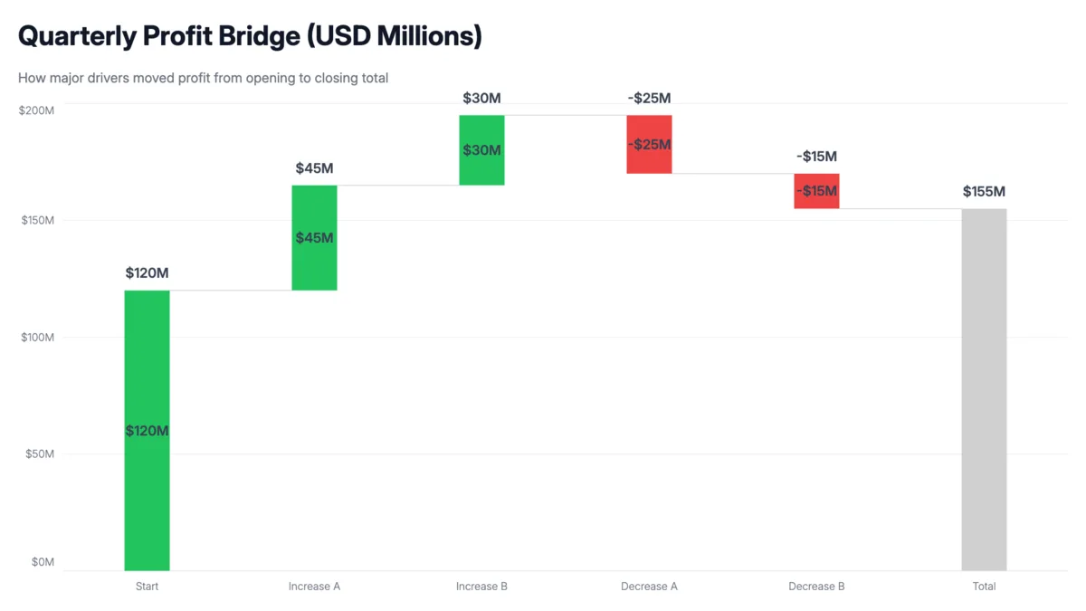
Sample data
Copy this into the editor to get started. Replace the labels and values with your own numbers.
| Category | Value ($M) |
|---|---|
| Last Year Revenue | 4.8 |
| New Customers | 0.85 |
| Expansion | 0.42 |
| Price Increases | 0.18 |
| Churn | -0.35 |
| Downgrades | -0.2 |
| This Year Revenue | 5.7 |
How to read it
The opening and closing bars sit on the baseline — everything in between shows what moved revenue up or down. Green bars are growth drivers, red bars are headwinds. The height of the closing bar relative to the opening bar tells you net growth at a glance.
When to use it
Quarterly business reviews
Show leadership exactly which drivers hit target and which fell short. Makes the growth story concrete rather than just reporting a top-line number.
Board and investor decks
Boards want to know why you hit or missed revenue targets. A bridge chart answers that in one slide without requiring them to reconcile multiple tables.
Net revenue retention analysis
Expansion minus churn minus downgrades is your NRR story. The waterfall makes it visual — you can see whether growth is driven by new business or existing customers.