How to Create a Pareto Chart in Excel (Step-by-Step)
Excel has a built-in Pareto chart type available since Excel 2016. It automatically sorts bars in descending order and adds a cumulative percentage line — no manual setup needed. This guide covers data preparation, inserting the chart, reading the 80% cutoff, and adding an optional reference line.
Skip the Excel steps — paste your data and get a clean pareto chart in seconds. Export as image or PPTX.
What is a pareto chart in Excel?
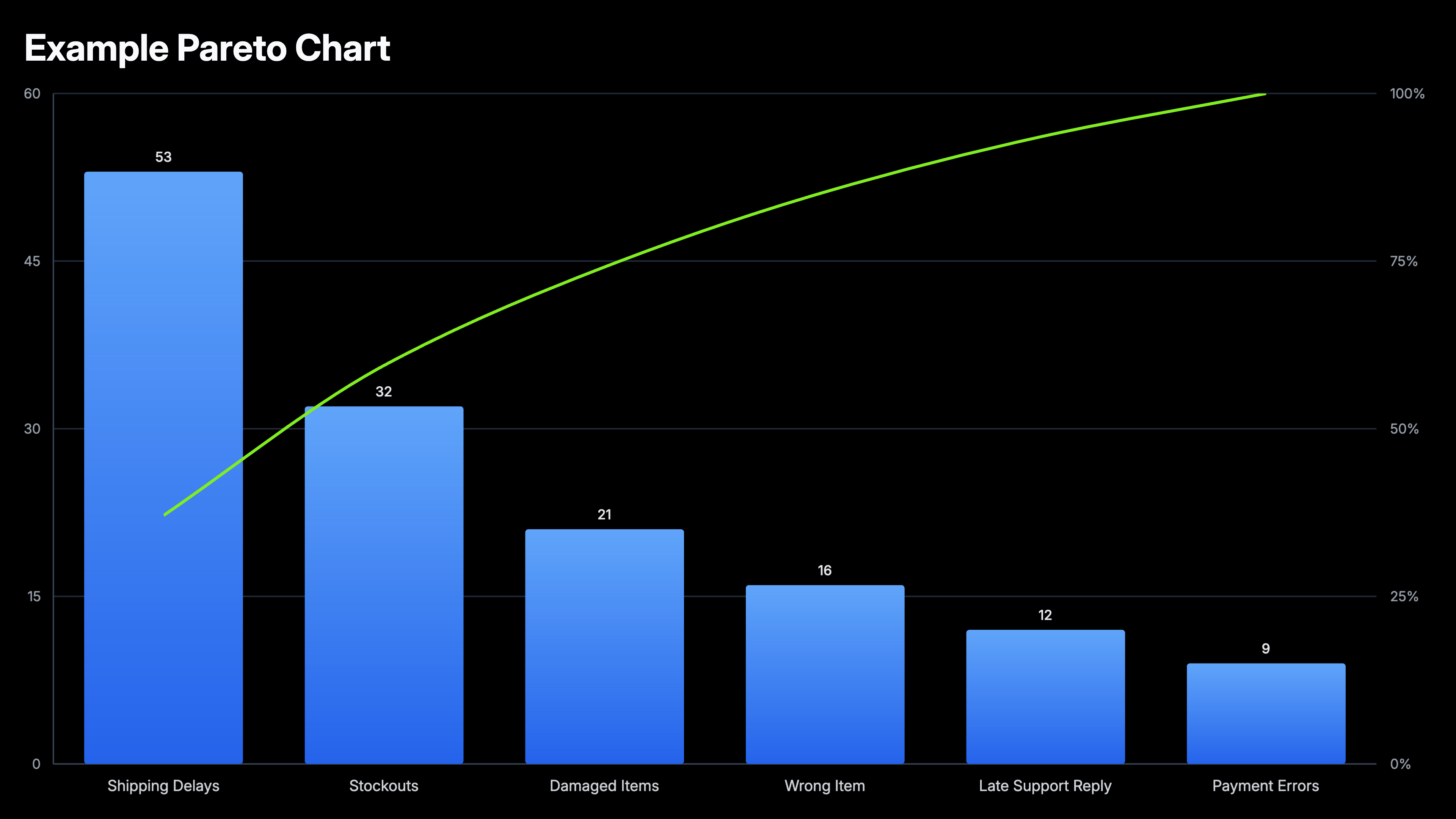
A Pareto chart in Excel combines a bar chart (sorted descending by value) with a cumulative percentage line on a secondary axis. It applies the 80/20 principle: the bars to the left of where the cumulative line crosses 80% represent the vital few causes responsible for the majority of effects. Excel 2016 added Pareto as a native chart type under Statistical Charts, making it a one-click insert from sorted two-column data.
Example data for a pareto chart in Excel
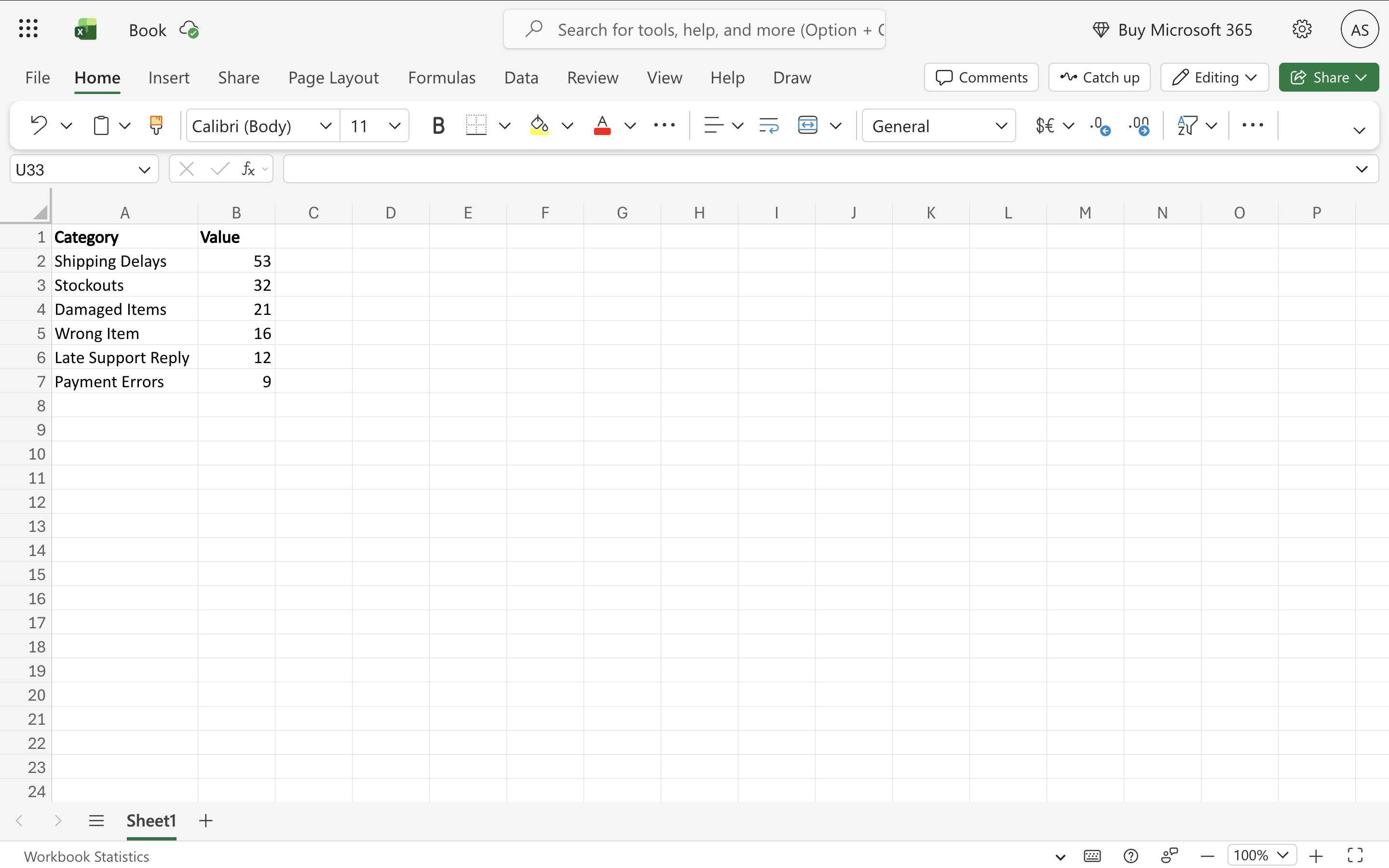
Use this sample dataset to follow along with the steps below. Copy it into Excel starting at cell A1.
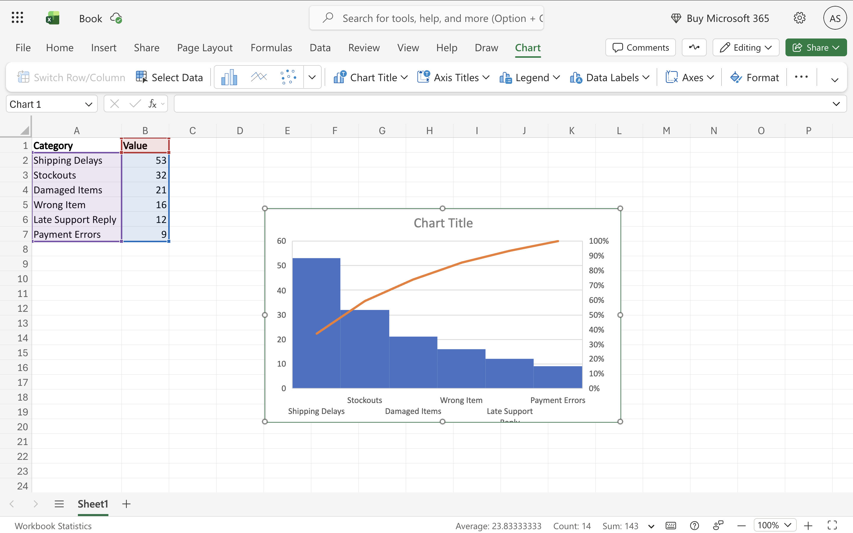
| Complaint Type | Count |
|---|---|
| Shipping Delays | 53 |
| Stockouts | 32 |
| Damaged Items | 21 |
| Wrong Item | 16 |
| Late Support Reply | 12 |
| Payment Errors | 9 |
6 steps to make a pareto chart in Excel
Prepare your data
Create two columns: one for category labels (defect types, complaint reasons, product lines, failure modes) and one for their counts or values. You don't need to sort — Excel reorders automatically — but sorting descending before inserting makes it easier to verify your data. Totals or subtotals should not be included in the selection.
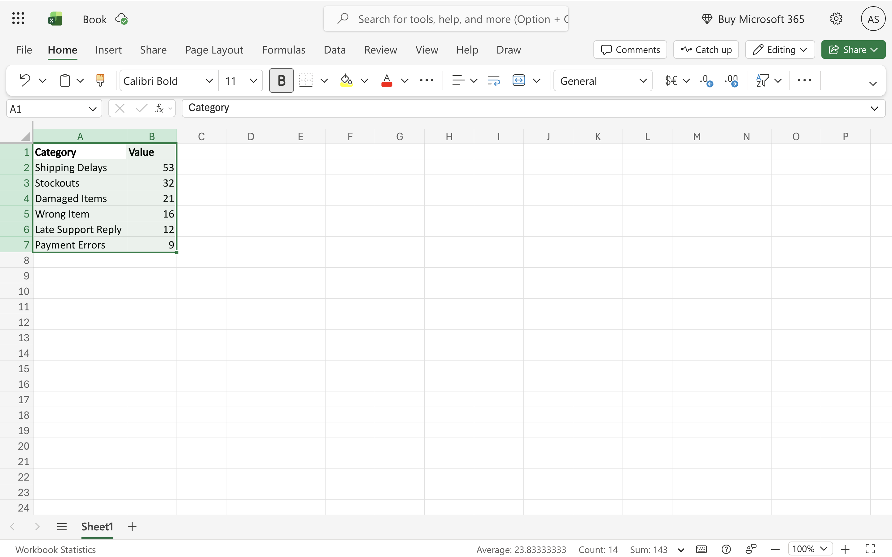
Select your data range
Click and drag to select both columns including the header row. For a clean chart, avoid selecting blank cells or totals rows.
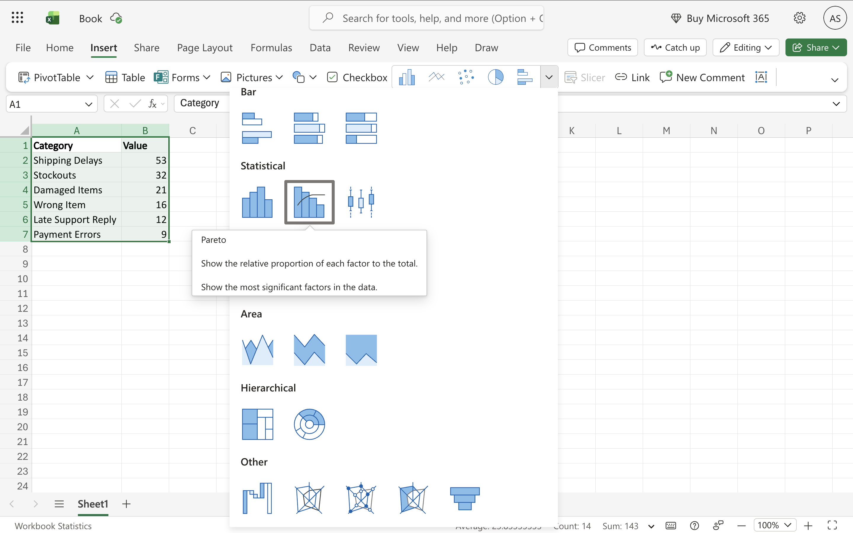
Insert the Pareto chart
Go to Insert → Charts → click the Insert Statistic Chart button (it shows a histogram icon) → select Pareto. Excel inserts the chart with bars automatically sorted descending and the cumulative percentage line already added on the right Y-axis.
Read the cumulative percentage line
The orange line on the secondary axis shows the cumulative percentage. Where it crosses 80% marks the Pareto cutoff — the categories to the left of that point drive 80% of the total. If the line reaches 80% by the second or third bar, you have a highly concentrated problem. If it takes eight bars to reach 80%, the causes are more evenly distributed.
Add an 80% reference line (optional)
Excel doesn't draw a horizontal 80% threshold line automatically. To add one: create a helper column with all values equal to 80. Add it as a new series on the secondary axis. Format it as a dashed line with no markers and a contrasting color. This makes the Pareto cutoff immediately visible.
Customize colors and labels
Right-click a bar → Format Data Series to change bar color. Pareto charts typically use a single bar color since the ranking is the story. Add data labels via Chart Elements (+). Title the primary axis (count) and secondary axis (cumulative %).
When to use a pareto chart in Excel
Quality control and defect analysis
Identify which defect types, failure modes, or error categories cause the majority of problems. Manufacturing, customer support, and QA teams use Pareto charts to prioritize what to fix first.
Customer complaint prioritization
Show which complaint categories account for most volume. If the top two complaint types make up 78% of all tickets, fixing those two delivers far more impact than addressing the remaining ten.
Revenue and sales concentration
Visualize which products, customers, or regions drive most revenue. Classic 80/20 insight — a small number of customers or SKUs typically drive the majority of sales.
Root cause analysis
After a 5-Why analysis or fishbone diagram session, use a Pareto chart to rank identified root causes by frequency or impact to decide where to focus corrective action.
Components of a pareto chart in Excel
Descending bars
Each bar represents one category, sorted from largest to smallest. The leftmost bar is the biggest contributor. Excel sorts these automatically.
Cumulative percentage line
Plotted on the secondary (right) Y-axis, scaled 0–100%. Shows what percentage of the total is accounted for as you move left to right across the bars.
80% threshold
The point where the cumulative line reaches 80%. Categories to the left of this point are the 'vital few' — they explain the majority of the effect. Not drawn automatically but can be added as a reference line.
Primary Y-axis
Left axis, scaled to the raw counts or values of the bars.
Secondary Y-axis
Right axis, scaled 0–100%, used by the cumulative percentage line.
Frequently Asked Questions
Related